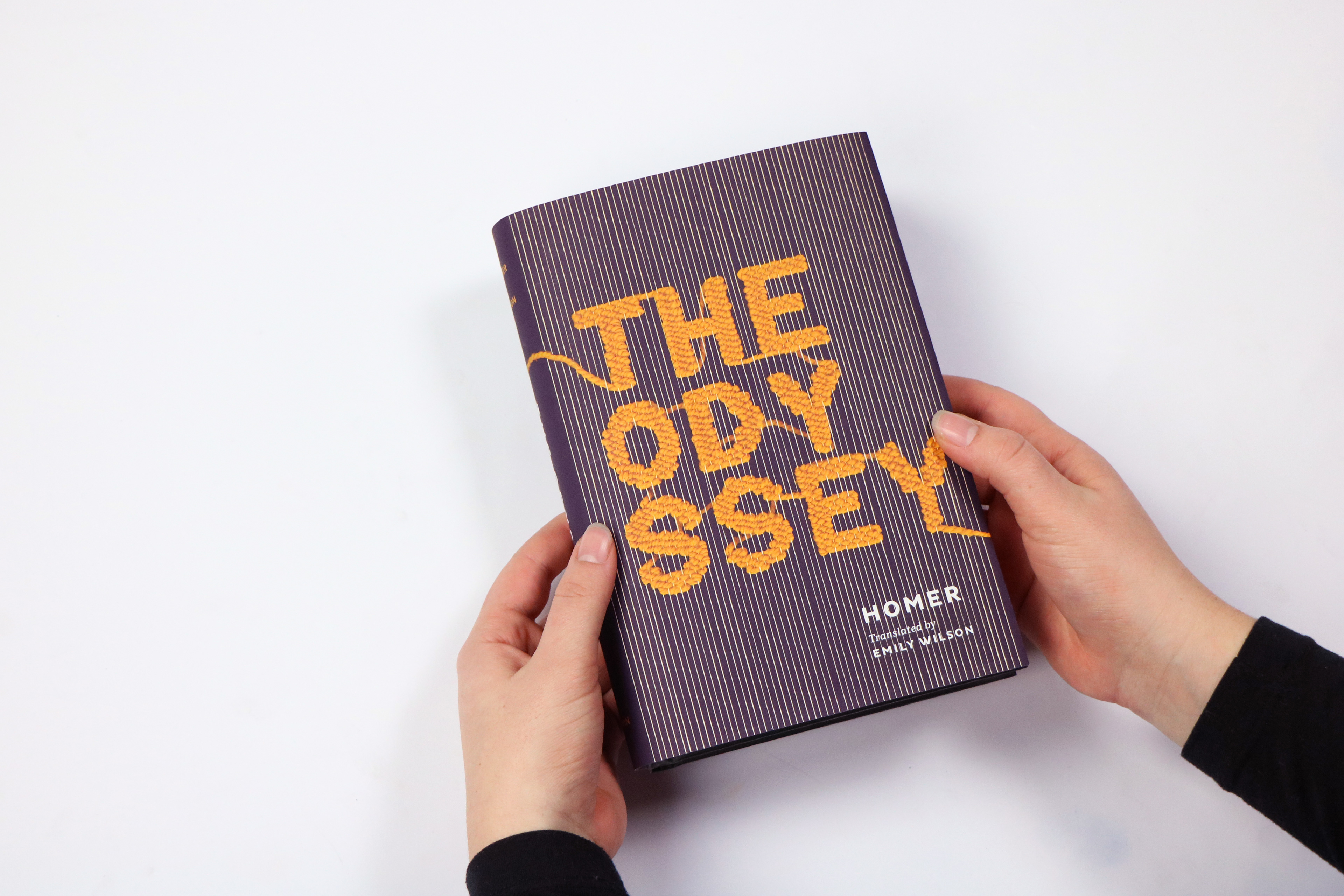
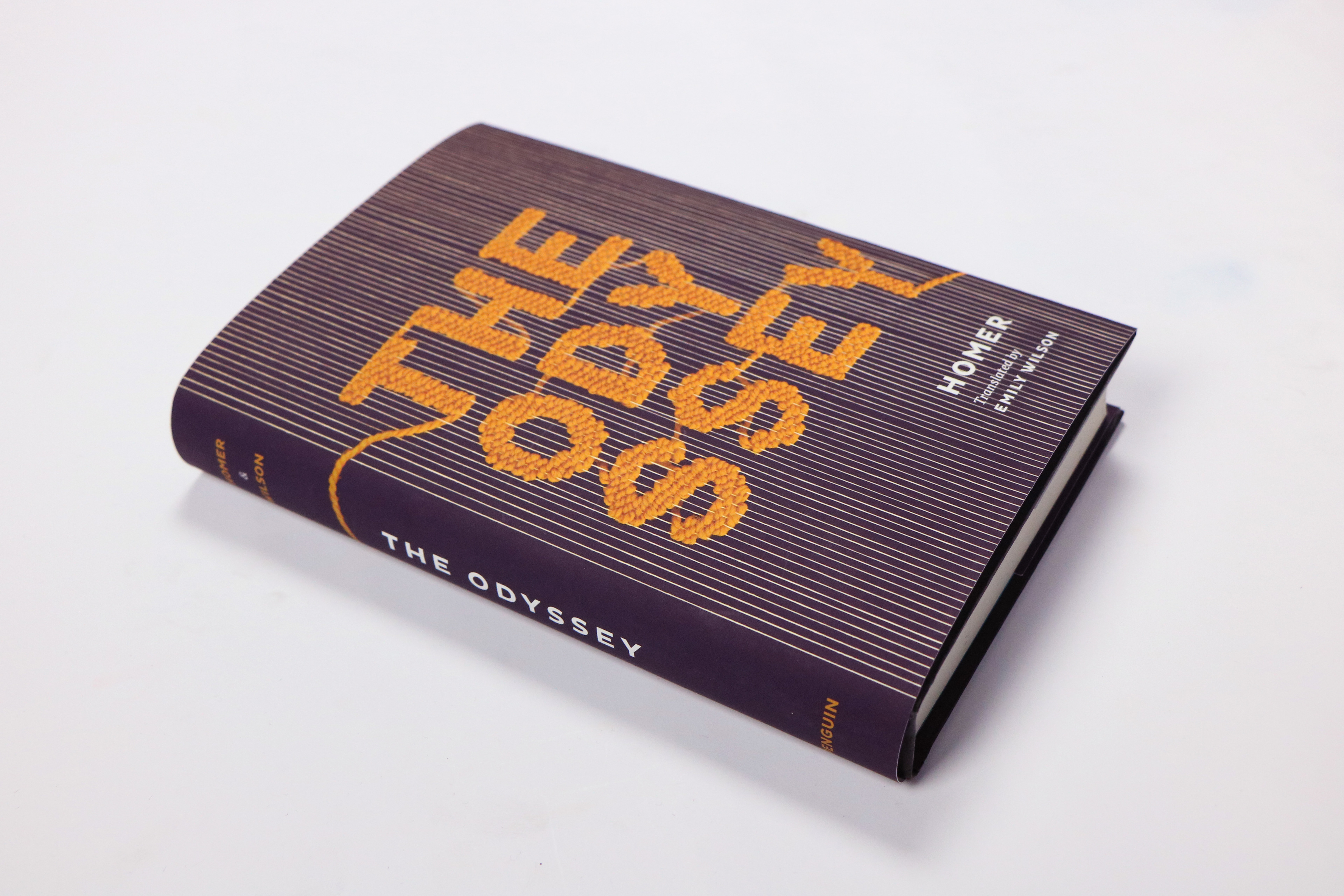
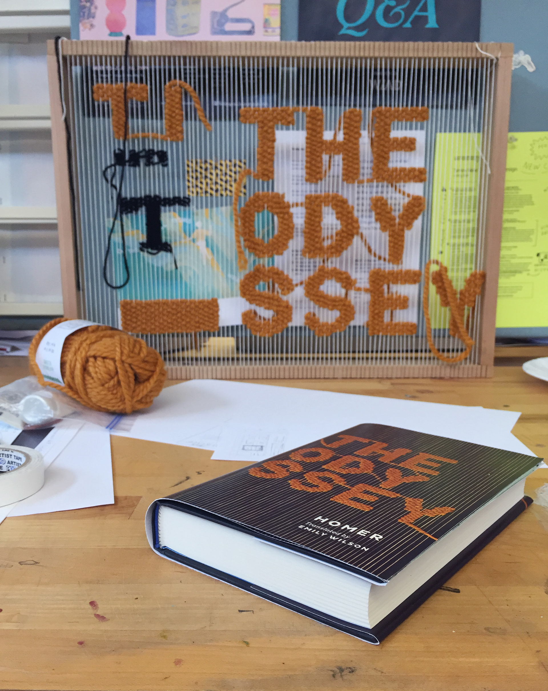
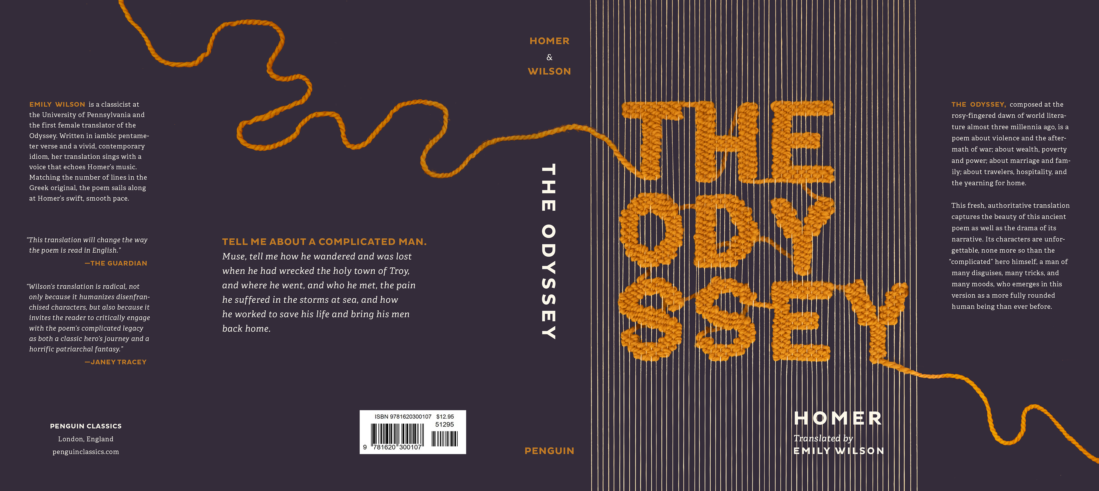
Responding to a prompt to design a book jacket using three-dimensional typography for the title, I chose Homer’s “The Odyssey” and created a wooden loom to weave letters.
I considered themes such as hubris, cycles of violence, war, double standards, misogyny, divine intervention, and the journey home, as well as visual motifs such as the “wine-dark sea,” mazes, wood, oceans, and weaving. I ultimately decided to explore this epic poem through the lens of Penelope, Odysseus' wife.
I discuss some of my process below, but you can read about it more in depth on Issuu.
One part of The Odyssey that stood out to me was that while Odysseus is away fighting monsters, sleeping with women, and sailing overseas, his wife Penelope is at home with their son Telemachus. Both must deal with a rowdy bunch of suitors who have essentially taken over the home. All this time, Penelope has been weaving a tapestry. She promises the suitors that she’ll choose one of them to marry once she finishes her tapestry, but is actually unweaving parts of the tapestry each night because she has a gut feeling that Odysseus is still alive out there (she's right) and is waiting for him to come home.
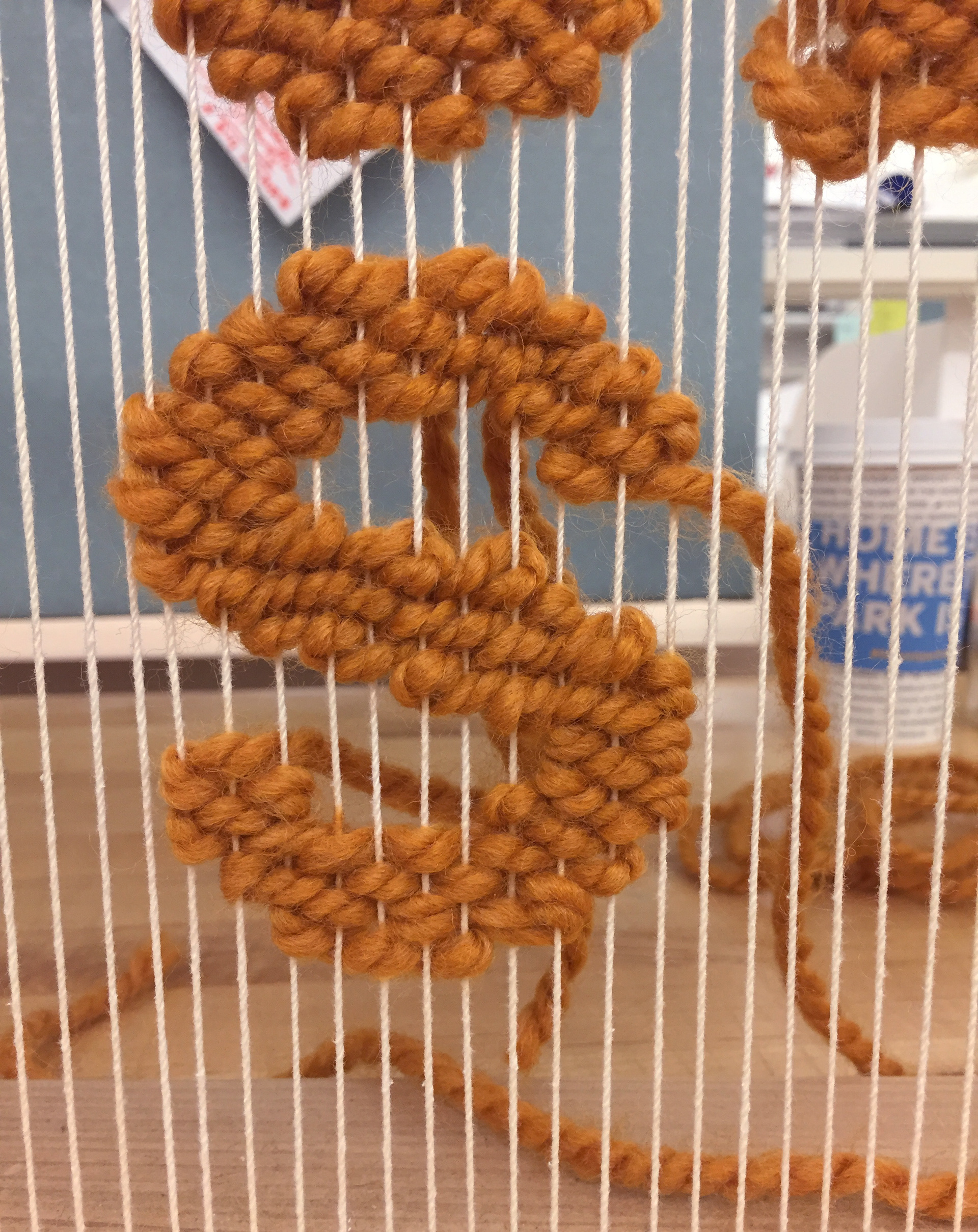
I thought weaving, like Penelope, would bring a different lens through which to view The Odyssey, and ended up creating a simple loom using wood and a staple gun. Inspired by Ancient Greek black figure pottery, I used my loom to painstakingly weave the words “The Odyssey” using orange yarn.
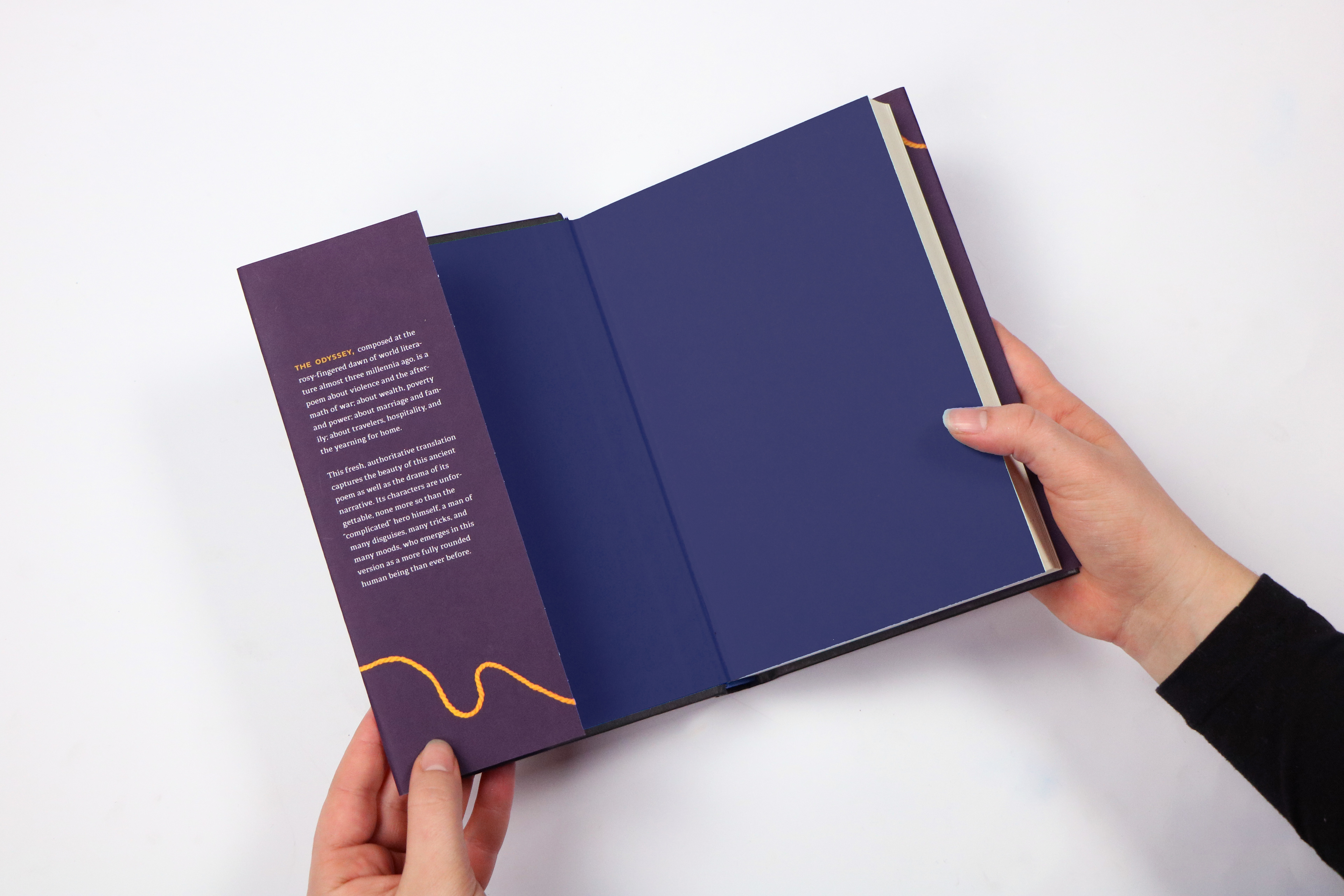
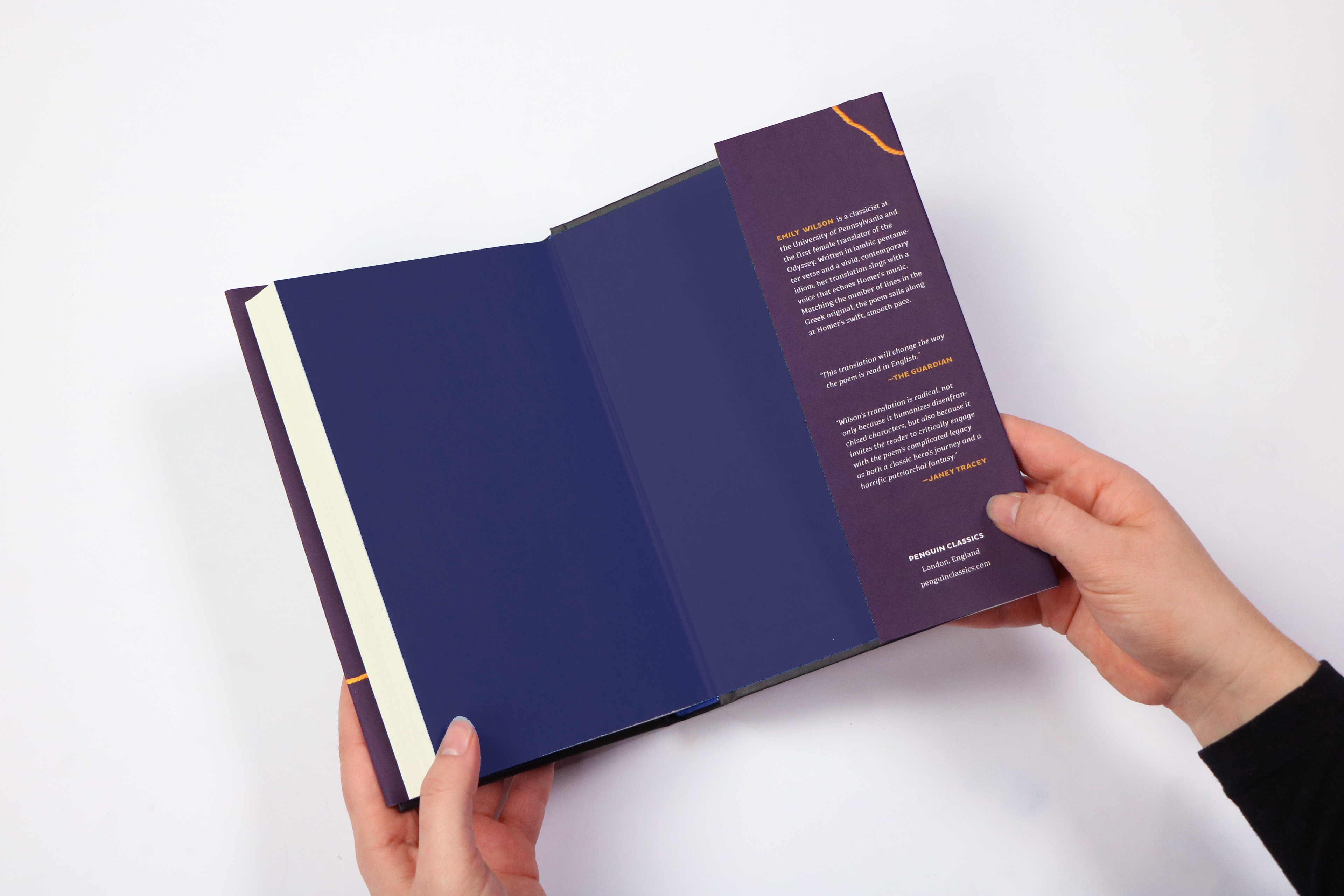
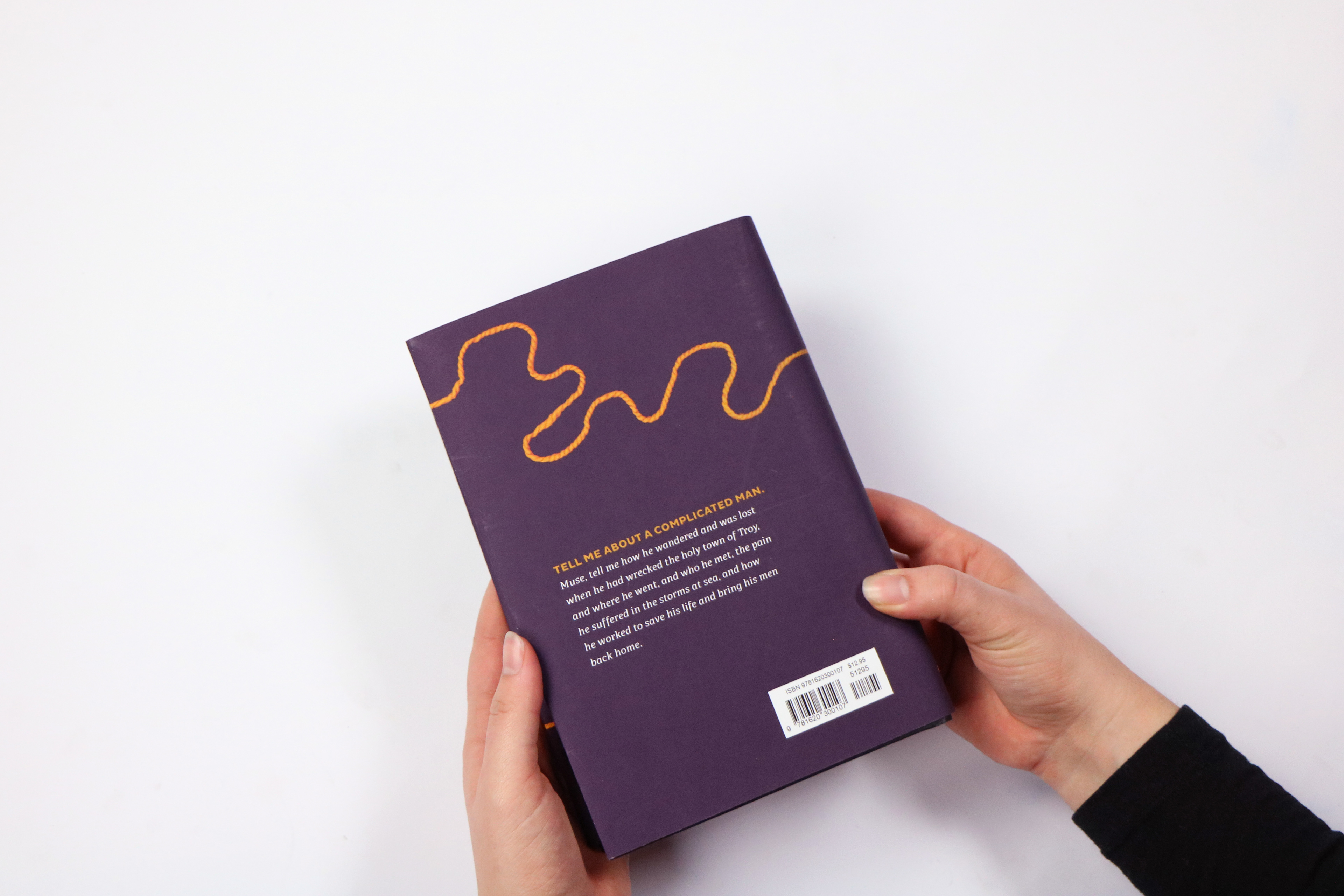
Much later in the process, I discovered a new 2017 translation by Emily Wilson, the first female translator of “The Odyssey.” Her translation is more critical of the misogyny present in previous translations and is written using the same number of syllables as Homer, in iambic pentameter. I felt that her translation fit the Penelope-focused theme of my jacket.
Peers commented that they enjoyed the woven title and saw how it fit into the theme of “journey.” My professor noted that my type choices, Pluto Sans and Adelle, worked well together. Some disliked that my inside flaps contained “too many unnecessary” hyphens. While I agree that hyphens can distract from reading, I included hyphens when carefully typesetting because I prioritized a clean and non-distracting rag. This does make me curious as to whether more hyphens makes a text less readable or not.
If I continued working on this project, I would try to find another way to more seamlessly integrate “Homer” and “Translated by Emily Wilson” into my cover. I enjoyed creating a book jacket for the first time and weaving on a loom for the first time in a long time.
Attribution
Pluto Sans designed by Hannes von Döhren for HVD Fonts
Mentorship provided by Jude Agboada and Megan Irwin
Woodworking knowledge and tools provided by Natalie Snyder and Bryce Robinson
Valuable feedback provided by my friend Eliot Cohen