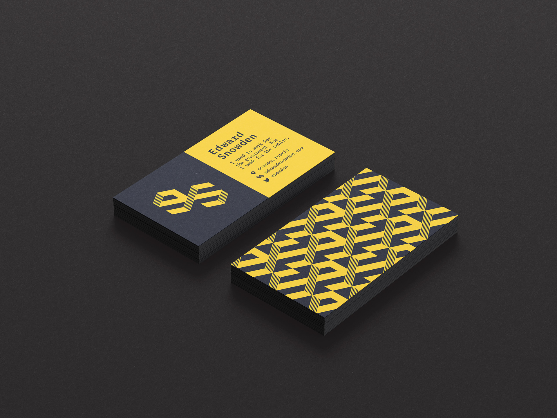
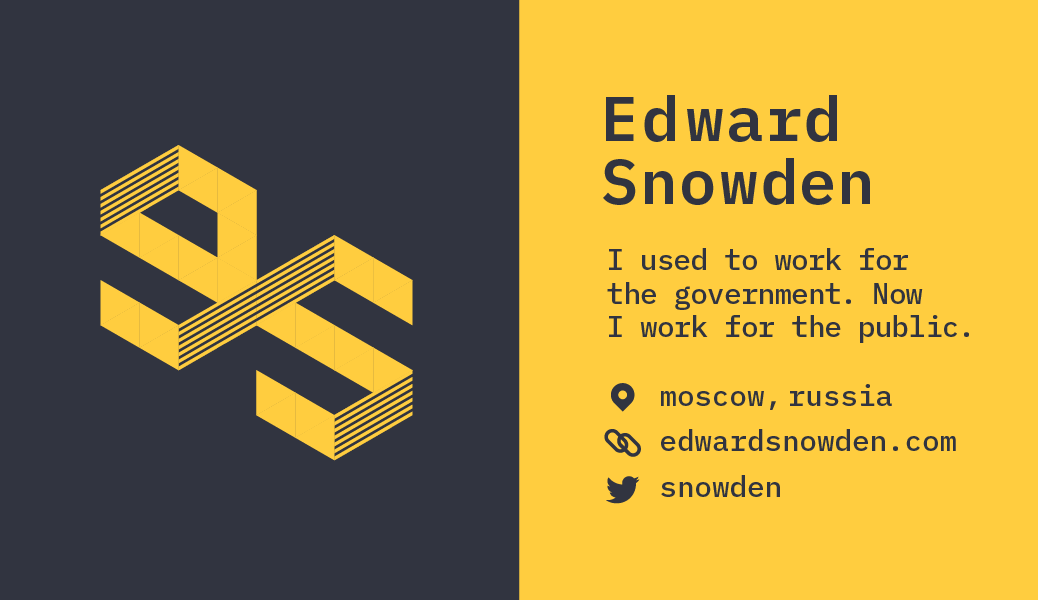
This is a monogram I designed for my assigned hypothetical “client,” Edward Snowden. After creating this monogram, I designed the front and back of a business card.

From my research, I concluded that Edward Snowden is an intelligent whistleblower who leaked NSA secrets to the American public because he thought we deserved to know them. Some people think Snowden is patriotic, while some (including government officials) think Snowden is a traitor to our country. I explored the theme of duality. In Snowden’s case, this referred to him being hidden in plain sight, visible yet invisible, patriotic yet traitorous.
Before this project, I knew Snowden as “the Wikileaks guy” but little else. I asked my peers what they knew about him. Most people didn’t know many details about him beyond him leaking government information, but one said Snowden seemed “imposing, annoying, menacing, and abrasive.” I decided to find out for myself, so I spent hours Googling him and watching interviews, including his most famous one with The Guardian a few months after the leak (pictured). A few quotes from an ABC News interview stood out to me:
Katie Couric: When you look back at the past three years, was it worth it?
Edward Snowden: Absolutely. I would do it again.
Couric: No regrets?
Snowden: No regrets at all.
Snowden: We should always make a distinction that right and wrong is a very different standard than legal and illegal.
Couric: Are you saying that what you’ve done is right? or legal? or both?
Snowden: I would not have done it if I didn’t believe it was right.
Based on those traits, I drafted a concept:
Edward Snowden is an intelligent whistleblower who leaked NSA secrets to the American public because he thought we deserved to know them.
I noticed that some people think Snowden is patriotic, while some (including government officials) think Snowden is a traitor to our country. I later explored the theme of duality. In Snowden’s case, this referred to him being hidden in plain sight, visible yet invisible, patriotic yet traitorous.
While creating preliminary sketches, I started with seeing how the letters E and S, could fit together. I noticed that the E and S are somewhat similar in that they can both be divided into 2 sections and are made of 3 parts (the arms of the E, the spine of the S), so they fit together decently well, versus, say, a G and a W (my classmate was assigned Gillian Welch). At this point, I wasn’t sure whether to use an uppercase E and S or a lowercase e and s.
I also experimented with creating the letters out of shapes (lines, circles) instead. I knew at this point that I wanted to evoke a digital feel—he did work as a high-ranking NSA cybersecurity officer, after all—but wasn’t set on how to do so.
Working digitally, I explored possible methods. I began exploring concepts I drafted on paper using both machine type and shapes I created.
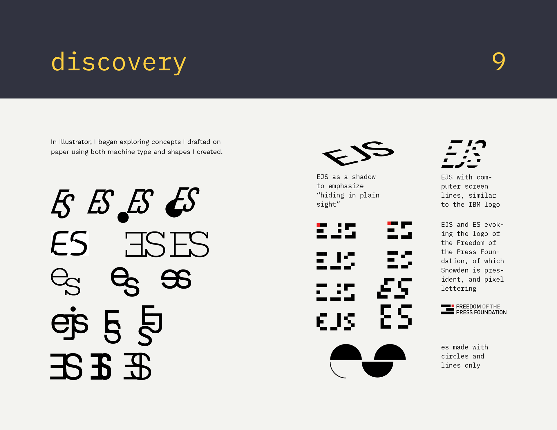
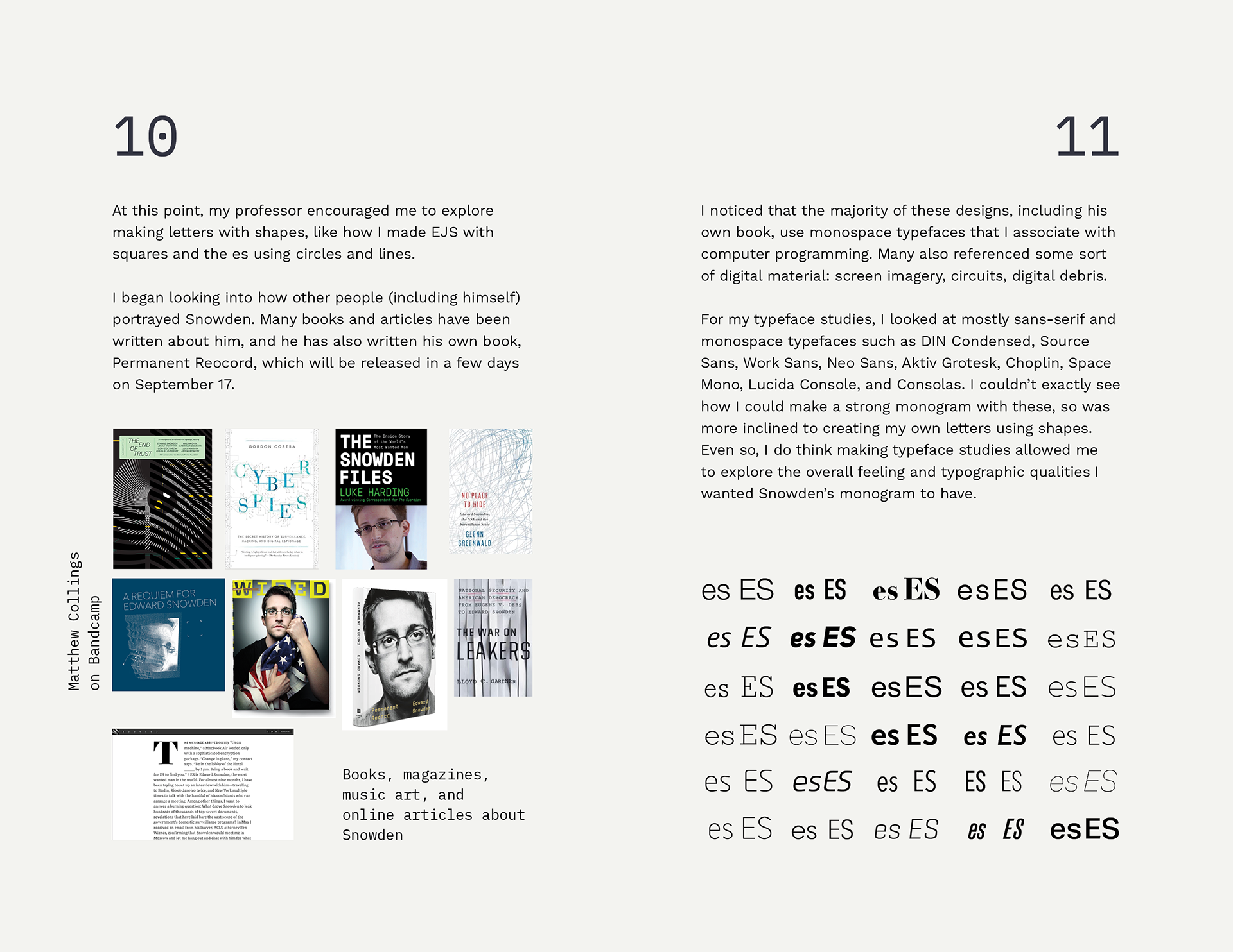
I began looking into how other people (including himself) portrayed Snowden. I noticed that the majority of these designs use monospace typefaces that I associate with computer programming. Many also referenced some sort of digital material: screen imagery, circuits, digital debris.
For my typeface studies, I looked at mostly sans-serif and monospace typefaces. I couldn’t exactly see how I could make a strong monogram with these, so was more inclined to creating my own letters using shapes. Even so, I do think making typeface studies allowed me to explore the overall feeling and typographic qualities I wanted Snowden’s monogram to have.
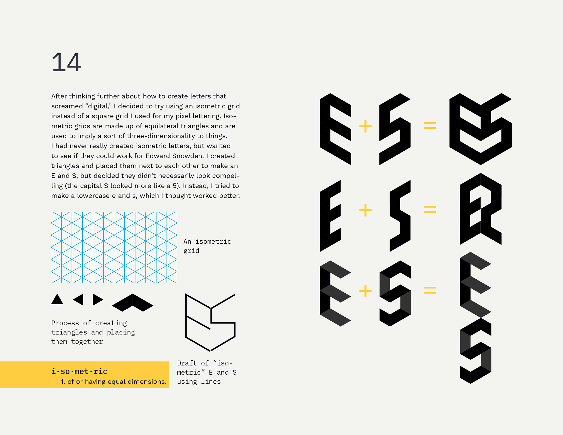
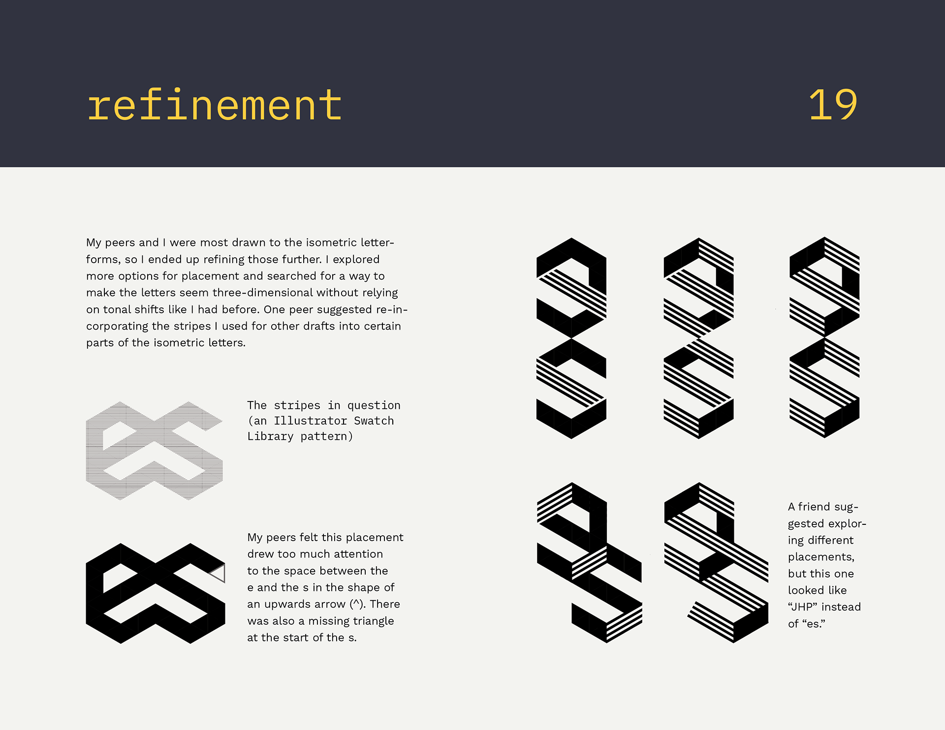
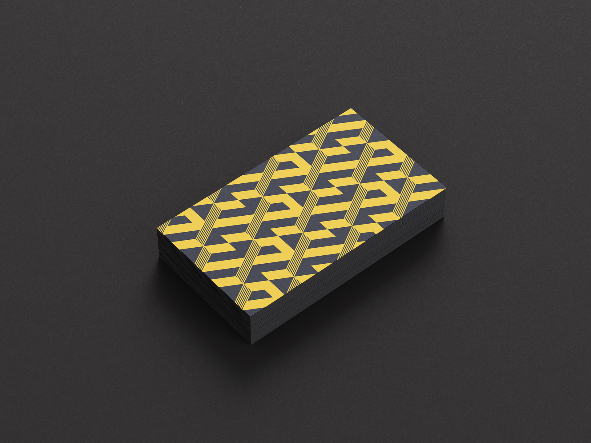
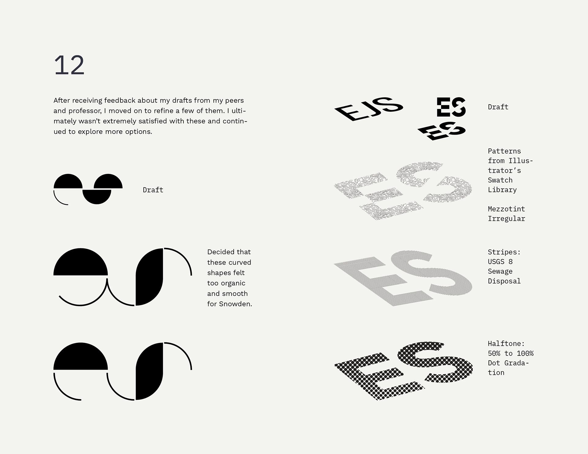
After thinking further about how to create letters that screamed “digital,” I decided to try using an isometric grid instead of a square grid I used for my pixel lettering. Isometric grids are made up of equilateral triangles and are used to imply a sort of three-dimensionality to things. I had never really created isometric letters, but wanted to see if they could work for Edward Snowden. I created triangles and placed them next to each other to make an E and S, but decided they didn’t necessarily look compelling (the capital S looked more like a 5). Instead, I tried to make a lowercase e and s, which worked better.
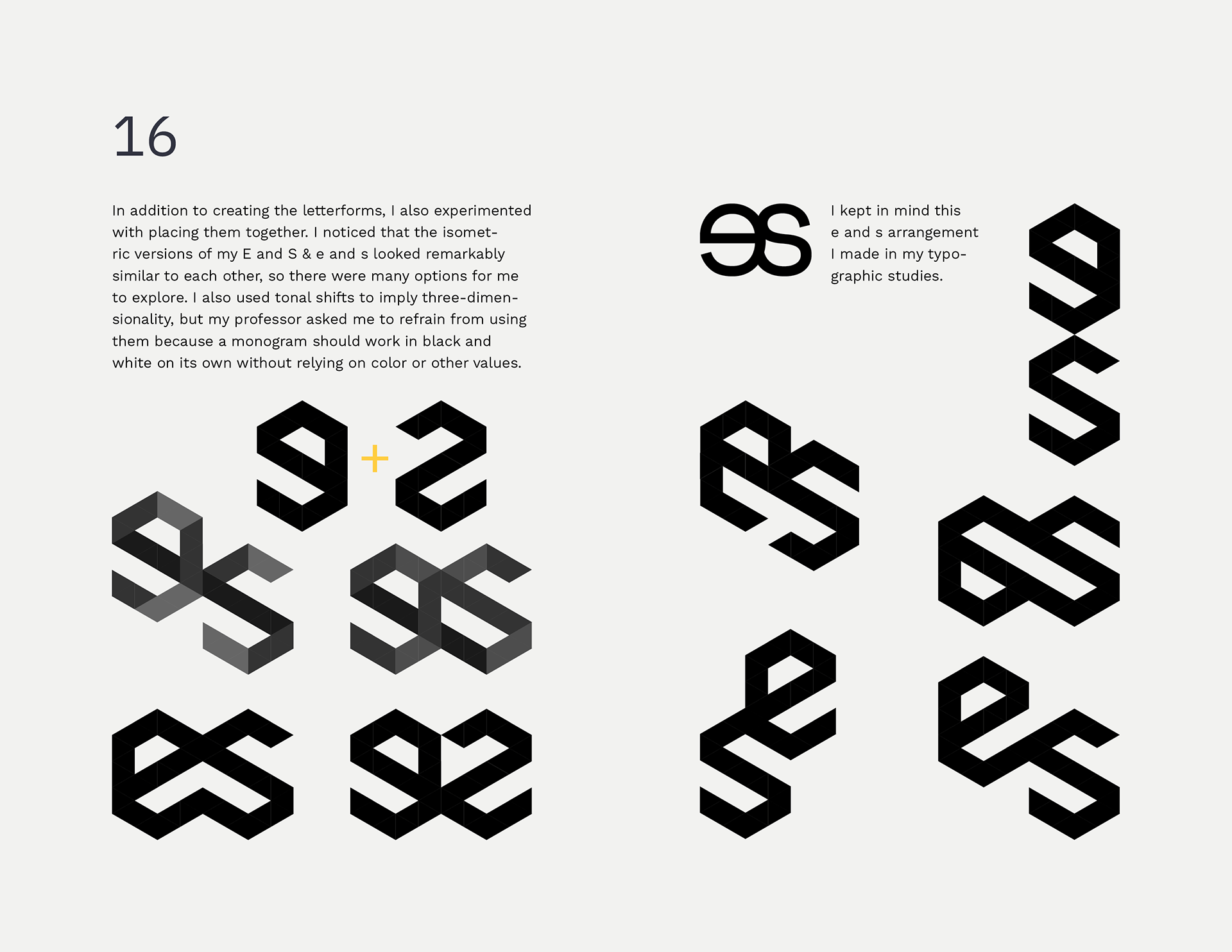
I noticed that the isometric versions of my E and S & e and s looked remarkably similar to each other, so there were many options for me to explore. I also used tonal shifts to imply three-dimensionality, but my professor Chrissi Cowhey asked me to refrain from using them because a monogram should work in black and white on its own without relying on color or other values.
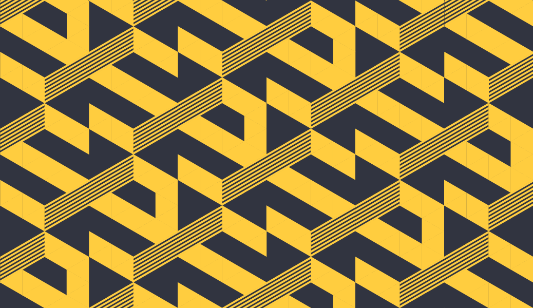
When considering the business card, I first began with the back of the card by featuring my monogram at different scales. I created potential color palettes by eyedropping colors from programming softwares like atom.
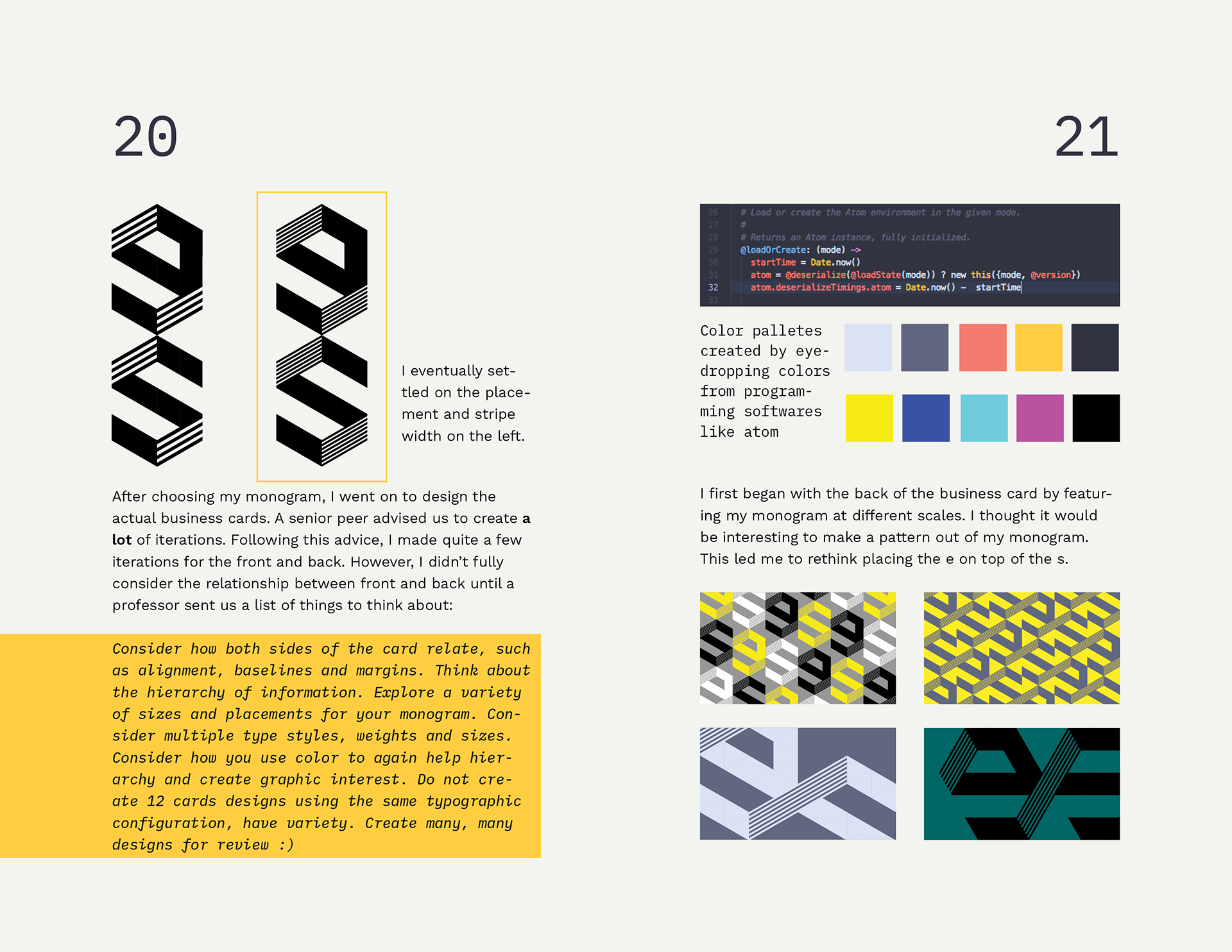
Peers commented that the pattern on the back felt like a circuit, an algorithm, and a digital maze through which Snowden was running from the government. Three commented that it looked like a design by Goyard. I can see why my peers thought that, even though isometric grids aren’t uncommon. Chrissi said she could see the pattern being expanded as a brand identity.
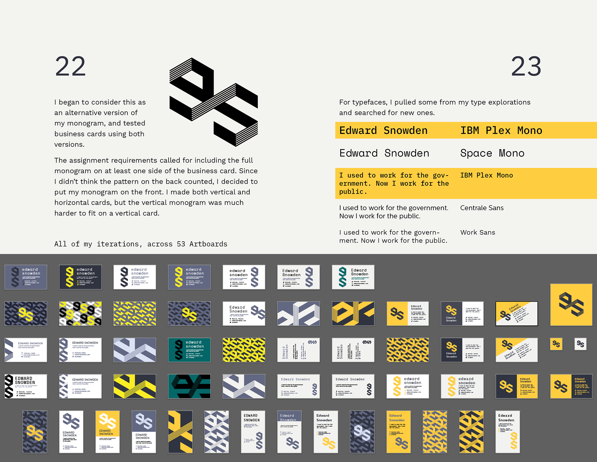
I don’t think the monogram exactly reads well at 1 inch due to the lines (which appear as a tonal shift when small), so I would tweak the line width if I continued this project. I’d also build out a branding system utilizing the full color palette.
If you’d like to view my process on Issuu, click the button below.
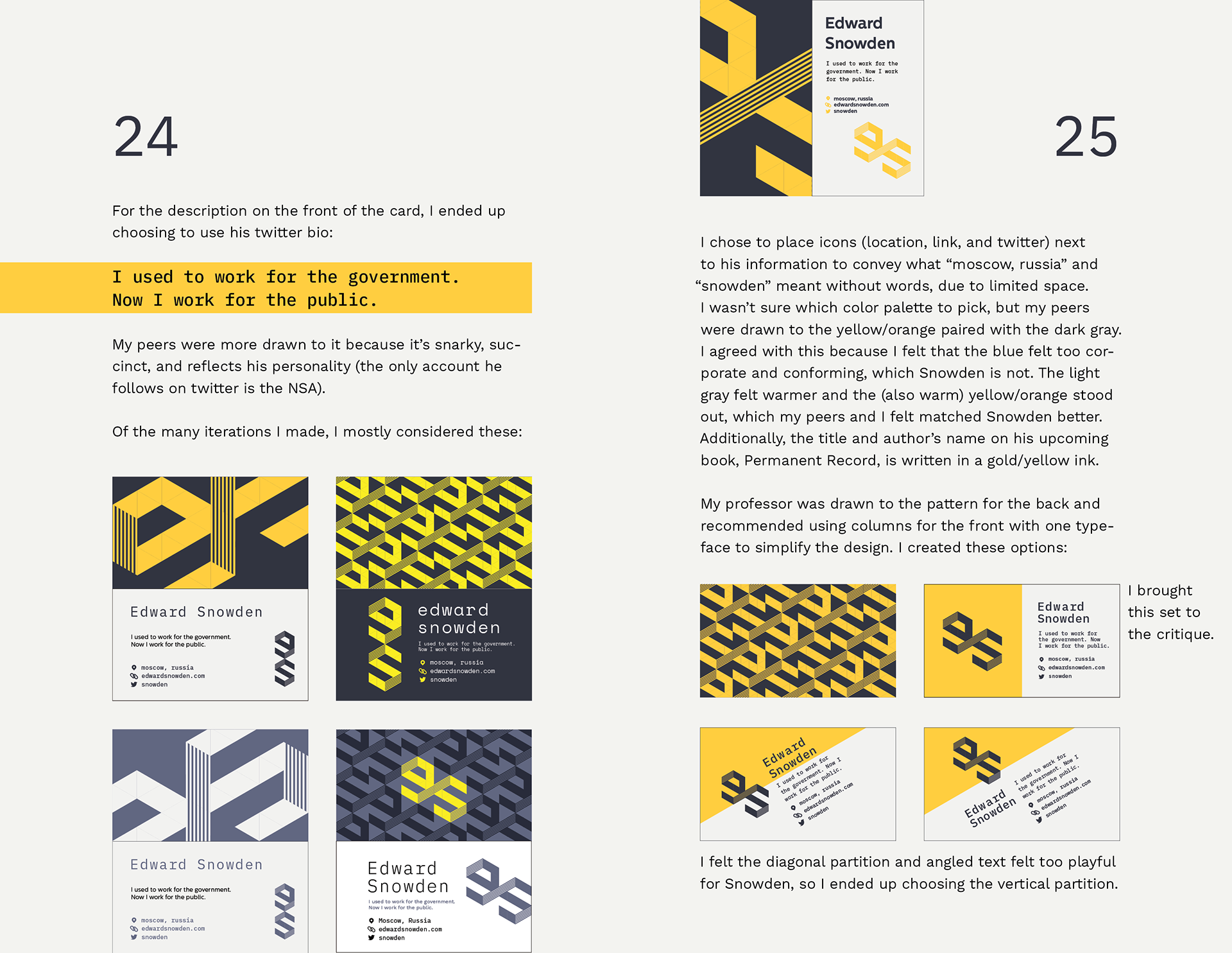
Attribution
IBM Plex Mono designed by Mike Abbink, IBM BX&D, in collaboration with Bold Monday. I first “discovered” IBM Plex through this project and immediately loved that a monospace typeface had so many weights. I’ve developed a deep appreciation not only for Plex’s letterforms but also that IBM very intentionally made Plex open source.
Mentorship provided by Chrissi Cowhey and Eve Wallack
Valuable feedback provided by my peers