This phase of usability testing is a continuation of my UX Research project, “The Search.” Please read my case study for more context. Also note that any wireframes on this page aren’t my best work—I could definitely iterate on them, but being nitty gritty about wireframes wasn’t my main focus here.
Project Brief
Challenge: Improve the apartment finding experience for WashU students looking to rent off-campus units
Goals: Foster more open, direct communication between current residents and potential residents. Remove landlords as middlemen between current residents and potential residents (at least in early stages).
Solution: A digital community-made map of apartments in surrounding neighborhoods with rent transparency
Timeline: February 2021 to March 2021

A meme I used when recruiting people for usability testing
The Plan
Objectives: Is this concept useful? How can it be expanded or shrunk? Simple or complex version? Is there information overload? Privacy concerns, contact info
Assumptions and Hypotheses: People might be skeptical or concerned about submitting their address and rent. Possible confusion about timing (ie: what part of the apartment search it’d be helpful for). People may have experience with filling out forms and viewing databases or maps.
Methods: Asynchronous A/B testing for simple vs complex options, through sites like Maze or Usability Hub. Think aloud protocol for synchronous testing.
Measuring success: Results show distinct preference for one option over the other
Asynchronous Testing: A/B, First Click
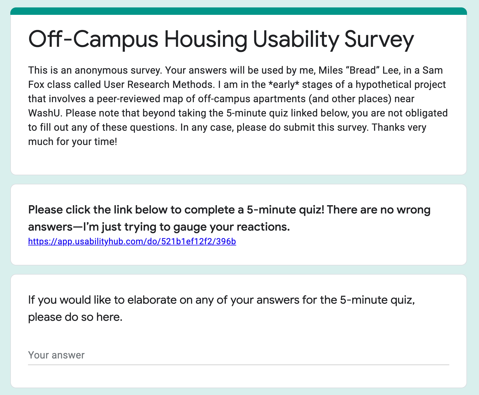
I used Usability Hub for asynchronous testing. I gathered 26 responses (as of the end of March 29). All responses were received within 24 hours.
To recruit respondents, I posted my survey in three Discord servers (one design server with 2,000+ members, one programming server with 1,200+ members, and one game server with 490+ members) and one WashU-related GroupMe with 200+ members. For the WashU GroupMe only, instead of sharing the direct Usability Hub link, I shared a Google Form with optional followup questions.
Usability Hub Responses: 26 total. View responses on Usability Hub
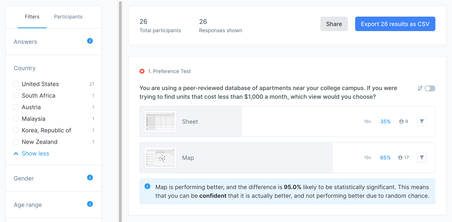
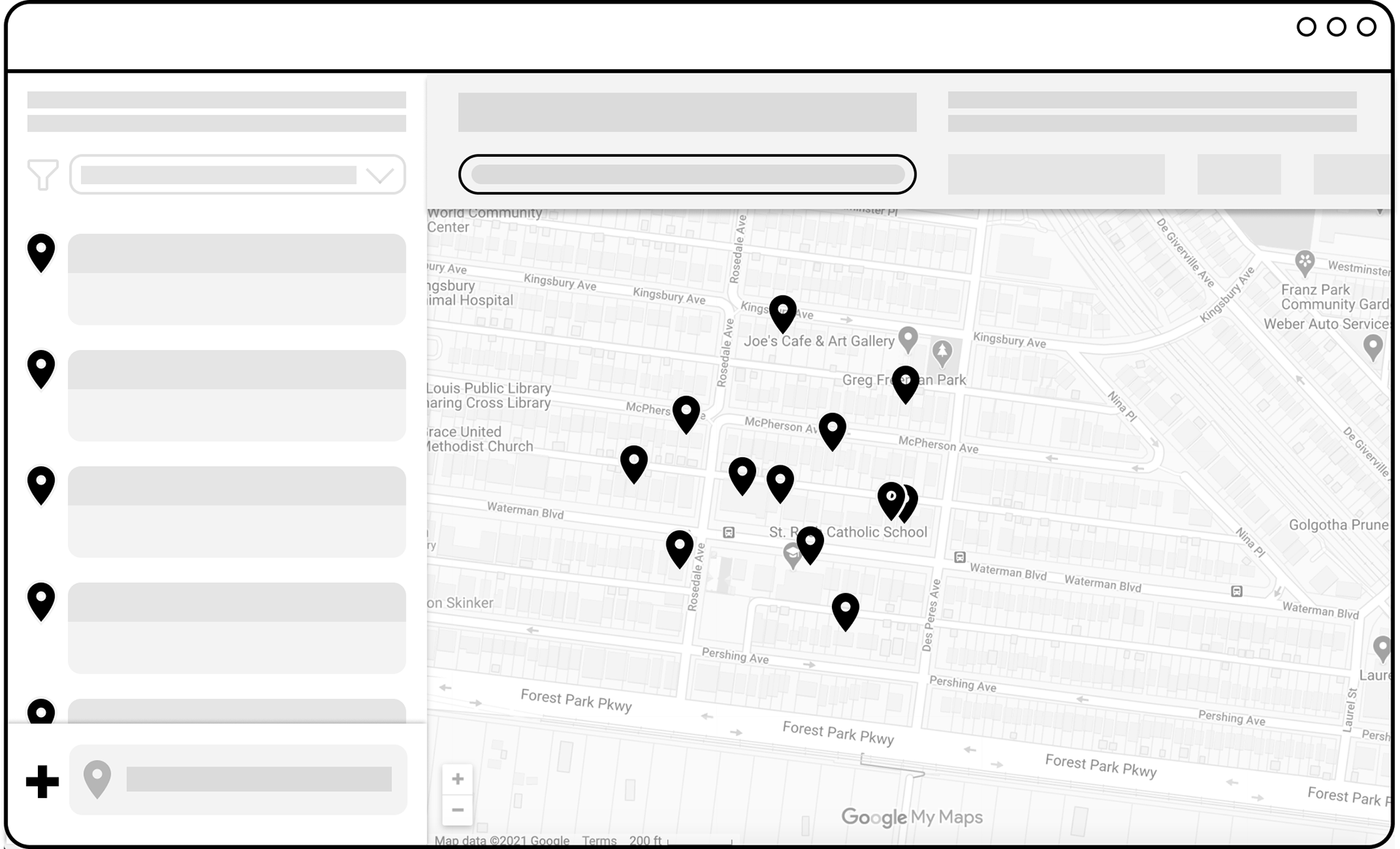
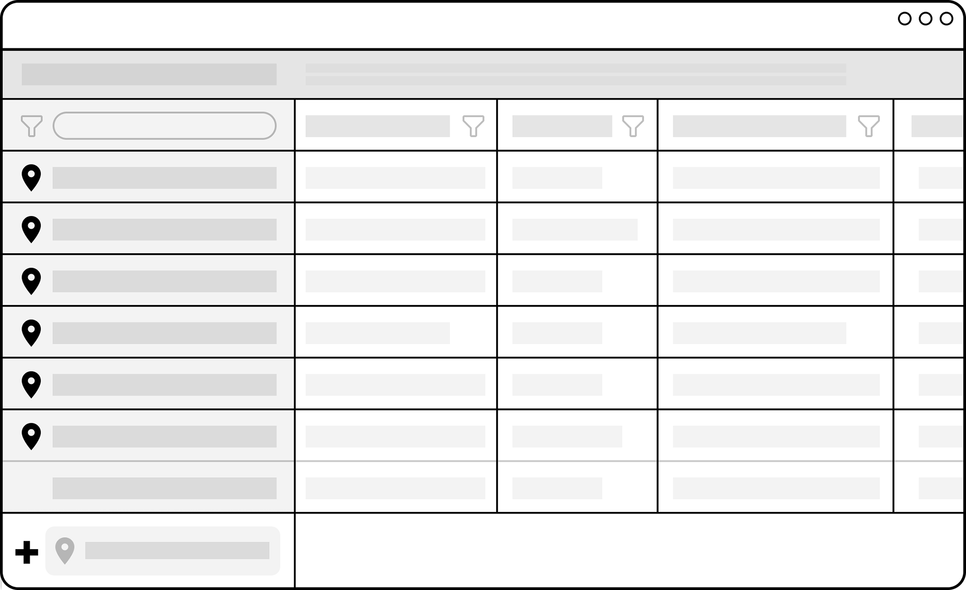
1. Preference Test: [Sheet] [Map] You are using a peer-reviewed database of apartments near your college campus. If you were trying to find units that cost less than $1,000 a month, which view would you choose?
Responses (as of the end of March 29): 35% for Sheet, 65% for Map
Usability Hub: Map is performing better, and the difference is 95.0% likely to be statistically significant. This means that you can be confident that it is actually better, and not performing better due to random chance.
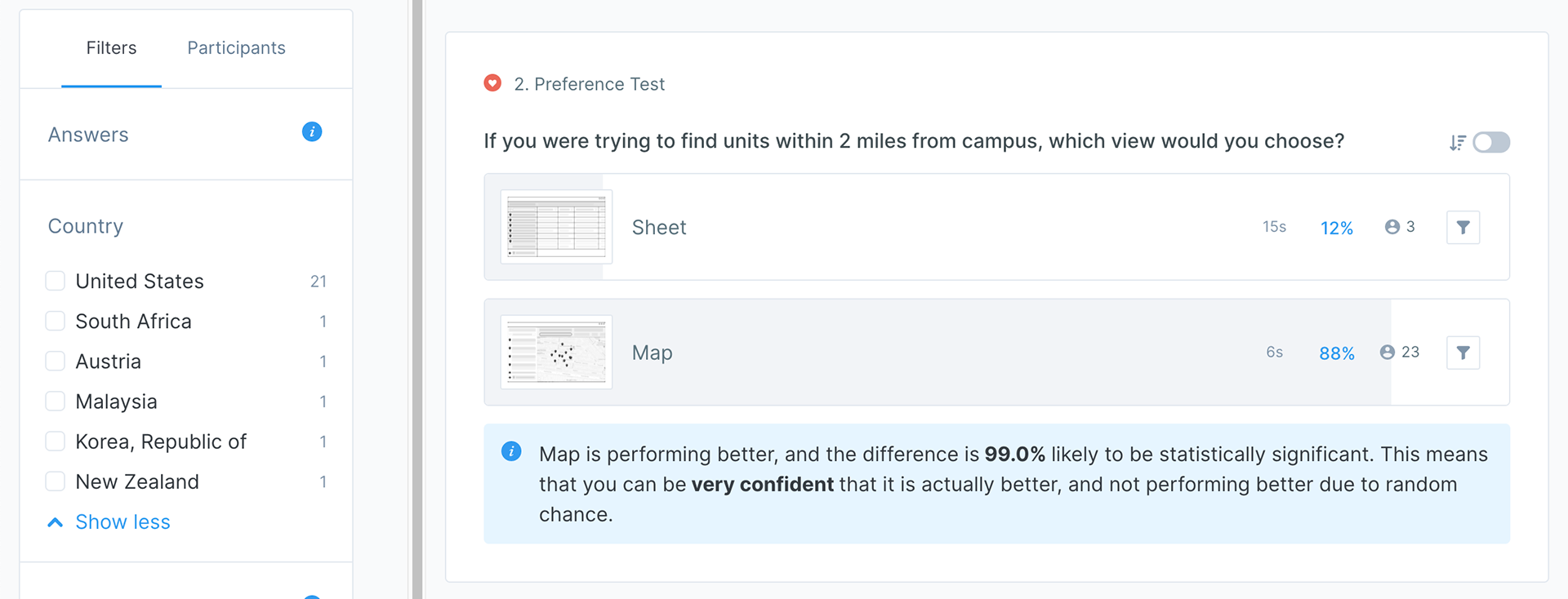
2. Preference Test: [Sheet] [Map] If you were trying to find units within 2 miles from campus, which view would you choose?
Responses (as of the end of March 29): 12% for Sheet, 88% for Map
Usability Hub: Map is performing better, and the difference is 99.0% likely to be statistically significant. This means that you can be very confident that it is actually better, and not performing better due to random chance.
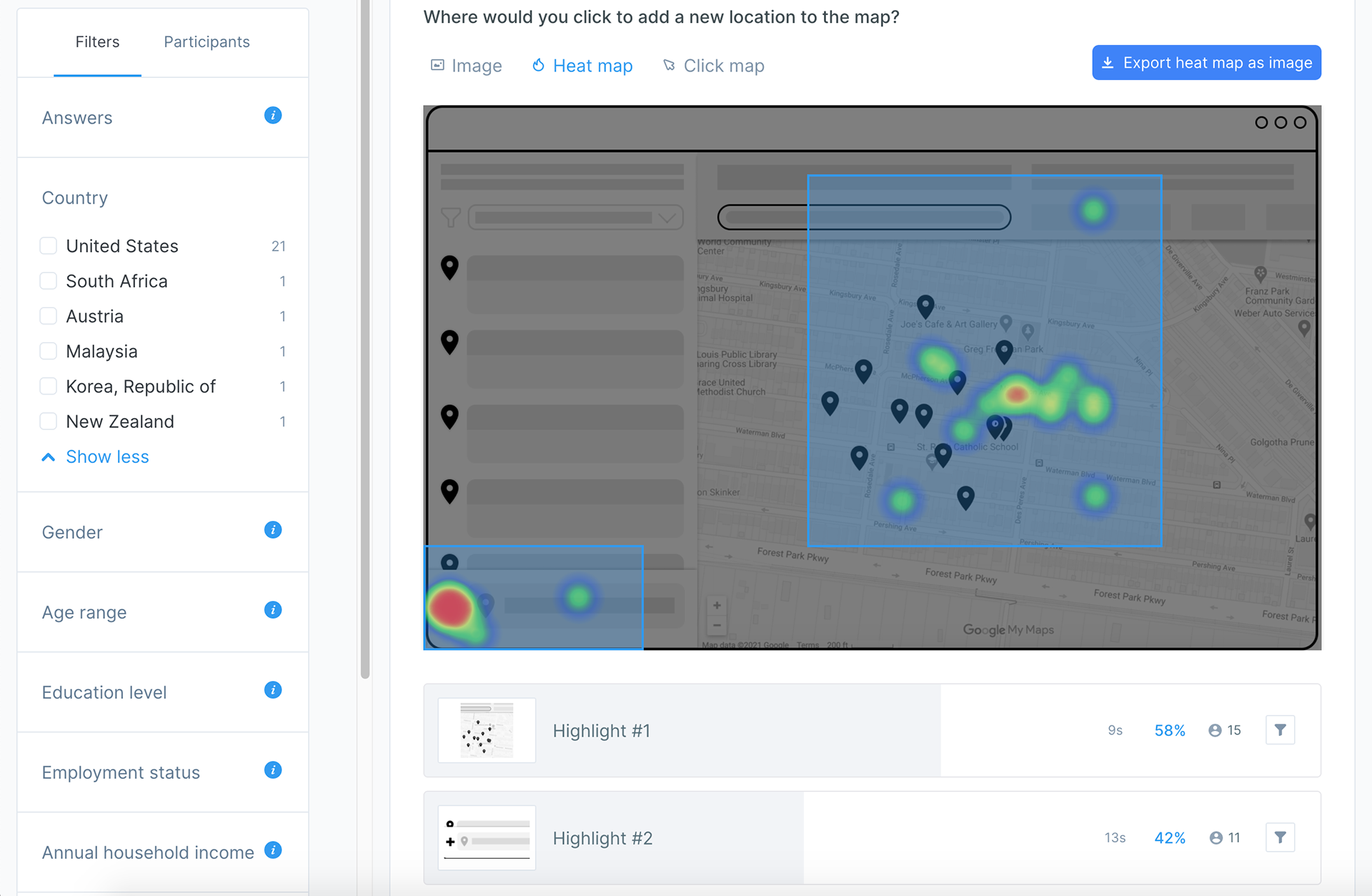
3. First Click: [Map] Where would you click to add a new location to the map?
Responses (as of the end of March 29): see heat map
WashU Responses
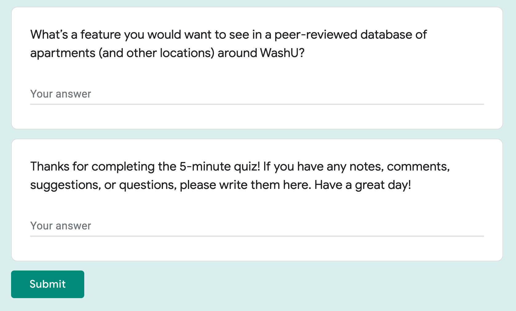
For the WashU GroupMe only, instead of sharing the direct Usability Hub link I shared a Google Form with optional WashU-specific followup questions. These 9 responses are included in the 26 Usability Hub responses, since I asked the WashU respondents to fill out the survey (even if they didn’t respond to any questions) and the Usability Hub test. Basically, at least 9 of the 26 respondents on Usability Hub were WashU students. The survey questions and responses are as follows:
Please click the link below to complete a 5-minute quiz! There are no wrong answers—I’m just trying to gauge your reactions.
If you would like to elaborate on any of your answers for the 5-minute quiz, please do so here. [Long answer text]
Responses (as of the end of March 29):
“I have a terrible sense of direction/spatial awareness, so if there’s a map option, I’m always going to pick it. Otherwise I’ll have no idea where anything is!”
What’s a feature you would want to see in a peer-reviewed database of apartments (and other locations) around WashU? [Long answer text]
Responses (as of the end of March 29):
“Bias report! I’m afraid people will disguise their biases as logic, i.e. equating majority black as dangerous.”
“Maybe a question-asking section?”
“reviews on the landlord! i don’t like my landlord and i want to post a review where other people can see it.”
Synchronous Testing: Think Aloud
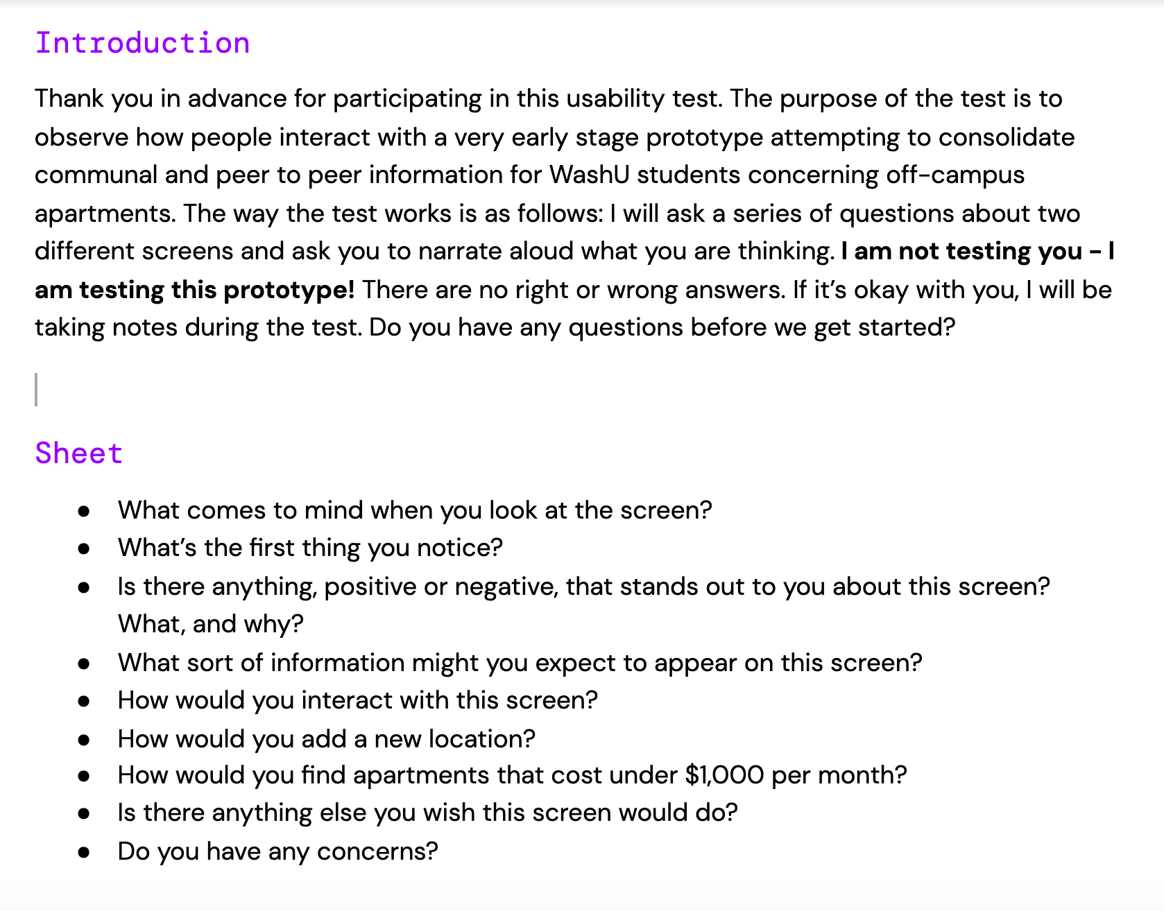
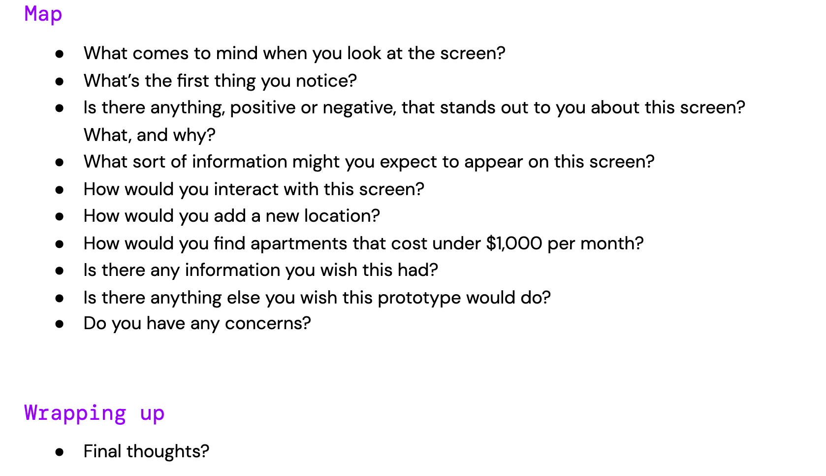
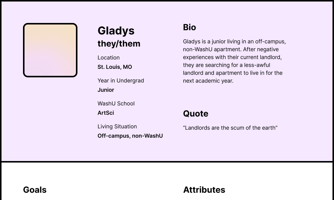
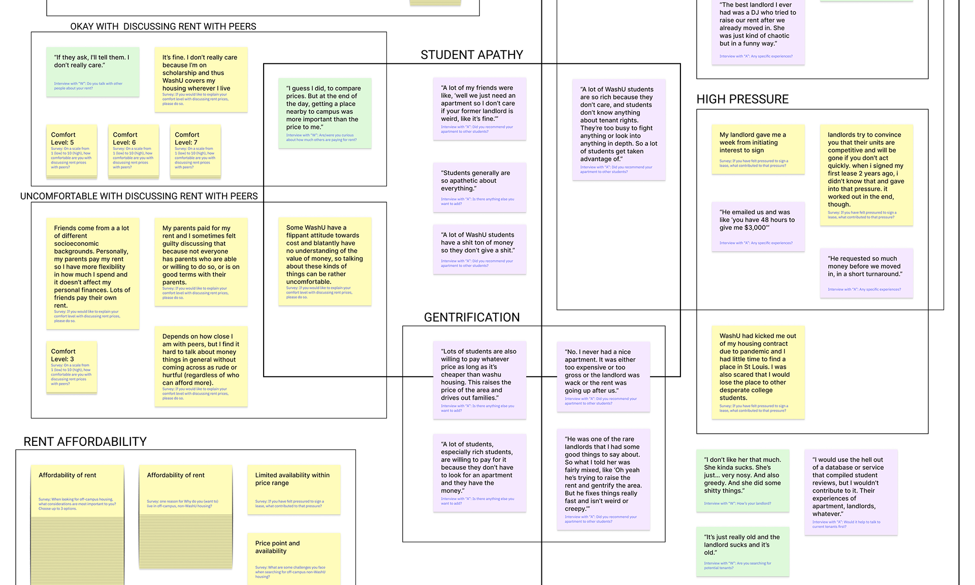
Affinity Mapping
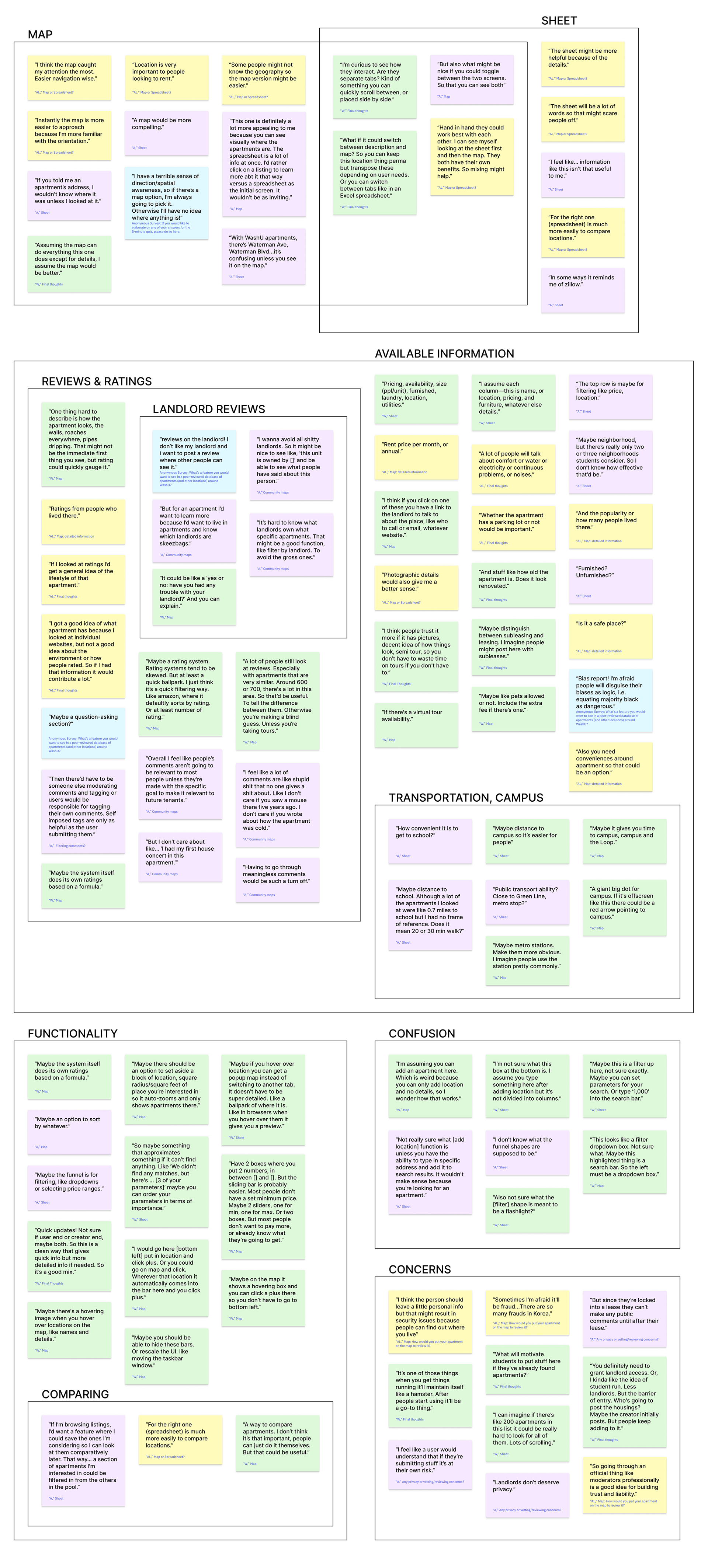
Map vs. Sheet
In terms of preference and A/B testing, the map view was most widely preferred to the sheet view. I initially provided the sheet view as the “simple” option in terms of feasibility/effort by organization. In my first synchronous usability test (I called them interviews, but that’s probably a misnomer) when my interviewee instinctively leaned towards the map view, I was sort of surprised because I felt it would appear more cluttered. But it might actually be the other way around. It seems that, especially for those unfamiliar with the area, the visuals a map provides are crucial to finding apartments.
“Instantly the map is more easier to approach because I'm more familiar with the orientation.” AL, interview
“I have a terrible sense of direction/spatial awareness, so if there’s a map option, I’m always going to pick it. Otherwise I’ll have no idea where anything is!” Anonymous, survey
“This one is definitely a lot more appealing to me because you can see visually where the apartments are. The spreadsheet is a lot of info at once. I’d rather click on a listing to learn more abt it that way versus a spreadsheet as the initial screen. It wouldn’t be as inviting.” A, interview
Another option is to enable both map and sheet view.
“Hand in hand they could work best with each other. I can see myself looking at the sheet first and then the map. They both have their own benefits. So mixing might help.” AL, interview
“What if it could switch between description and map? So you can keep this location thing perma but transpose these depending on user needs. Or you can switch between tabs like in an Excel spreadsheet.” W, interview
Usability
Both interviewees “A” and “W” didn’t recognize the classic filter symbol. Perhaps something like a gear icon or a sliding scale icon would be more recognizable?
“I don’t know what the funnel shapes are supposed to be.” A, interview
“Also not sure what the [filter] shape is meant to be a flashlight?” W, interview
To add a new location to the map, interviewees and usability testers (via my first click question on Usability Hub) felt like they could either click the area in the bottom left with a “+” sign (my intended “add location” area) or somewhere on the map (similar to creating location markers in Google Maps). Enabling both of those options seems like a good function to have.
“Not really sure what [add location] function is unless you have the ability to type in specific address and add it to search results. It wouldn't make sense because you’re looking for an apartment.” A, interview
“I’m assuming you can add an apartment here. Which is weird because you can only add location and no details, so I wonder how that works.” W, interview
On the map view, I noticed some confusion around the top area. I intended to mimic a website’s header, short description, and navigation links, but I feel like there should be less clutter of information in that particular area. This can be consolidated in future iterations.
“This looks like a filter dropdown box. Not sure what. Maybe this highlighted thing is a search bar. So the left must be a dropdown box.” W, interview
Scope of Concept
I wonder if I can re-center, re-frame, or re-consider the transparent peer to peer aspect of this project. I worry that it got a bit lost in the sheets/map. I’m not really interested in creating a new Zillow or something—I want this particular project to fill a more specific niche.
“In some ways it reminds me of Zillow.” A, interview
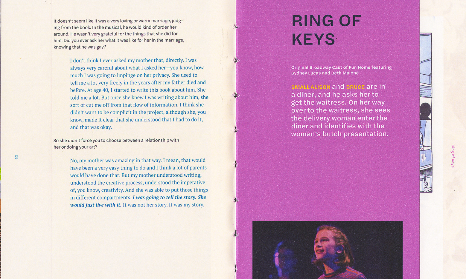
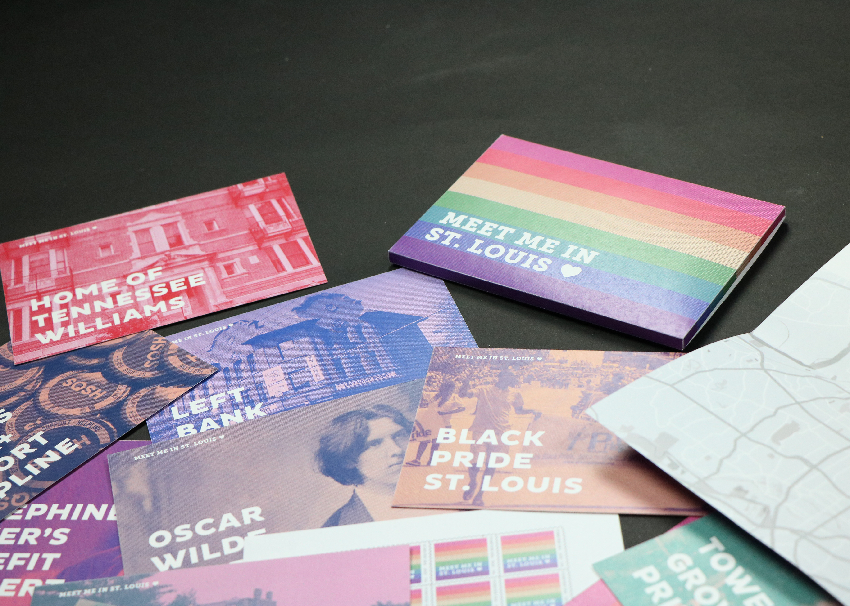
Some examples of community-made “maps” are Mapping LGBTQ St. Louis, SQSHBook, Map of LGBT Affirming Businesses, and Dear New York.
Interviewee “A” was skeptical of Dear New York: “I feel like a lot of comments are like stupid shit that no one gives a shit about. Like I don't care if you saw a mouse there five years ago. I don’t care if you wrote about how the apartment was cold.” A, interview
“Overall I feel like people’s comments aren’t going to be relevant to most people unless they’re made with the specific goal to make it relevant to future tenants.” A, interview
Interviewee “W” emphasized the importance of reviews. “A lot of people still look at reviews. Especially with apartments that are very similar. Around 600 or 700, there's a lot in this area. So that’d be useful. To tell the difference between them. Otherwise you’re making a blind guess. Unless you’re taking tours.” W, interview
“I got a good idea of what apartment has because I looked at individual websites, but not a good idea about the environment or how people rated. So if I had that information it would contribute a lot.” AL, interview
Possibilities for Shifting the Scope
A free-for-all map where users could submit any and all of their thoughts about particular areas or locations. This can be like “I really liked living in Skinker-Debaliviere” or “This street had a lot of people who threw loud parties when I lived here two years ago.”
A map where users can submit any and all thoughts about housing units, regardless of whether they lived there or not. If someone had a friend who lived in [x] apartment and felt from visiting that they wouldn’t recommend [x], they could comment that on the map.
A map that includes solely information about landlords (or property managers). Would show which units/buildings belong to which landlords. Users can leave ratings on landlords, like using a 5-star system, a scale system (“How satisfied are/were you with this landlord? 1 being very dissatisfied and 10 being very satisfied”), or a yes or no/thumbs up thumbs down question (“Would you recommend this landlord?”). This would not allow for reviews, since that has the possibility of getting users into legal trouble if their landlord notices and claims libel! But when people are leaving ratings, they could opt-in to provide some contact information if curious people want to directly ask them about their experiences with that landlord. That could invite legal troubles as well, though, like if a landlord or landlord-affiliated person contacted the user pretending to be a student looking for housing.
“I wanna avoid all shitty landlords. So it might be nice to see like, ‘this unit is owned by []’ and be able to see what people have said about this person.” A, interview
“It’s hard to know what landlords own what specific apartments. That might be a good function, like filter by landlord. To avoid the gross ones.” A, interview
“It could be like a ‘yes or no: have you had any trouble with your landlord?’ And you can explain.” W, interview
“reviews on the landlord! i don’t like my landlord and i want to post a review where other people can see it.” Anonymous, survey
Key Takeaways
If I continued working on this project, I would draft new lo-fi wireframes exploring the possible scopes listed above. I’d see if I could do more concept testing even before usability testing to get a clearer sense of possible solutions.
Attribution
Mentorship from erika harano
Inter by Rasmus Andersson
IBM Plex Sans designed by Mike Abbink, IBM BX&D, in collaboration with Bold Monday
Figma templates: Figma for Education (User Personas), Saroj Shahi (User Journeys), UX Theatre (Post-It notes)
Tools used: Figma, Google Forms, Google Slides