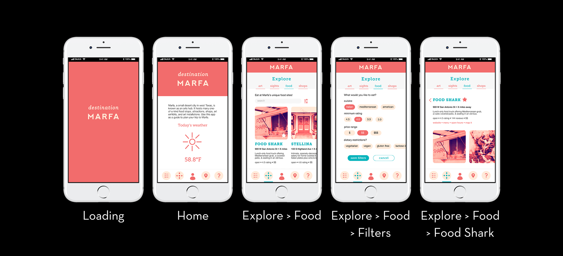
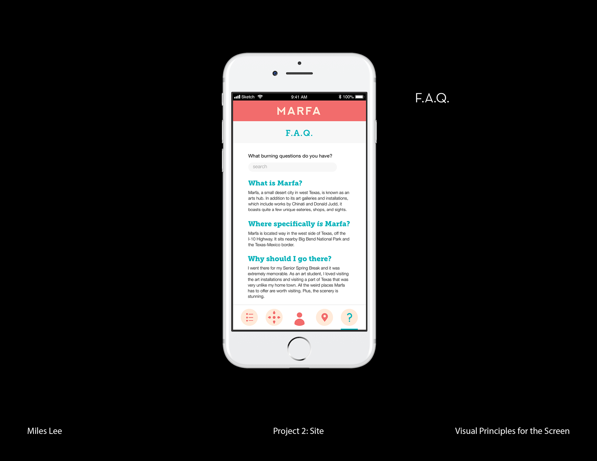
When prompted to create an app to serve as a guide to a selected site, I chose the desert art town of Marfa, Texas. Marfa is a small arts hub in West Texas, boasting site-specific installations by Donald Judd, the fake Prada Marfa storefront, and a vibrant arts community. I visited as a high school senior and was struck by the close-knit community and one-of-a-kind sites there.
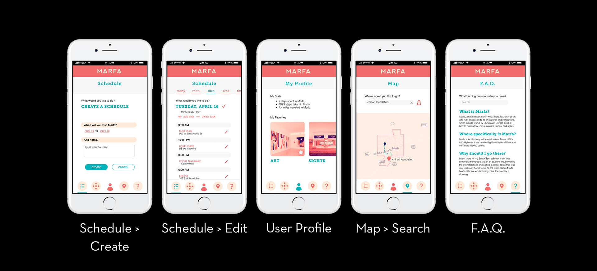
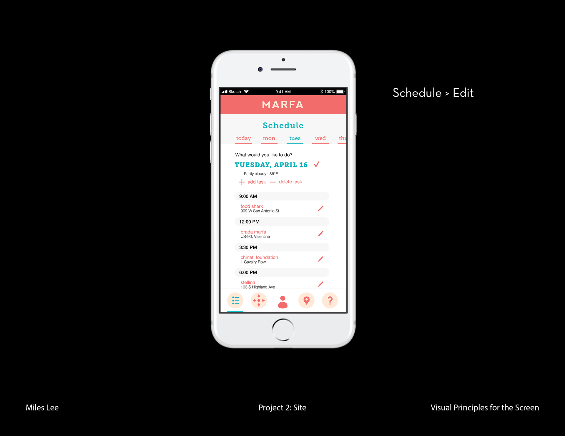
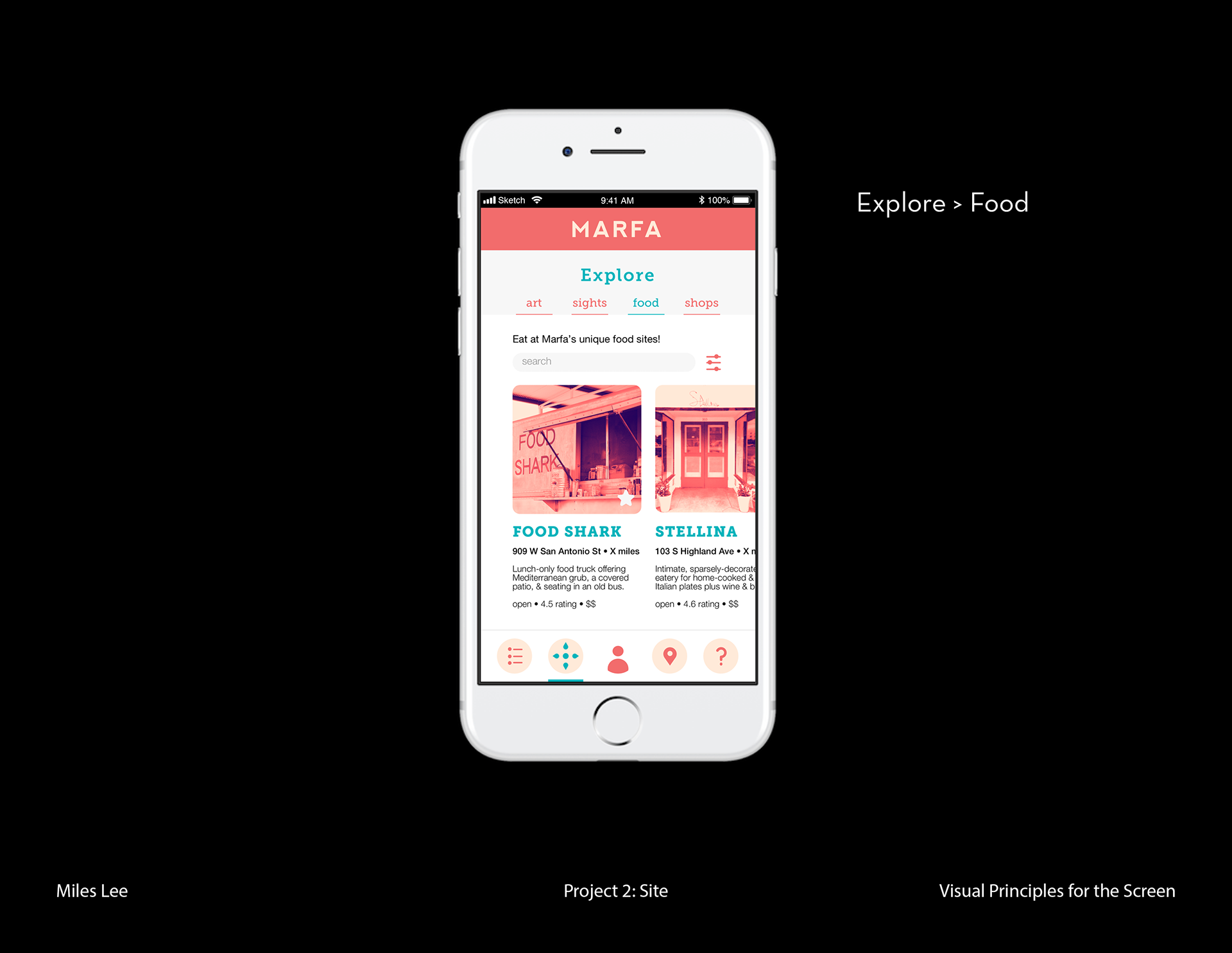
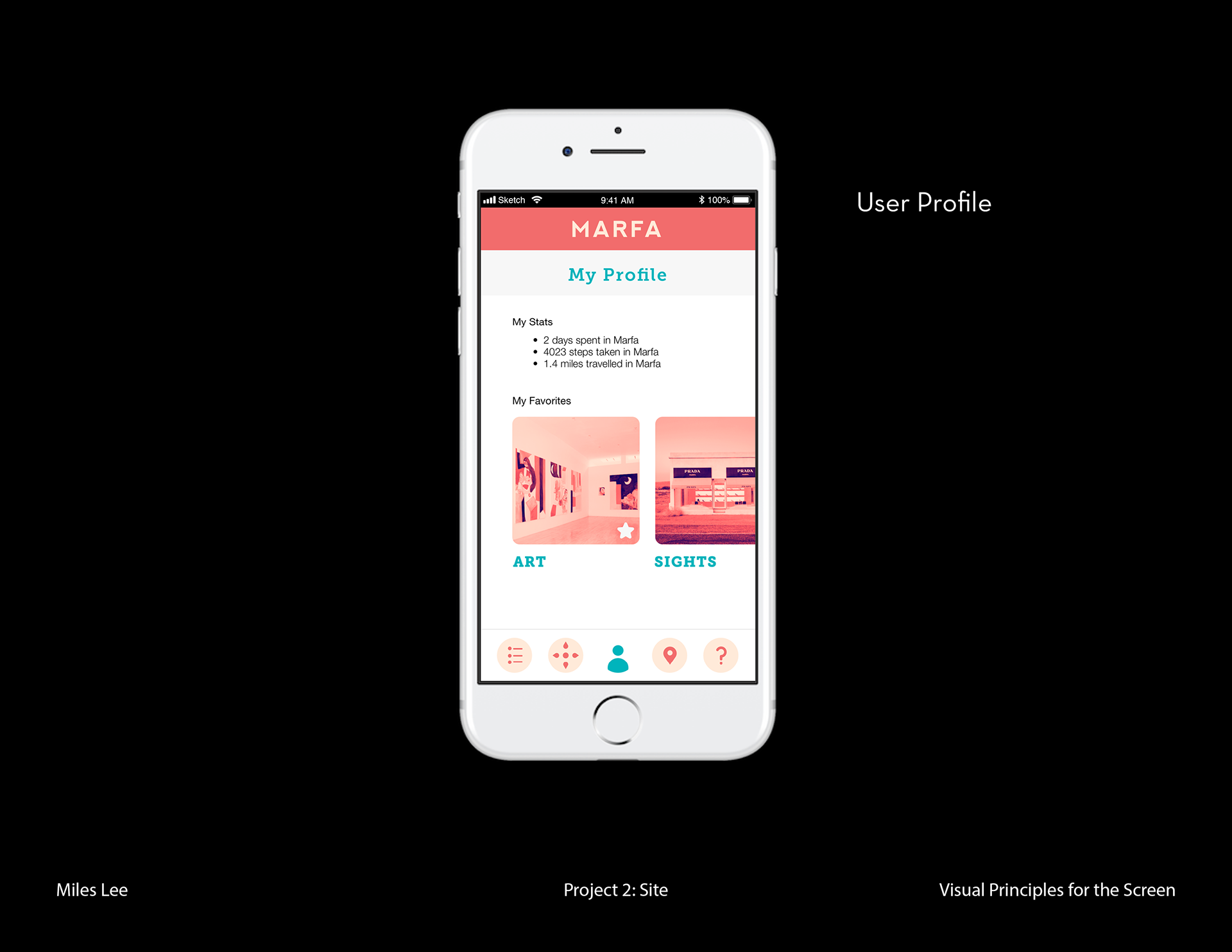
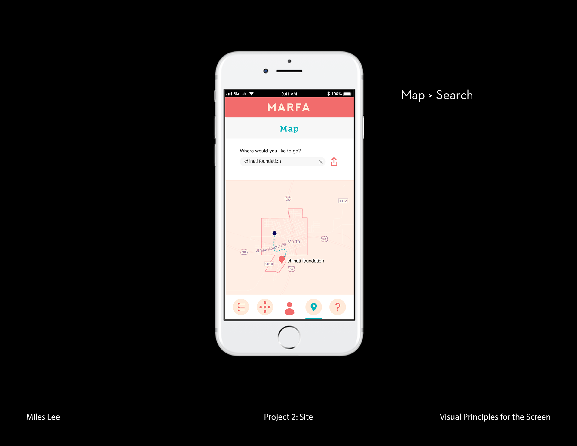
I wanted my app to function as a guide for people visiting Marfa for the first time. The user is able to create a schedule, explore options for art, sights, food, and shops, edit their user profile, use a map, and find more information about Marfa.
Mentorship provided by Rebecca Leffell-Koren.
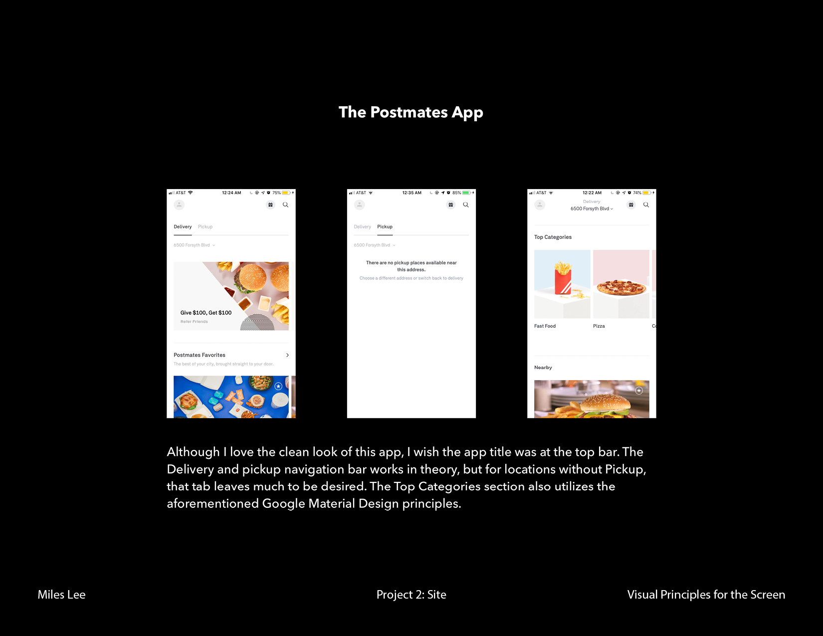
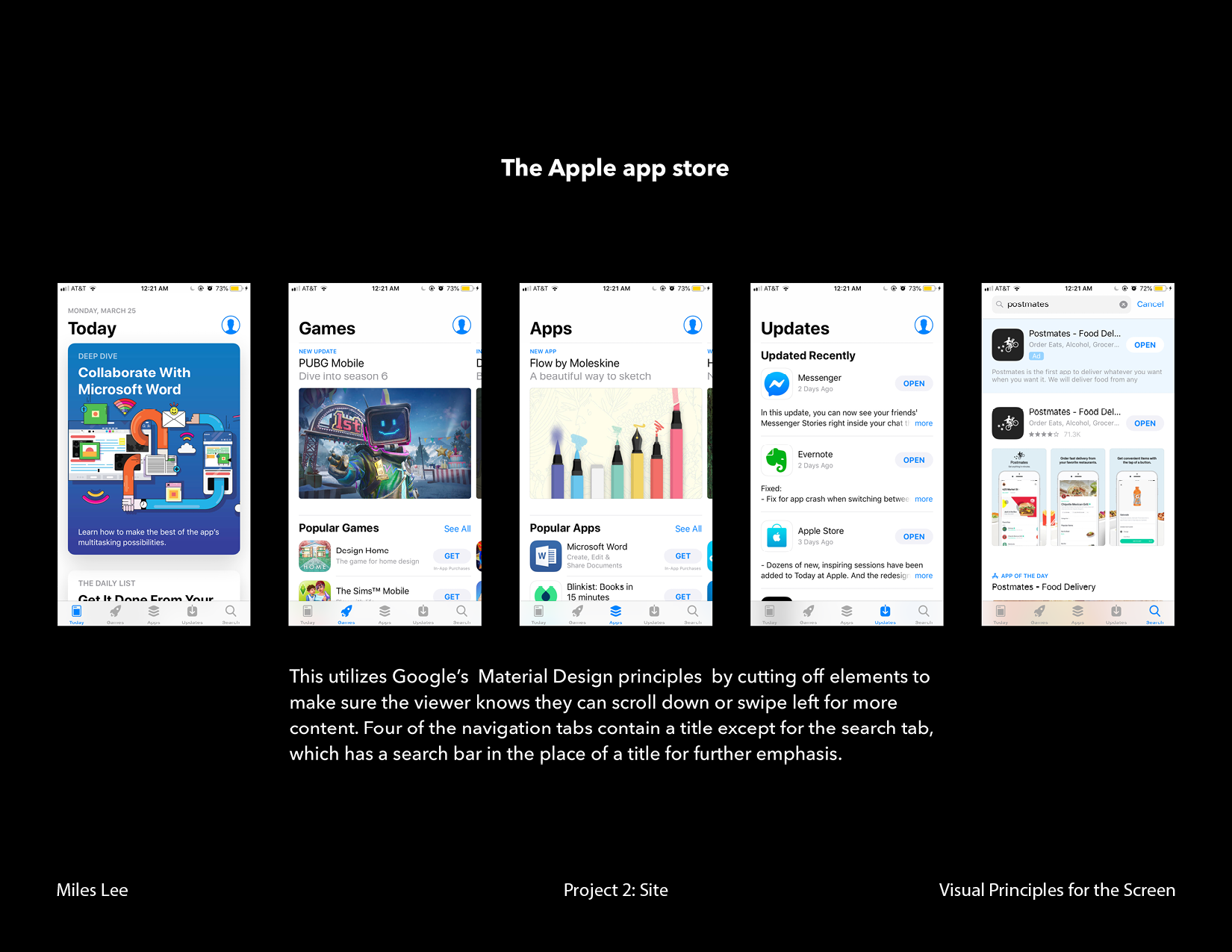
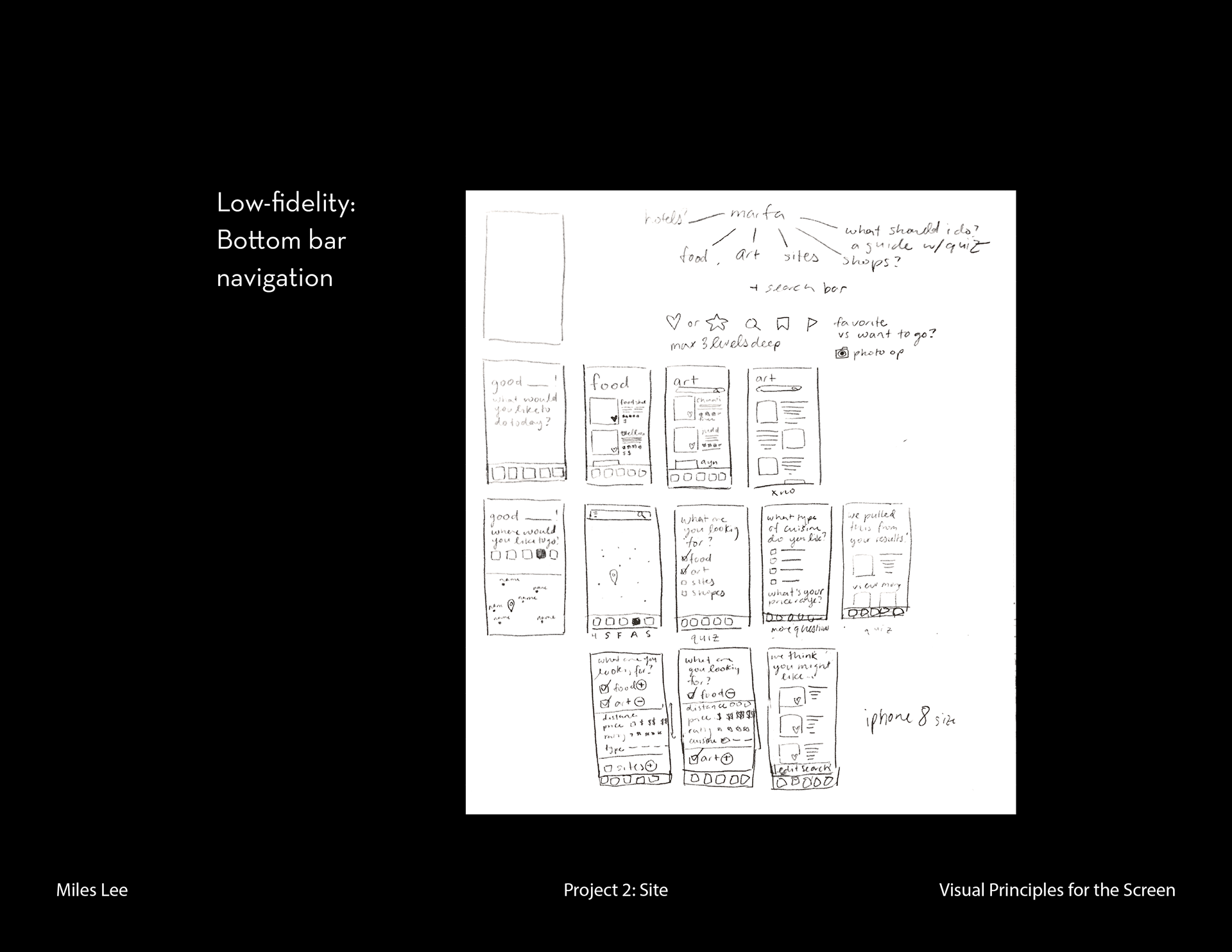
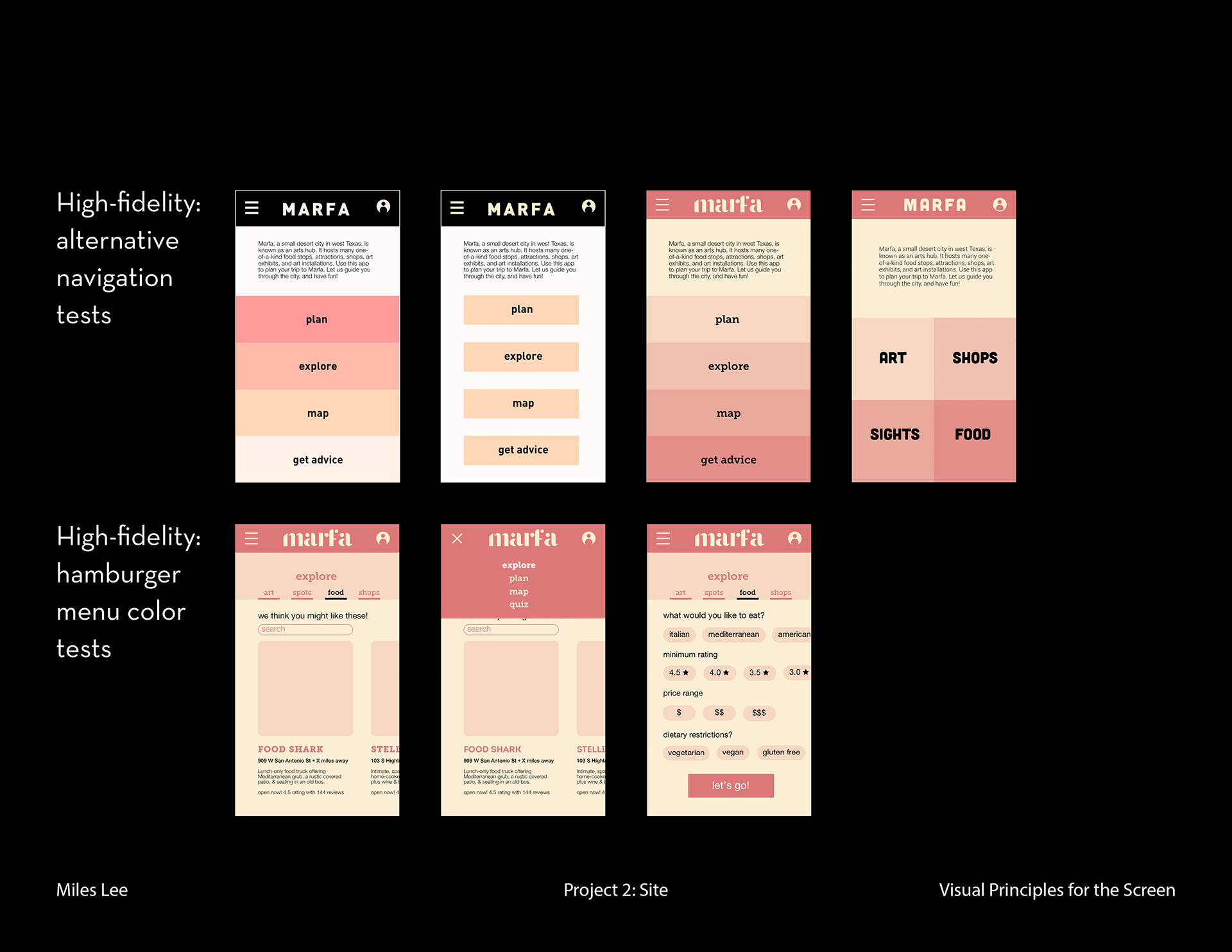
I compiled research by looking at the navigation systems of existing mobile apps I thought worked well and didn’t work well. I looked at apps with bottom navigation bars, side navigation bars, and top navigation bars.
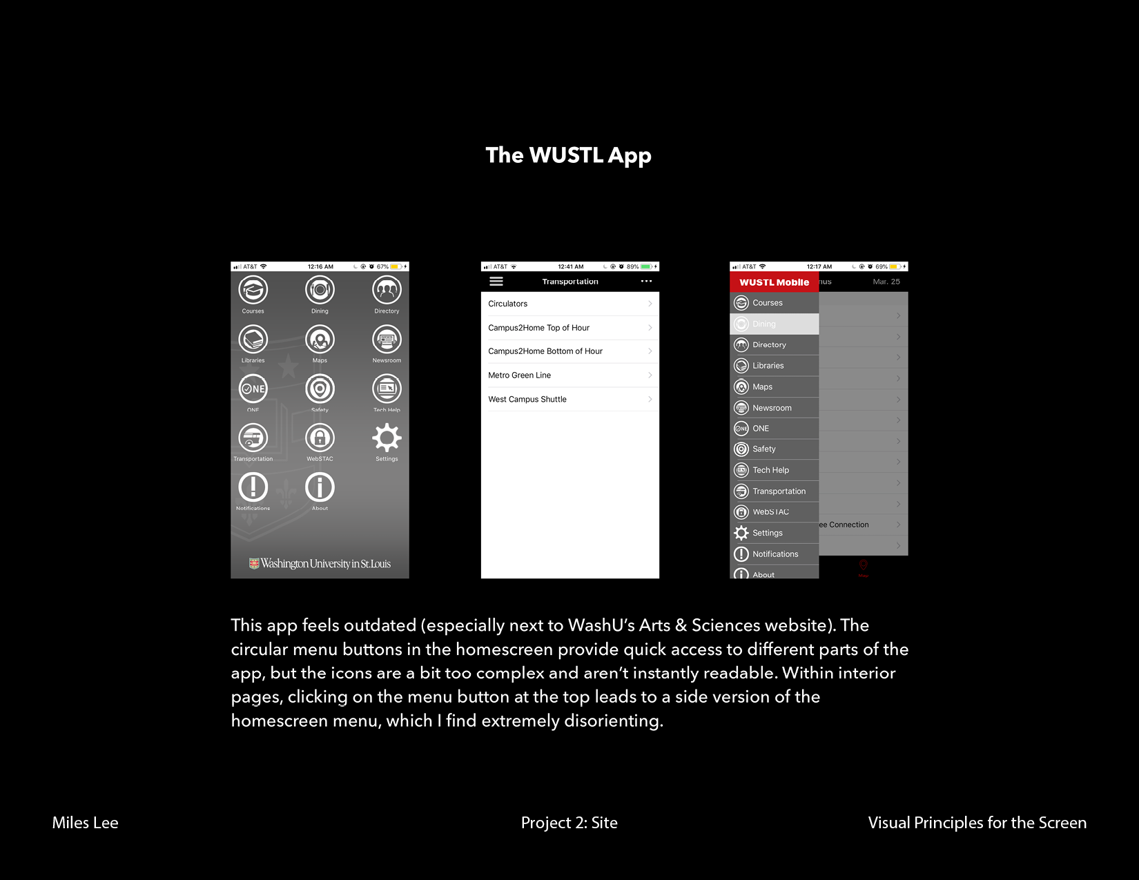
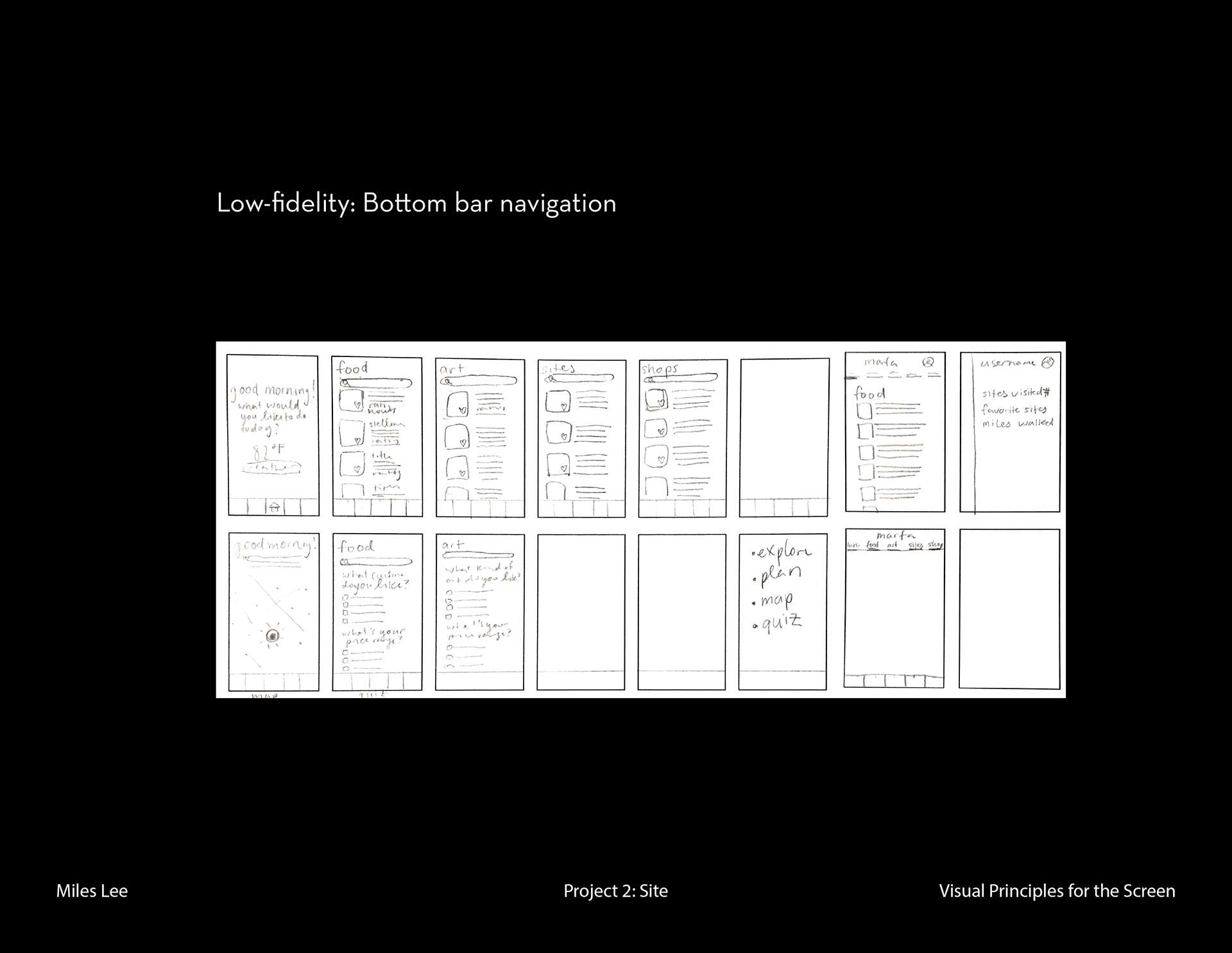
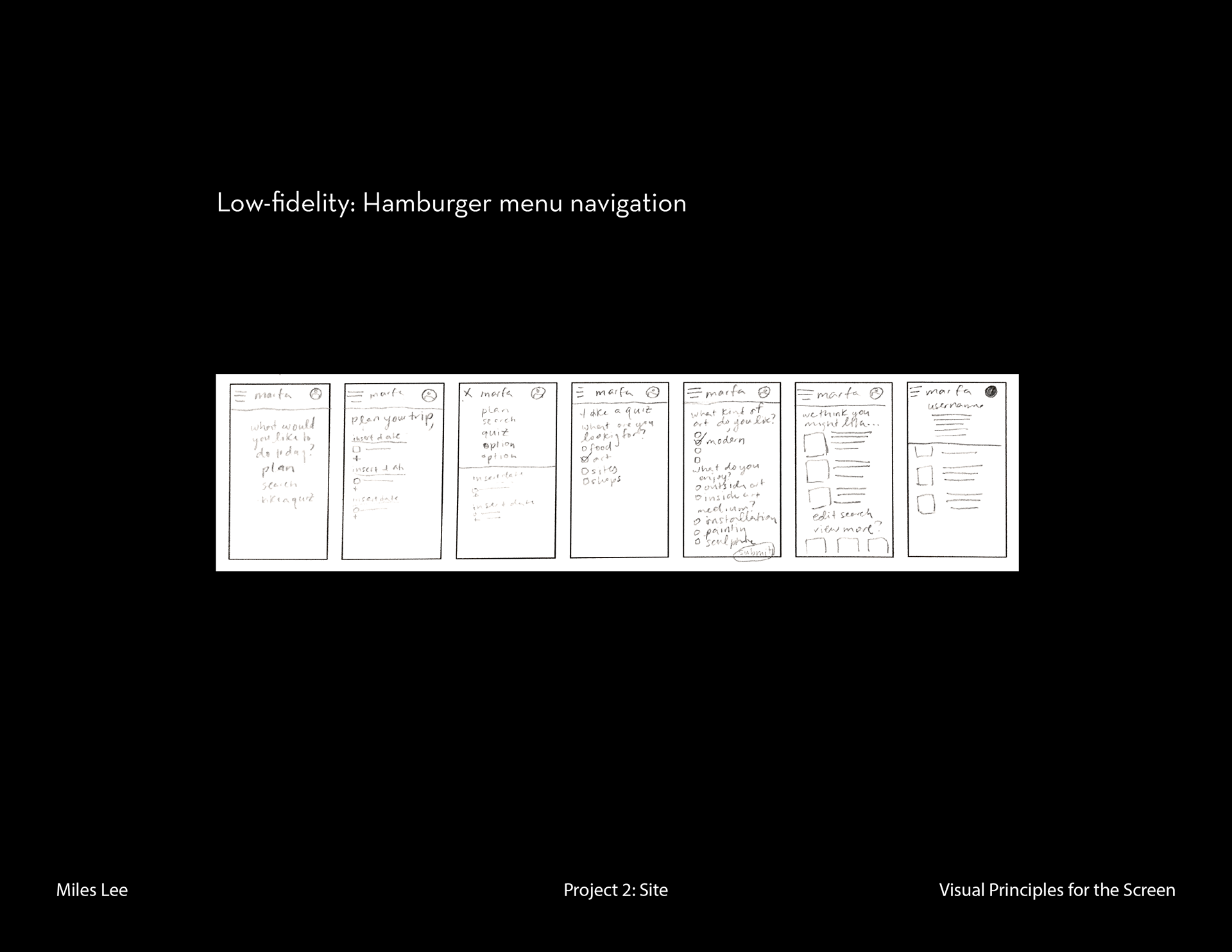
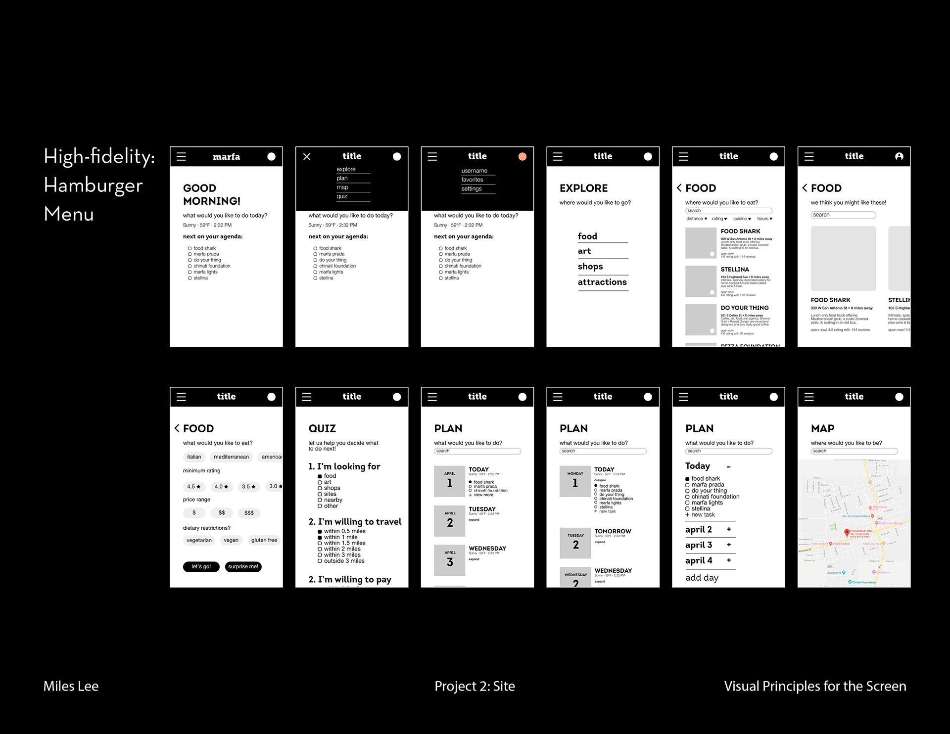
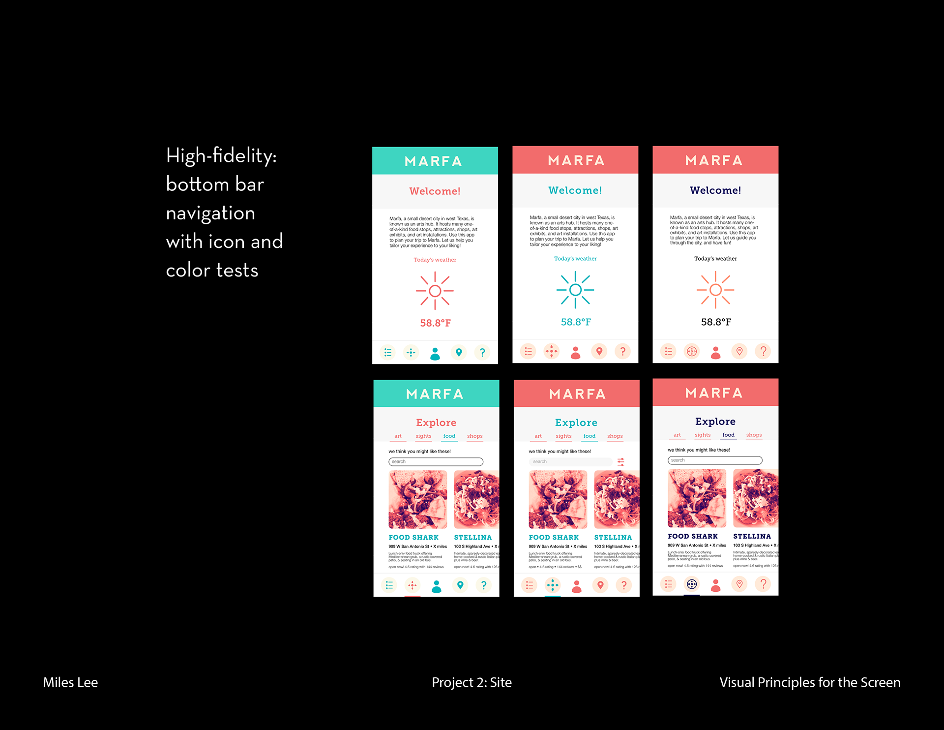
Looking at my research, I made thumbnails of my app using different kinds of navigation bars. I tried mostly a bottom navigation bar and a hamburger menu. Low-fidelity wireframing allowed me to visualize the layout of different app screens using each navigation option. After creating high-fidelity wireframes using different navigation types, I found that the hamburger menu became redundant. For the app’s home screen, I wanted my user to clearly see different entry points, but with the hamburger menu, the user would have access to the entry points in two different layouts (on the screen and in the hamburger menu). This felt too much like the WUSTL mobile app’s confusing navigation system. I decided to use a bottom bar navigation instead.
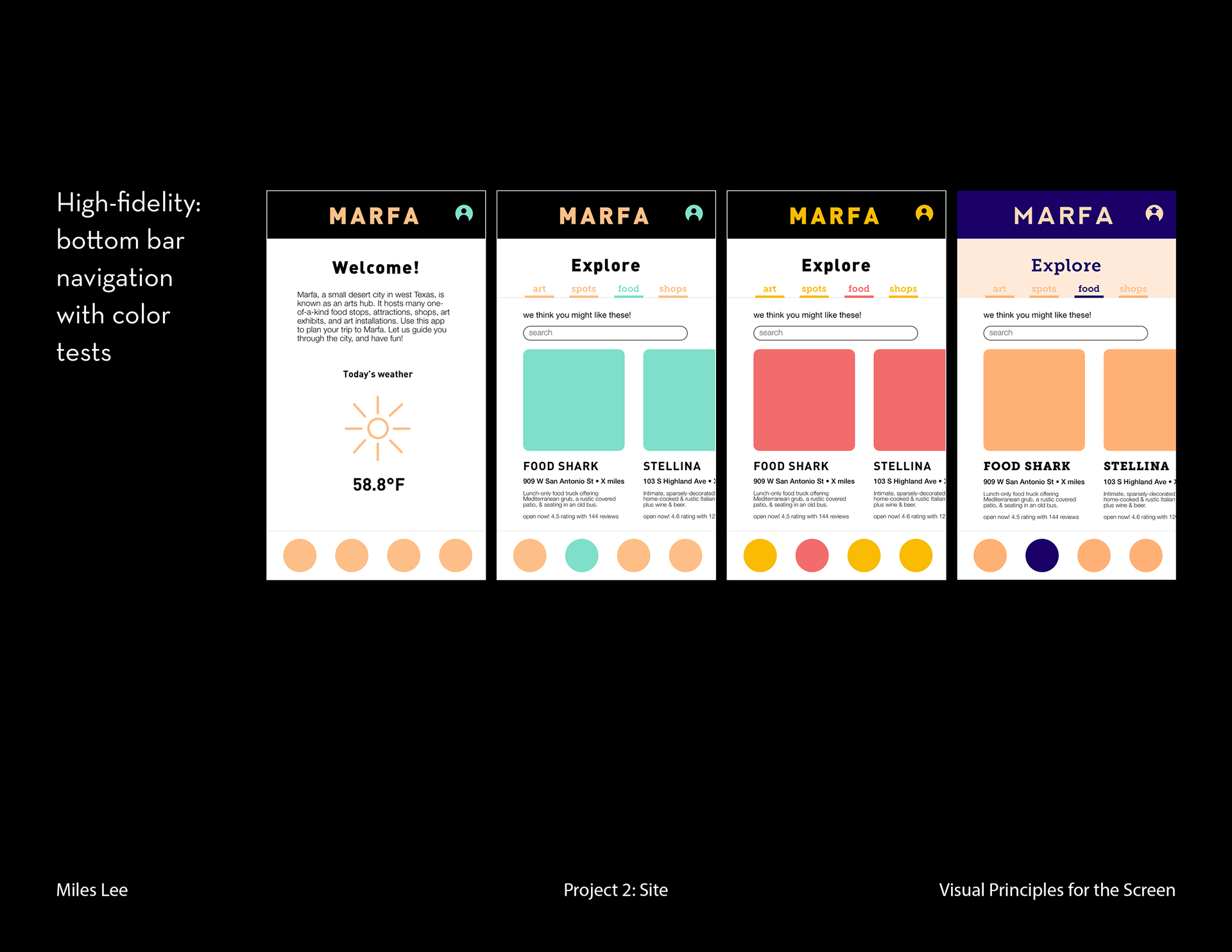
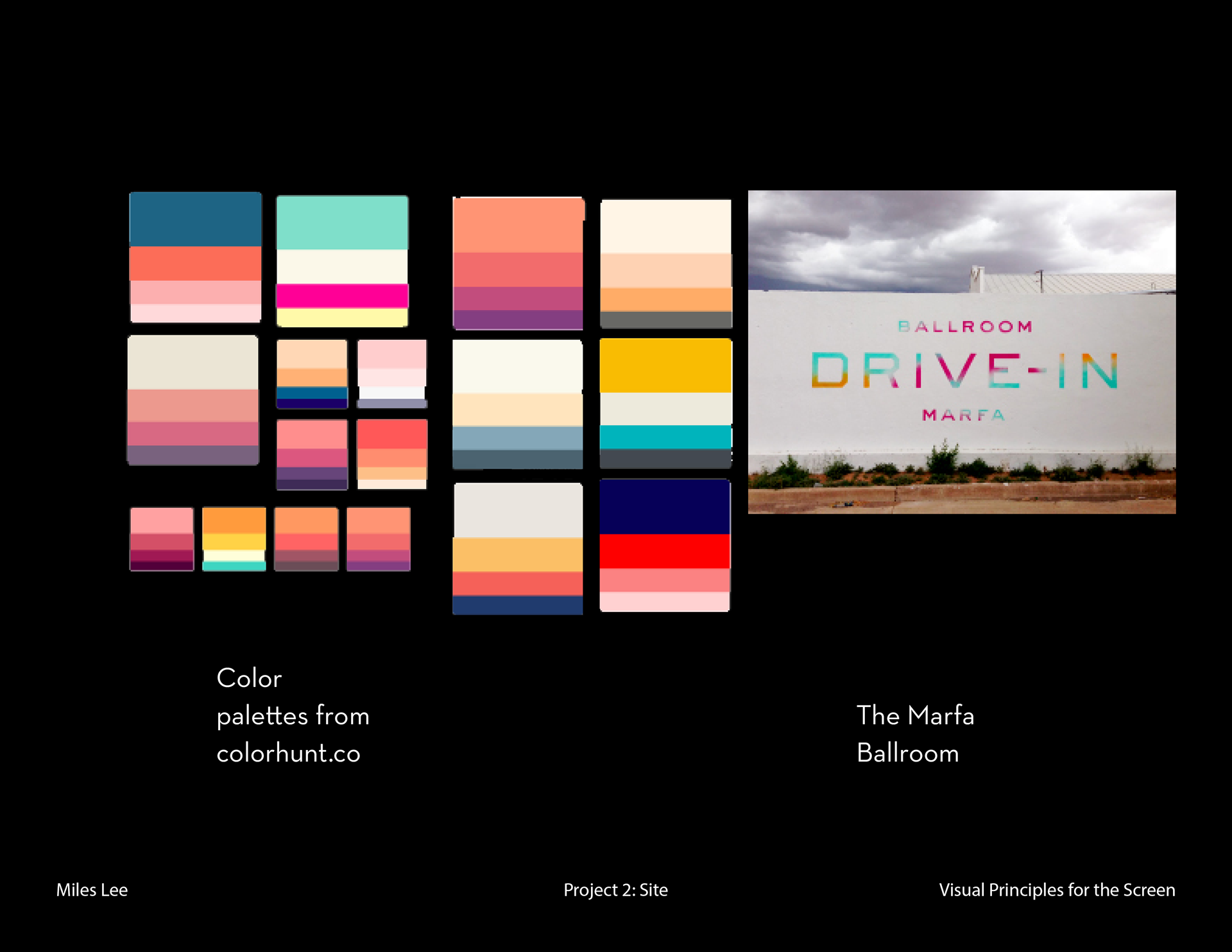
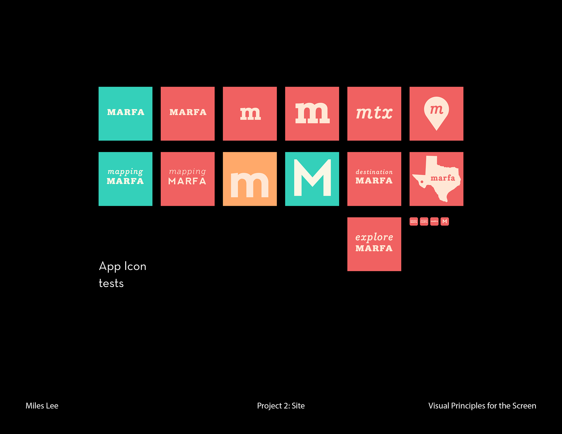
I wanted my app’s color scheme to represent the overall sense of Marfa I received when visiting. I struggled between portraying Marfa’s more modernist art side versus its Southwestern desert town side. I pulled many different color palettes from colorhunt.co for inspiration, and ended up with a color scheme more reminiscent of the latter.
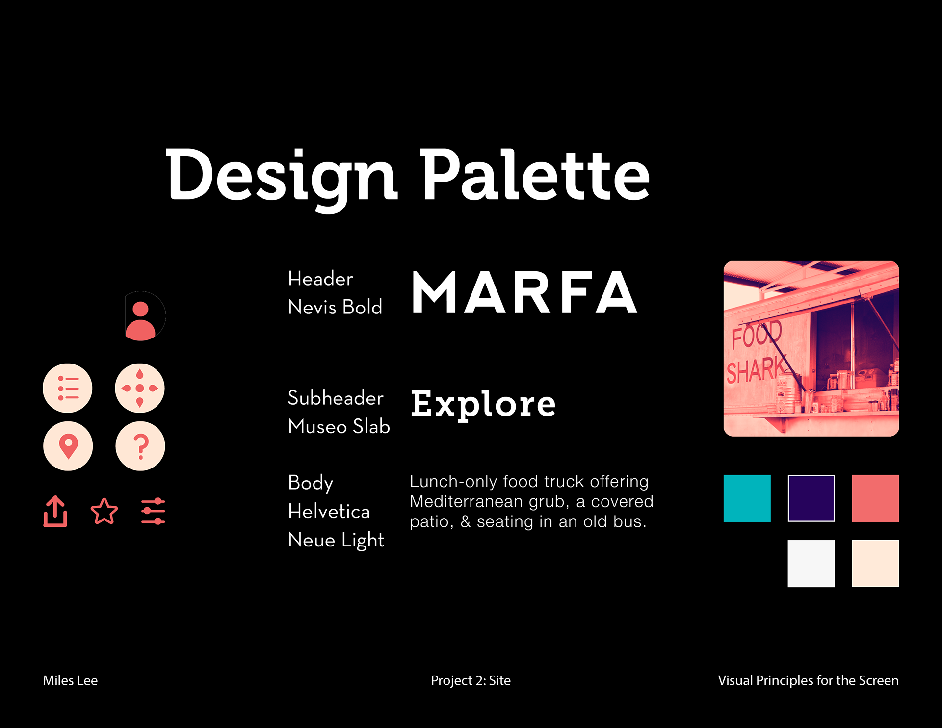

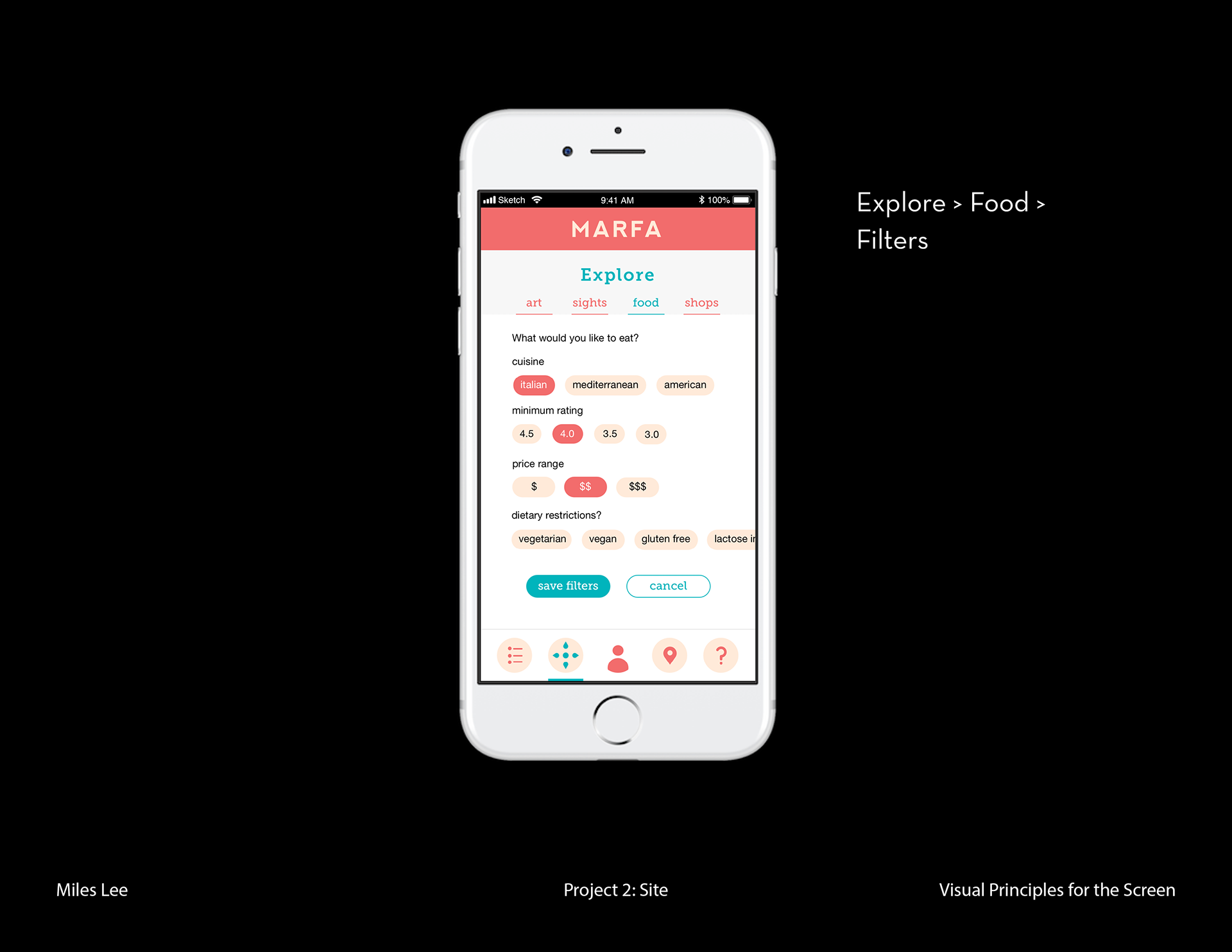
For the final prototypes of my app, I created 5 pages—a Schedule, Explore, User, Map, and FAQ page—each accessible through the bottom bar navigation.
This project allowed me to create a comprehensive mobile app design. I designed one mobile app design as a sophomore in high school, but hadn’t gone through such a thorough process like this to produce wireframes that really kept design principles and user experience in mind. I’m grateful that I was able to get a taste of designing for mobile screens with tools like Sketch and InVision (I used Photoshop for this in high school, yikes), and I hope to design many more.
If I were to continue to work on this project, I rework or further develop the user’s different points of entry. With this app, I spent most of my time developing the Explore page, but not nearly enough time developing the other pages, especially the Map and F.A.Q. pages. I also received feedback to make sure that the search bar is accessible in every screen. Many apps have a search page as a main entry point (for example, the Apple App Store has a search page at its bottom menu bar).