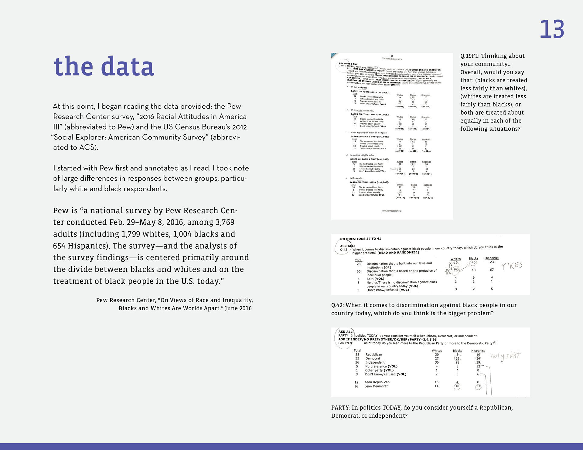
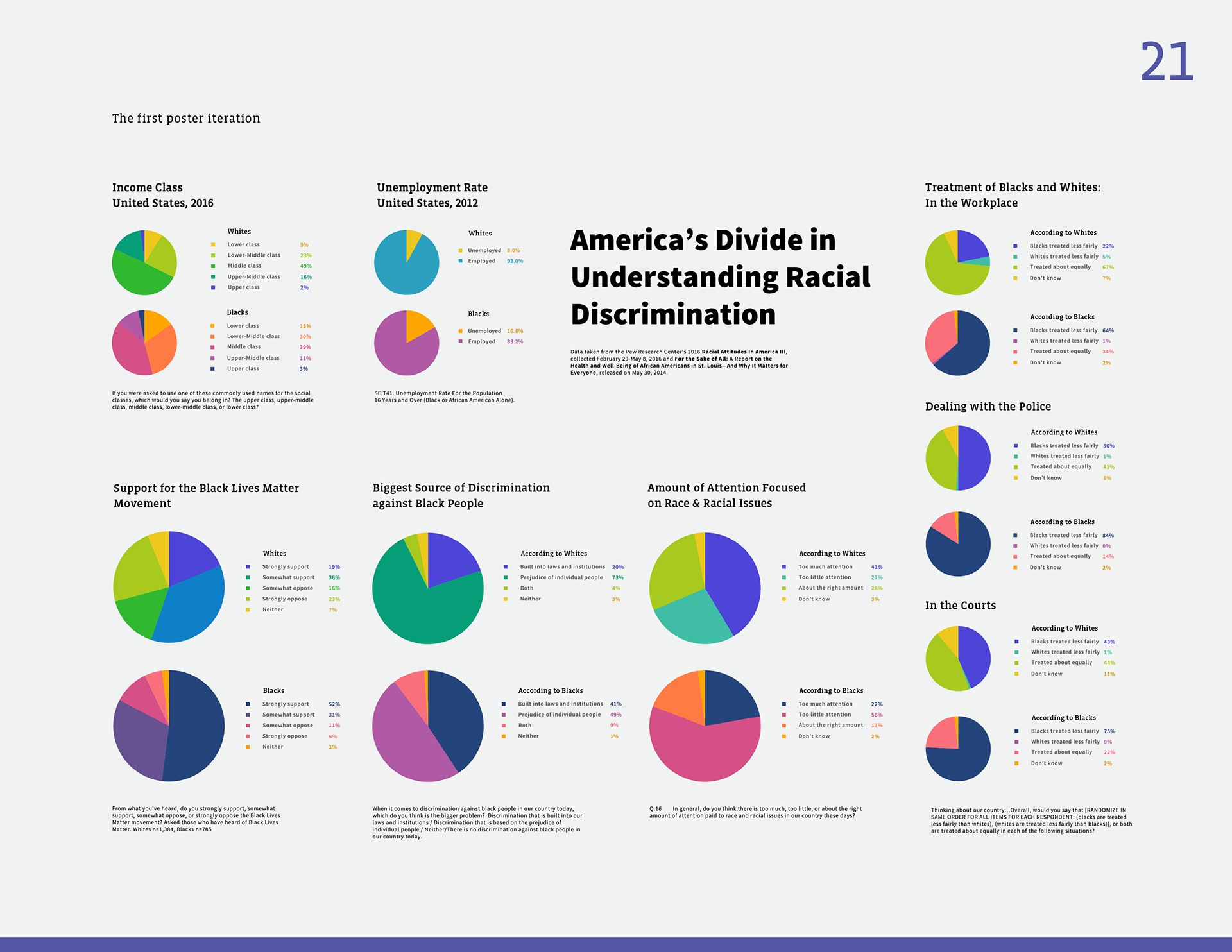
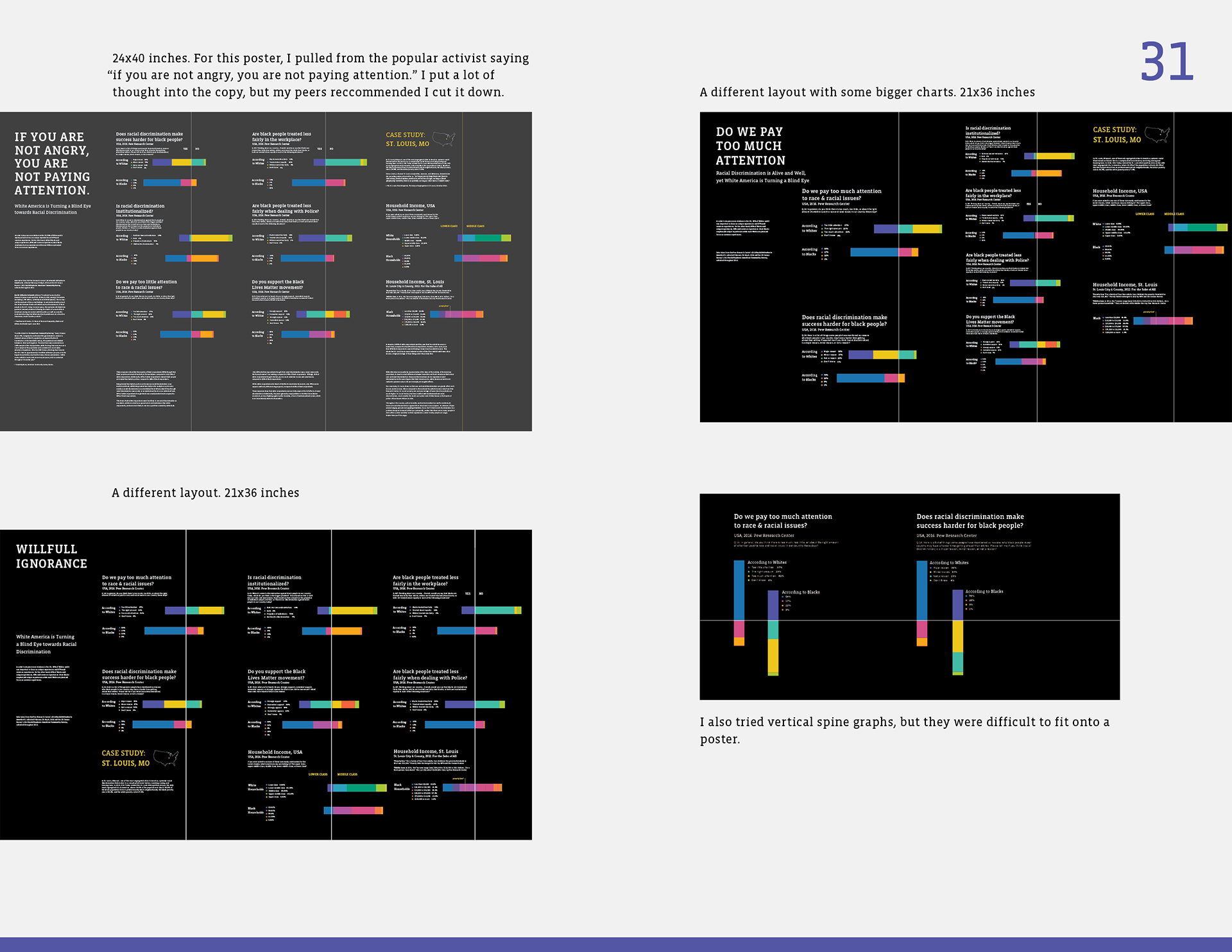
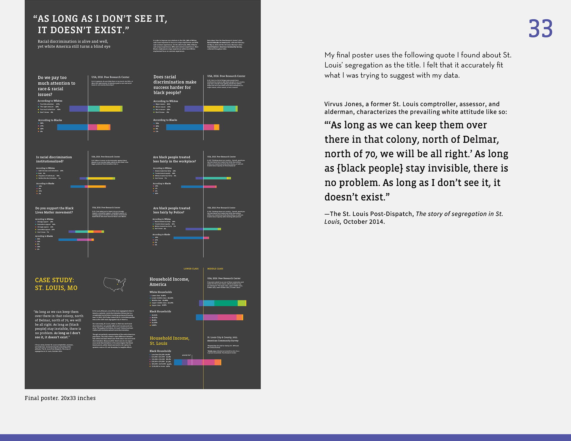
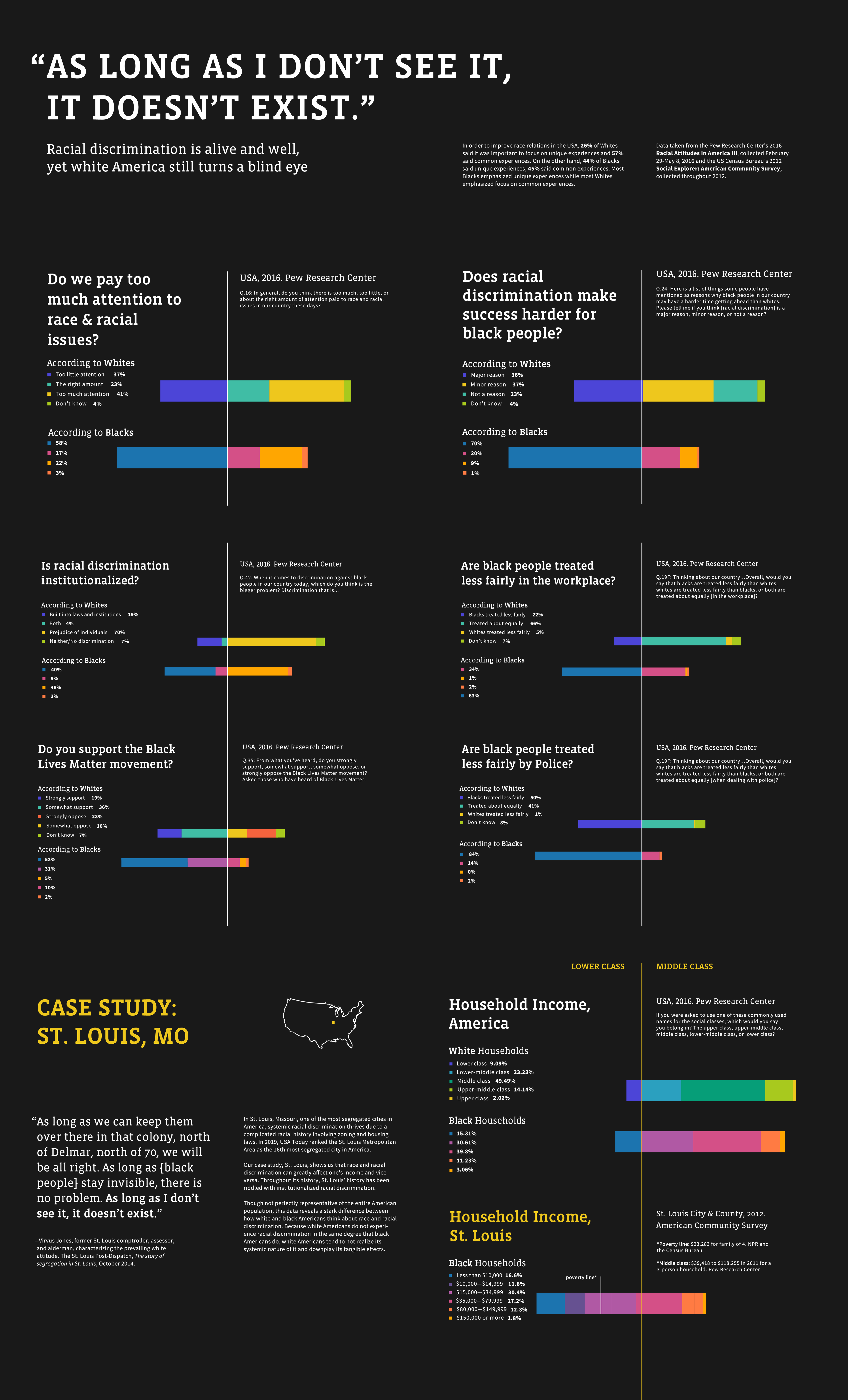
This is a Data Visualization poster I created using two sets of data: The Pew Research Center's 2016 Racial Attitudes in America III, and the US Census Bureau's 2012 Social Explorer: American Community Survey. I explored different ways to present this data such as pie charts and grid plots, but ultimately decided to use diverging stacked bars. When writing the content, I was careful to frame the data in the way I intended the user to interpret it.
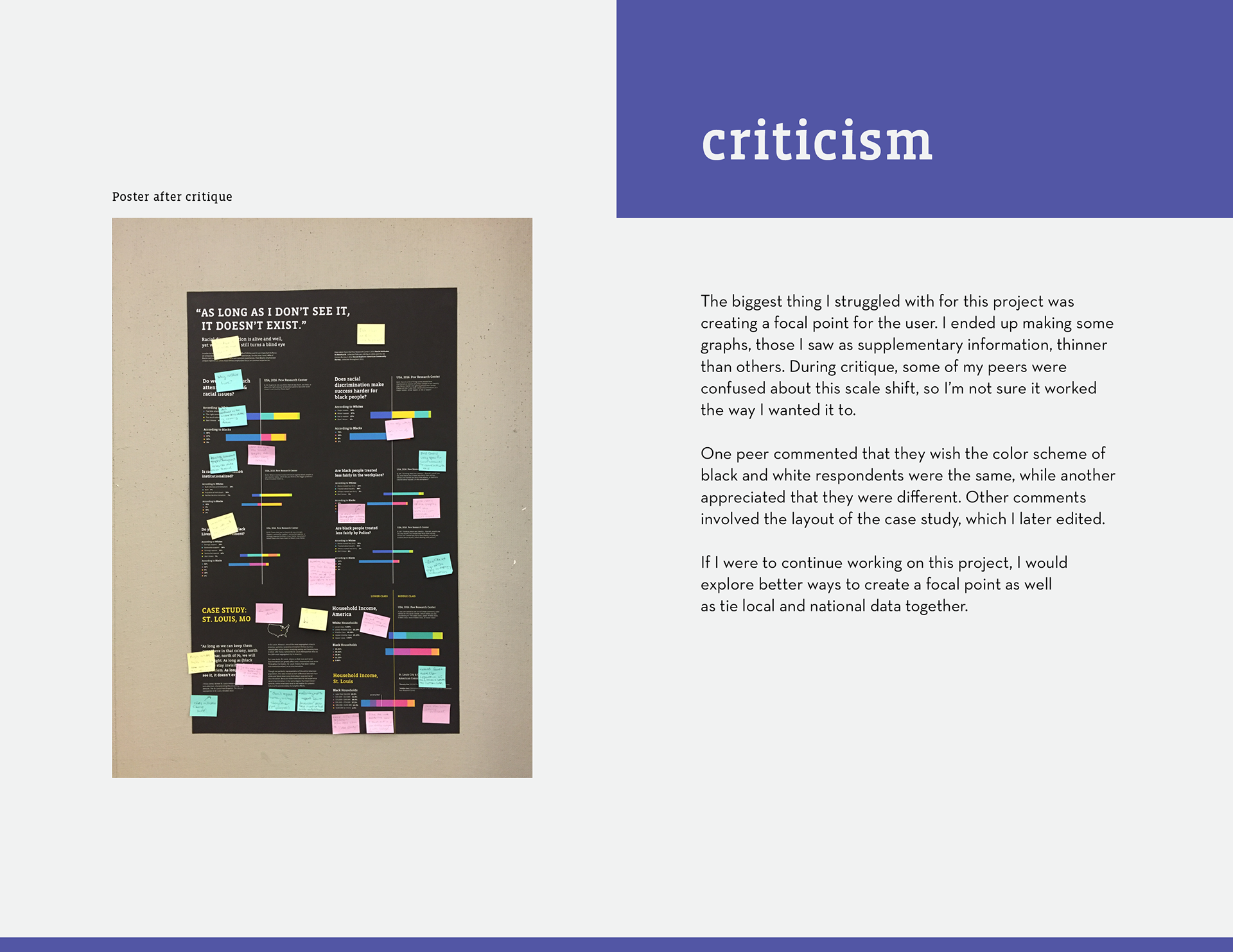
I received criticism that there are too many graphs on the poster for the viewer to know where to look, and I completely agree. One professor pointed out that I could simply use less graphs, which was definitely the solution to a lot of my problems; I just hadn’t fully realized it.
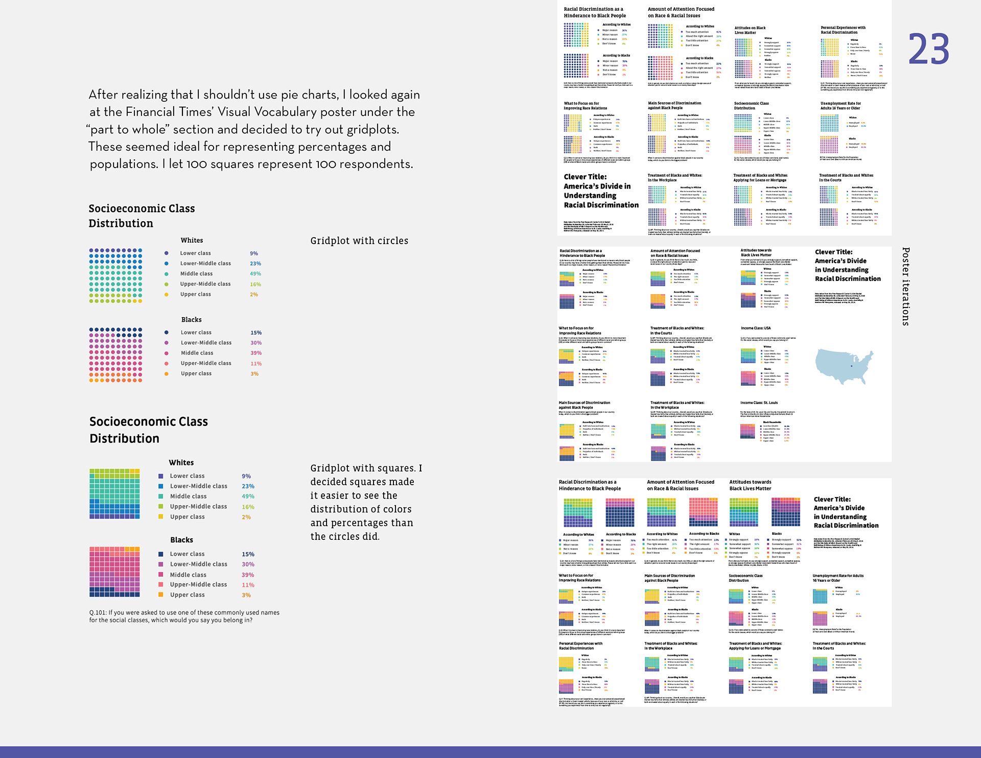
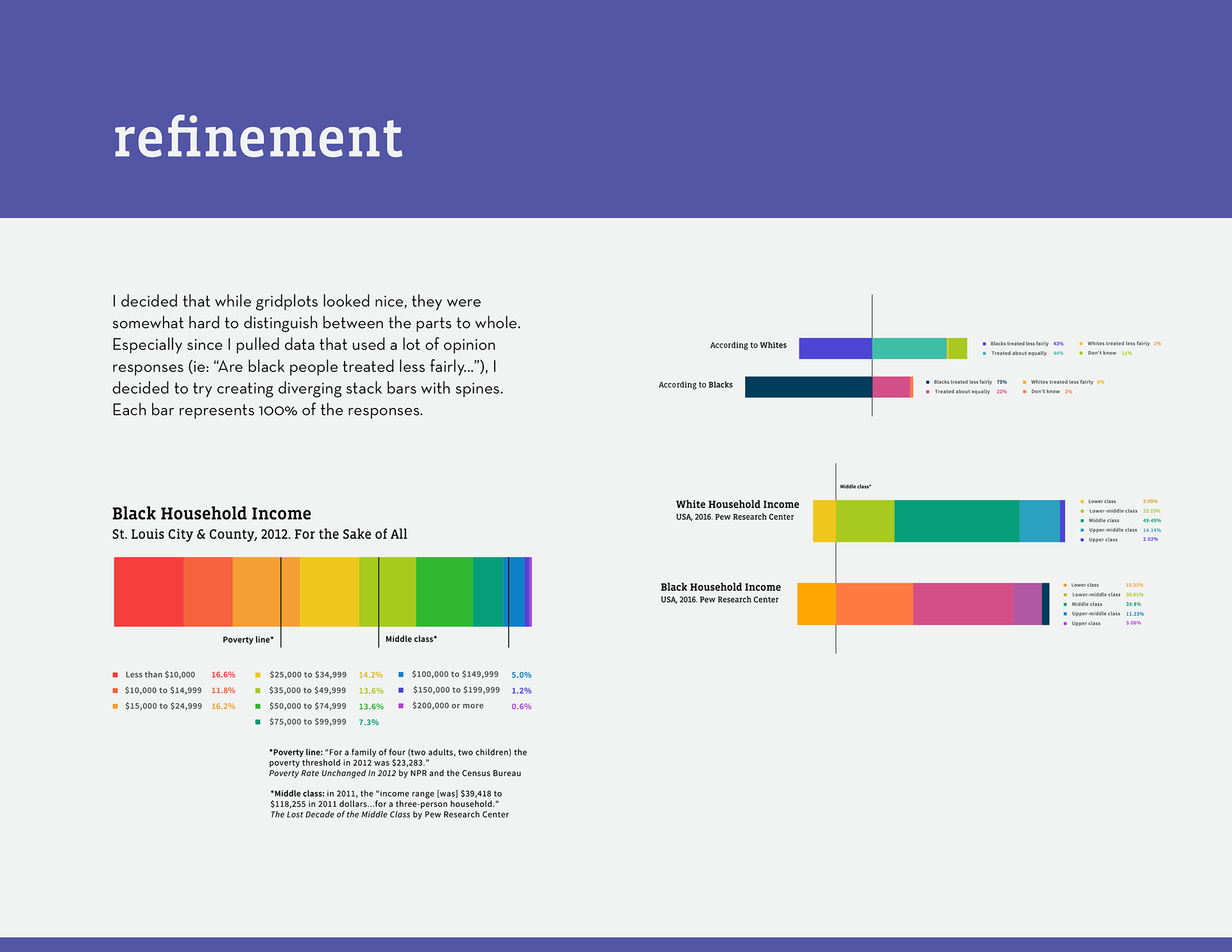
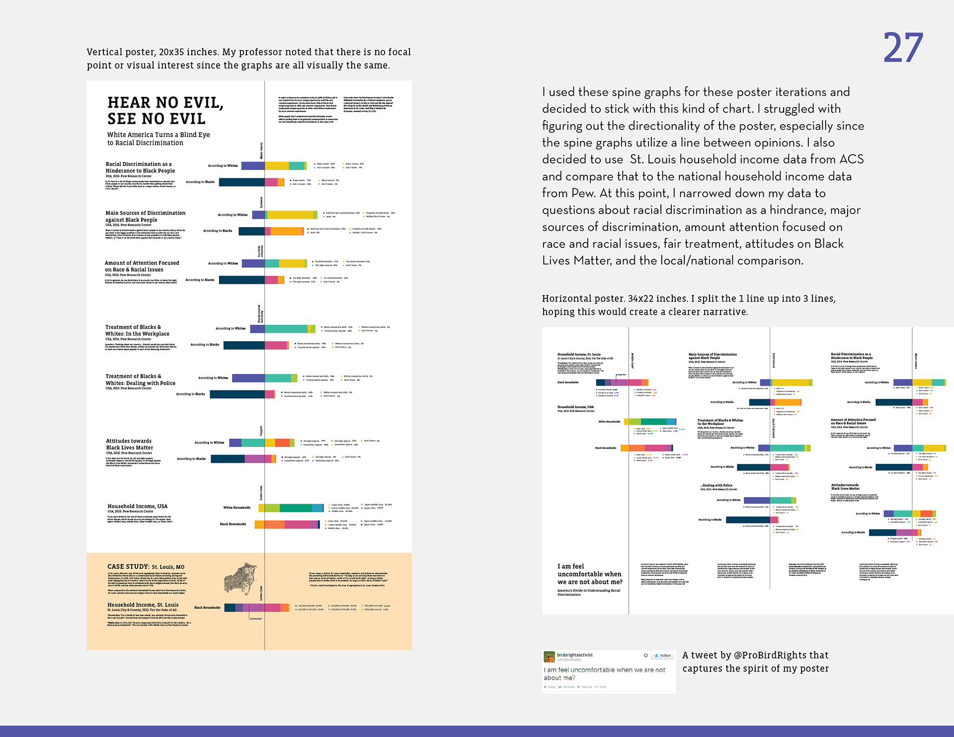
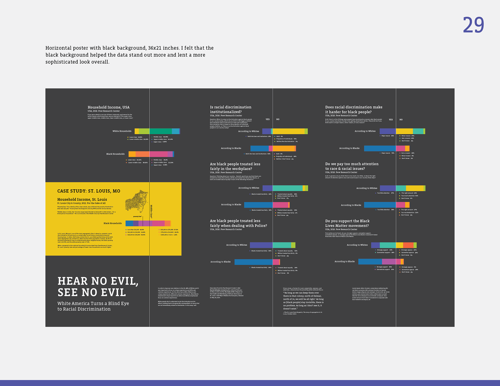
Here are spreads of my process book, in which I discuss my process in depth, from research to refinement. If you'd like to view the whole book on issuu, click the button below.