Project Brief
Challenge: The Sam Fox School of Art and Design at WashU boasts seven robust shops where students and faculty can work with wood, metal, ceramics, and more. Sam Fox shop administrators (techs and monitors) currently use analog sign-in sheets for shop users (students and teachers) and clunky Google docs for work shifts.
Solution: A mobile app that provides a centralized source of information through which shop administrators and shop users alike can keep track of space reservations.
Summary: I interviewed shop users and shop techs to understand the problem area and researched solutions to ease their pain points. After user testing and wireframing, I created a Figma prototype using components from Google's Material Design.
Timeline: November to December 2020
Context
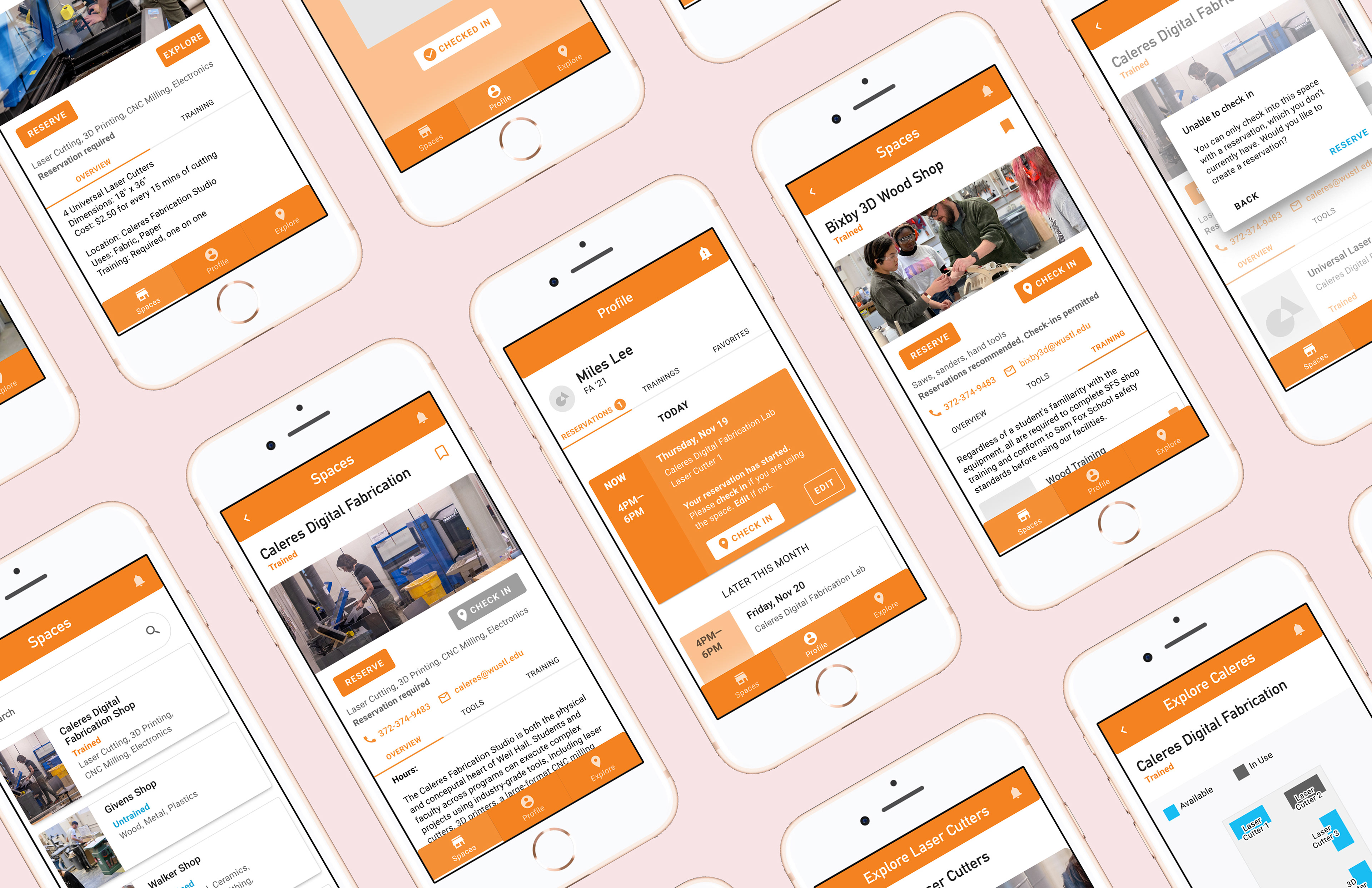
The Sam Fox School of Art and Design at WashU boasts seven robust shops where students and faculty can work with wood, metal, ceramics, printmaking, and other materials. Sam Fox Spaces is a mobile app I prototyped for Sam Fox students and administration to keep track of space reservations. Please note that the prototype is not fully built out and may contain glitches and abrupt segues.
Sam Fox shop administrators (shop techs and monitors) currently use analog sign-in sheets for shop users (students and teachers) and clunky Google docs for work shifts. In Fall 2020, prompted by COVID-19 restrictions, shop administrators were told to use the larger WashU reservation system reserveaspace. Reserveaspace, which I’ve used before as an exec member of student groups, sucks. Its UI/UX, specifically its (lack of) state changes and flow of information, is overly confusing. Not many students actually use reserveaspace, and at least one shop relies on Outlook calendar instead.
There’s a need for a centralized source of information where shop users can make reservations and shop administrators can keep track of them.
Led by Jonathan Hanahan, our class was fortunate to receive mentorship from several UX designers, researchers, and software engineers from Google. I learned a lot about user research and testing from them and deeply appreciate their time throughout the whole process.
Felix Wang was kind enough to introduce our class to Google’s Material. While I’d encountered Material in sophomore year in another class, I hadn’t actually used it to prototype or wireframe an app. I found using Google’s Material much more streamlined in terms of having pre-built components. Creating recognizable iconography (for features like navigation) takes iterating, time, and user testing. But Material has a wide range of iconography that’s been vetted. With UI, it’s important to consider (or rely on?) user expectations for how features will look and work. Material took a lot of that stress off my shoulders—I was able to take elements such as nav bars, dropdowns, and lists that users are already familiar with to hopefully lower the learning curve.
I do think it’s paramount to understand what action an element is meant for before using it, however. Early in the process, two of my peers (independently of each other) used a list view meant for dragging or re-ordering elements (think re-ordering songs on your Spotify playlist) for dropdowns or static views. They had unintentionally built up user expectation for those elements to be interactive. The biggest challenge I faced with Material was cobbling these elements cohesively together, in Figma (let’s just say that if I wasn’t previously familiar with Figma, I am now).
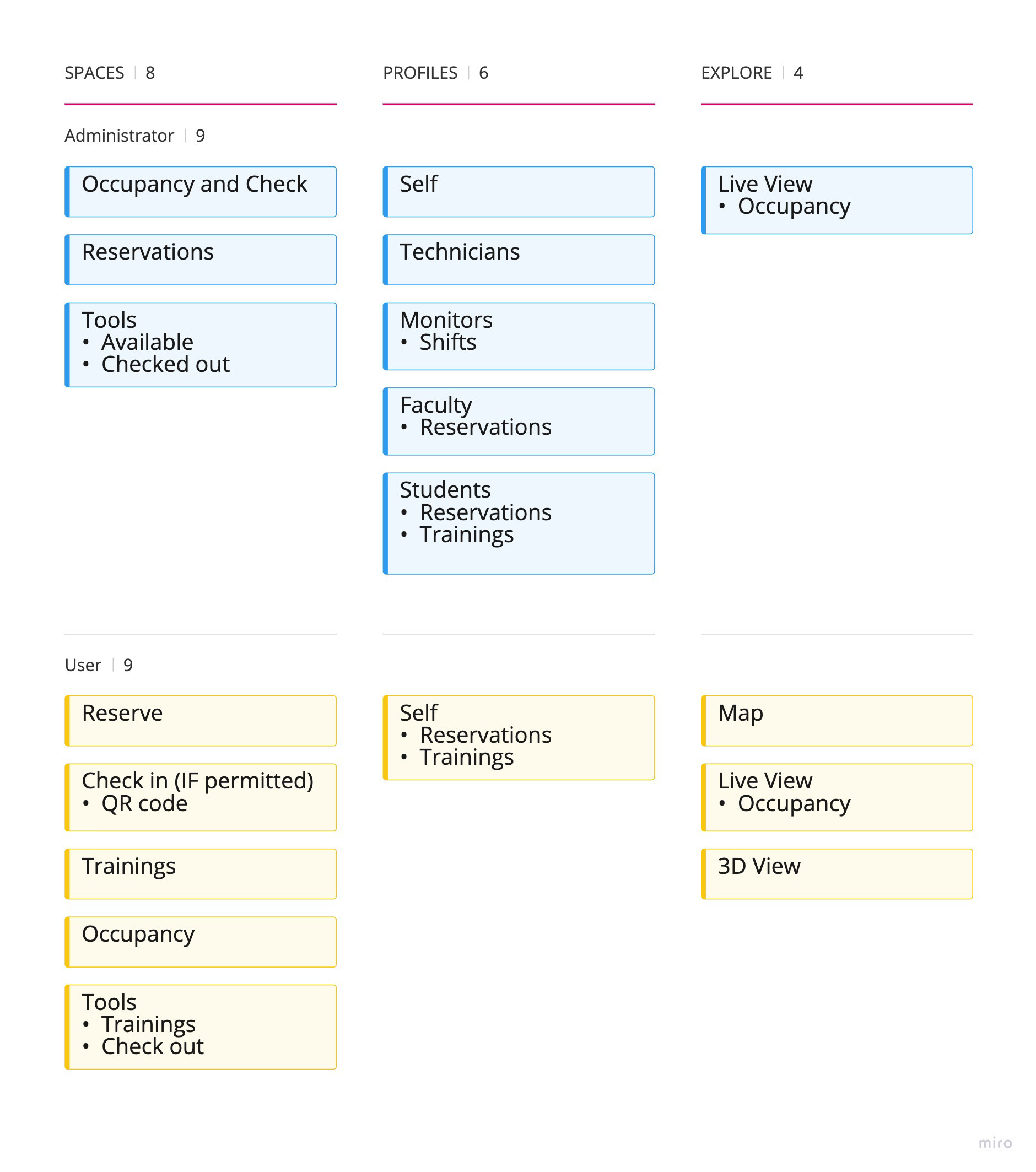
Information Map divided into users (vertically) and pages (horizontally)
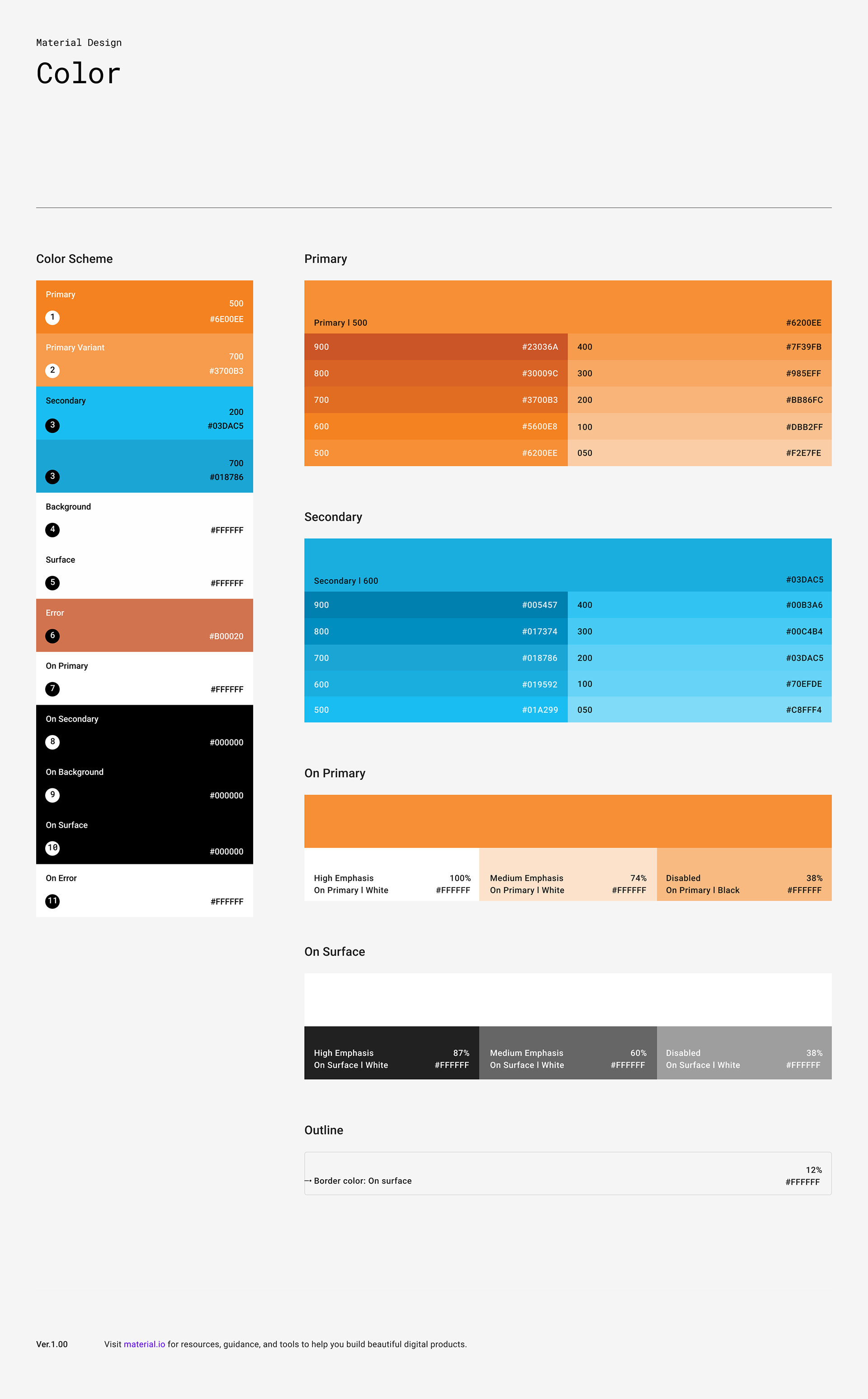
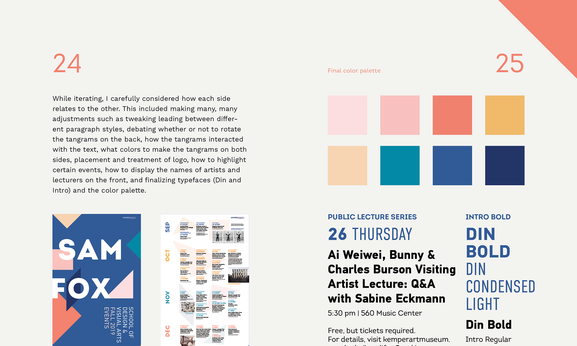
Google Material color sheet using Sam Fox School branding guideline colors
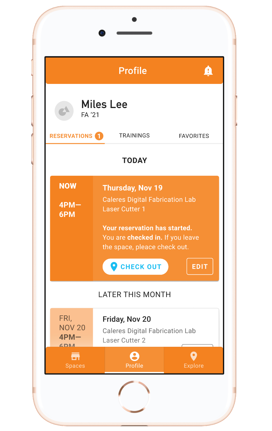
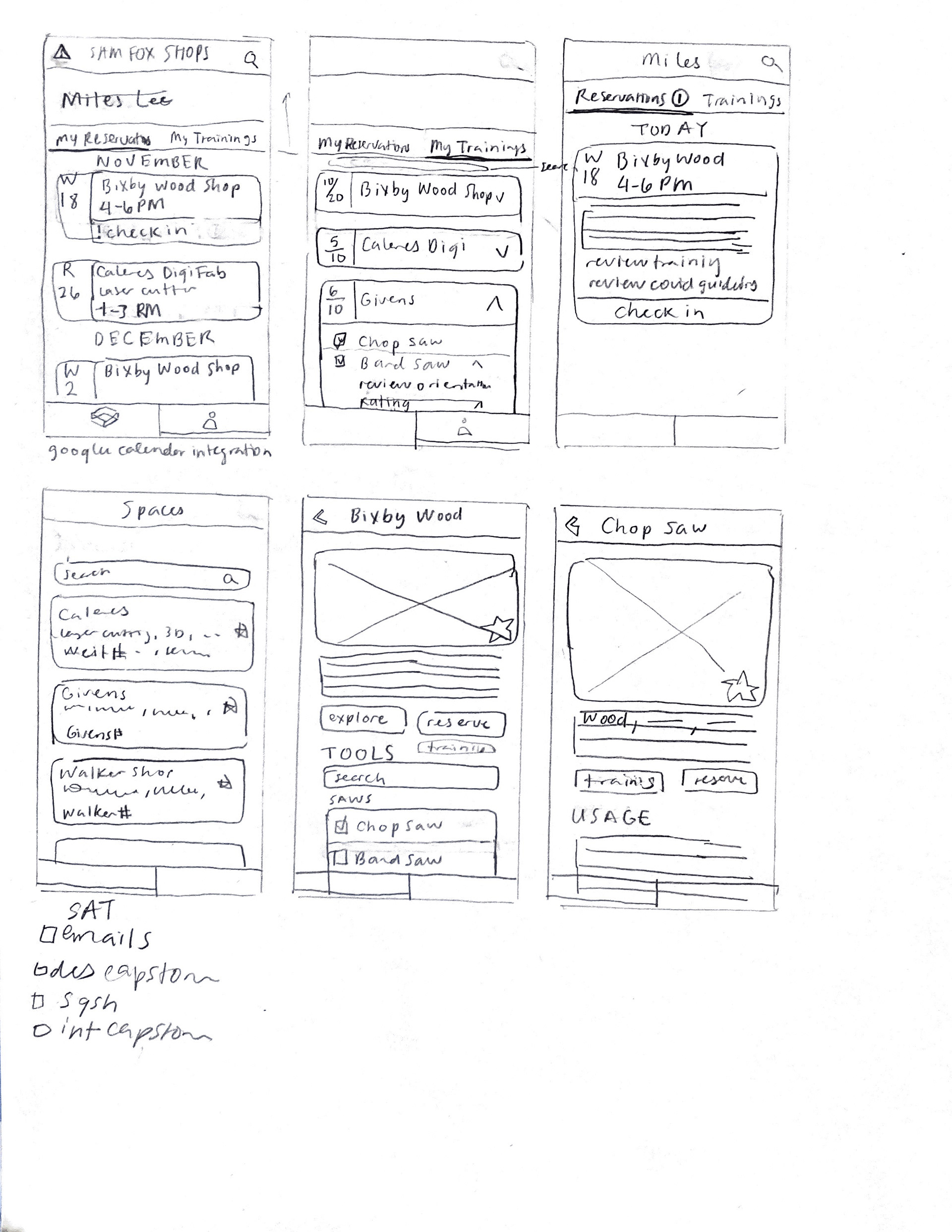
The app is meant to serve two primary users: shop administrators (technicians and monitors who need to: manage access, inventory, training and safety in shops, confirm users has completed safety training, and view availability of shop spaces and tools in real time) and shop users (students and faculty who need to: see which types of tools are in which spaces, access training to use equipment, view real time availability, schedule reserve tool/space).
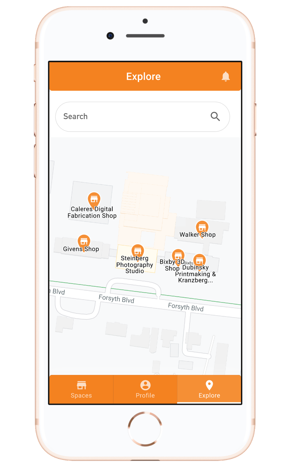
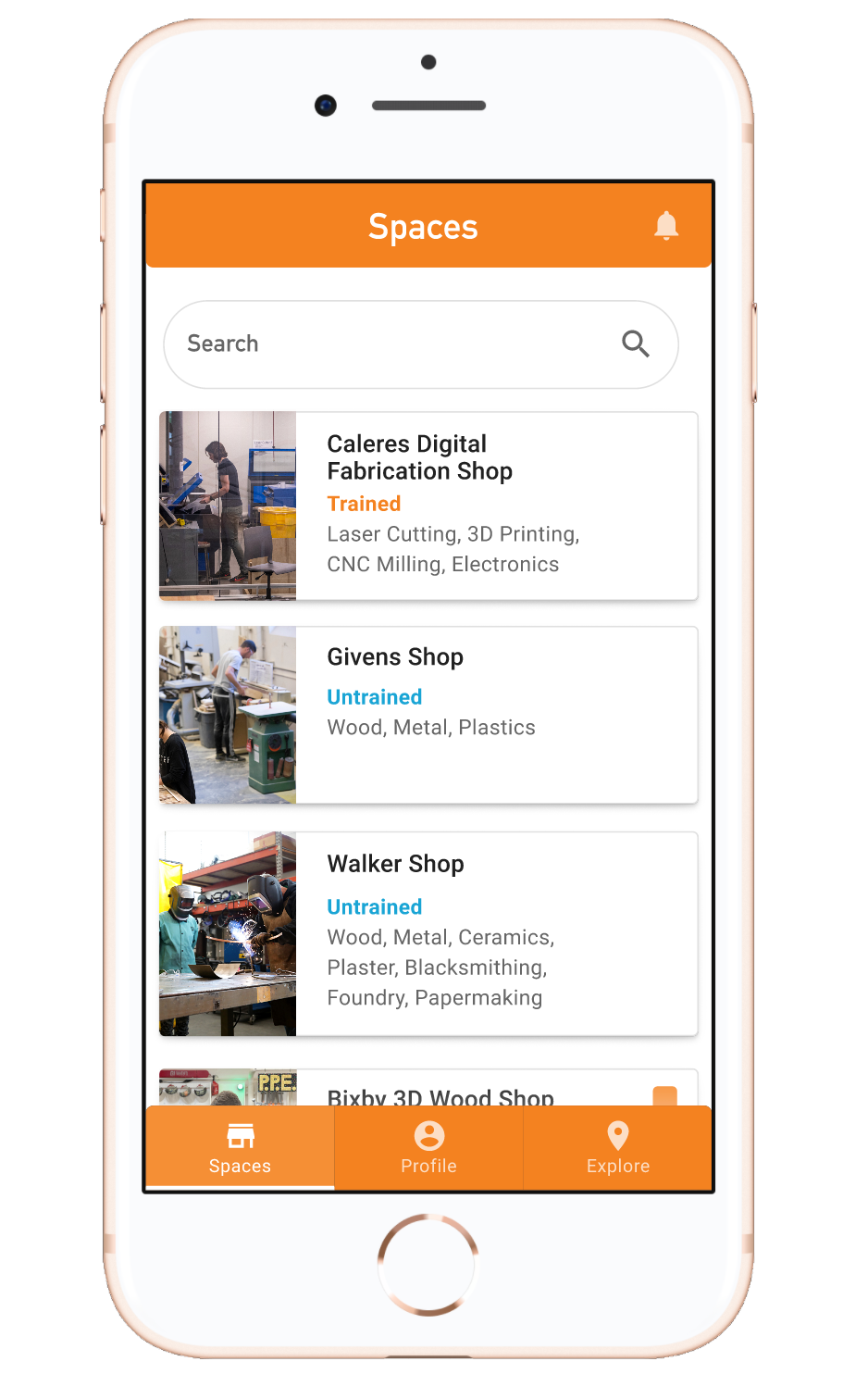
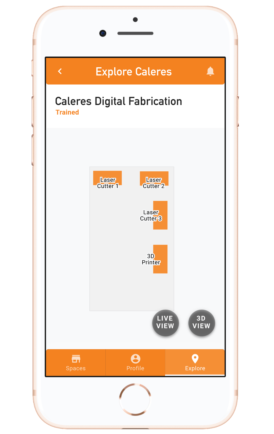
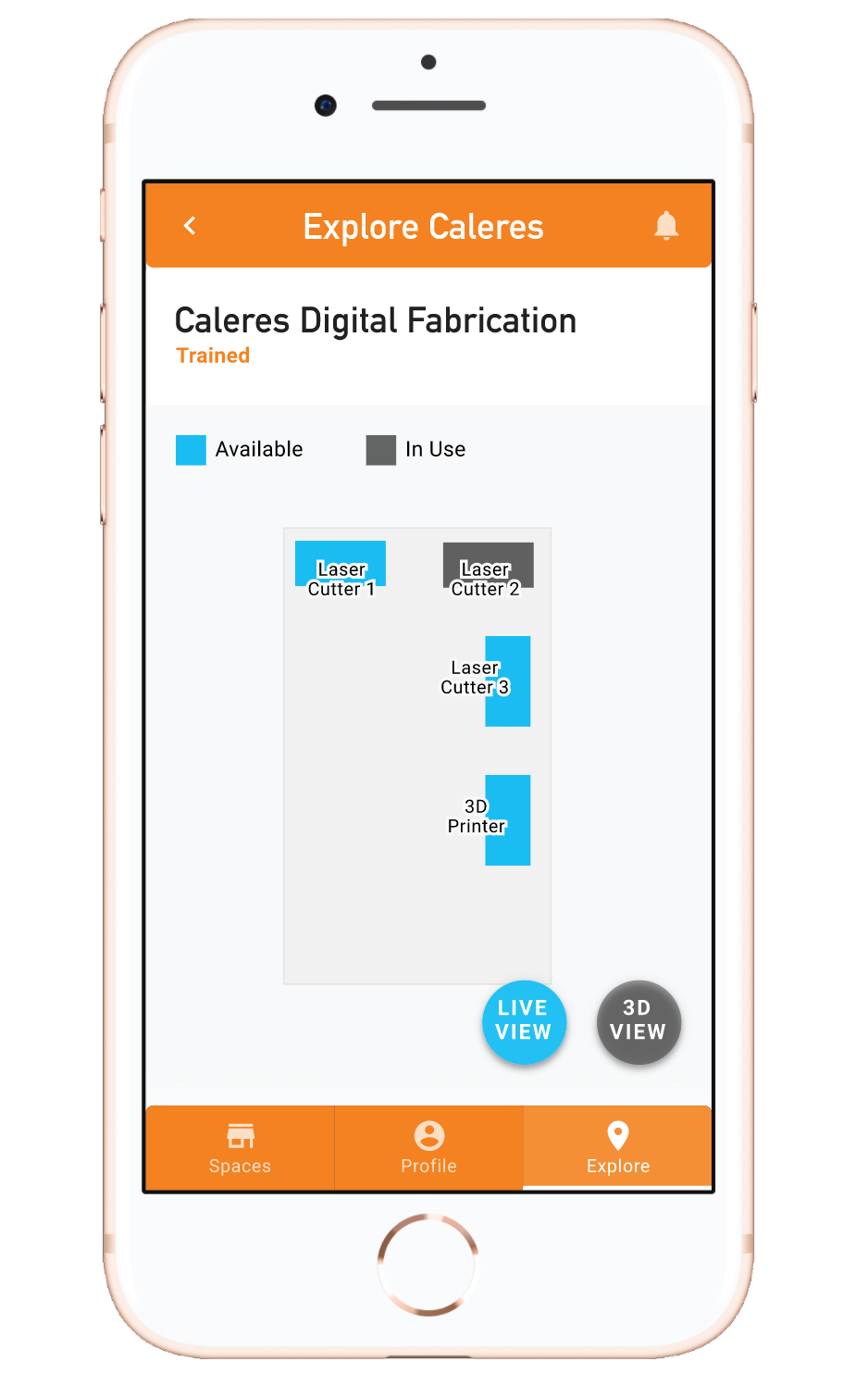
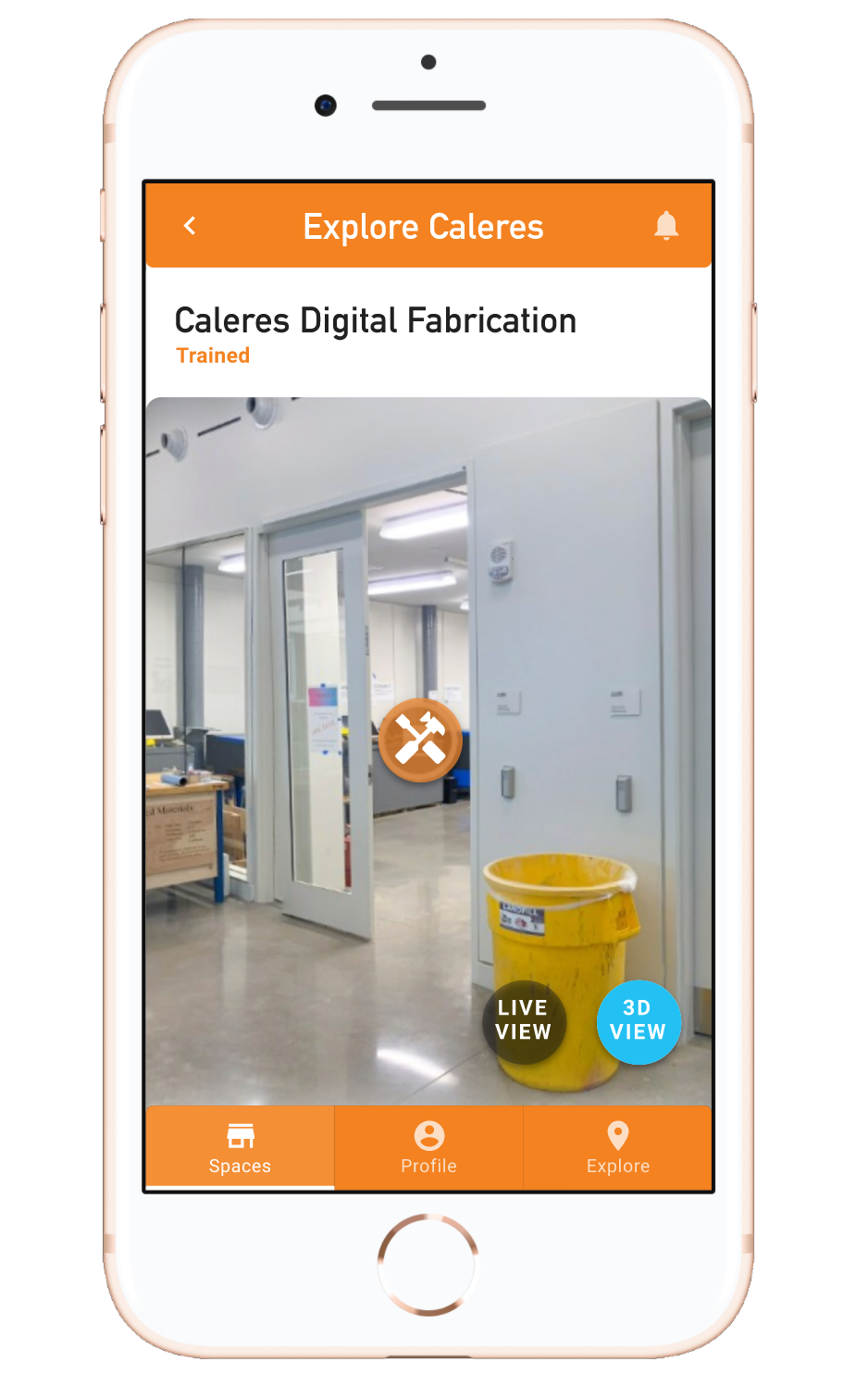
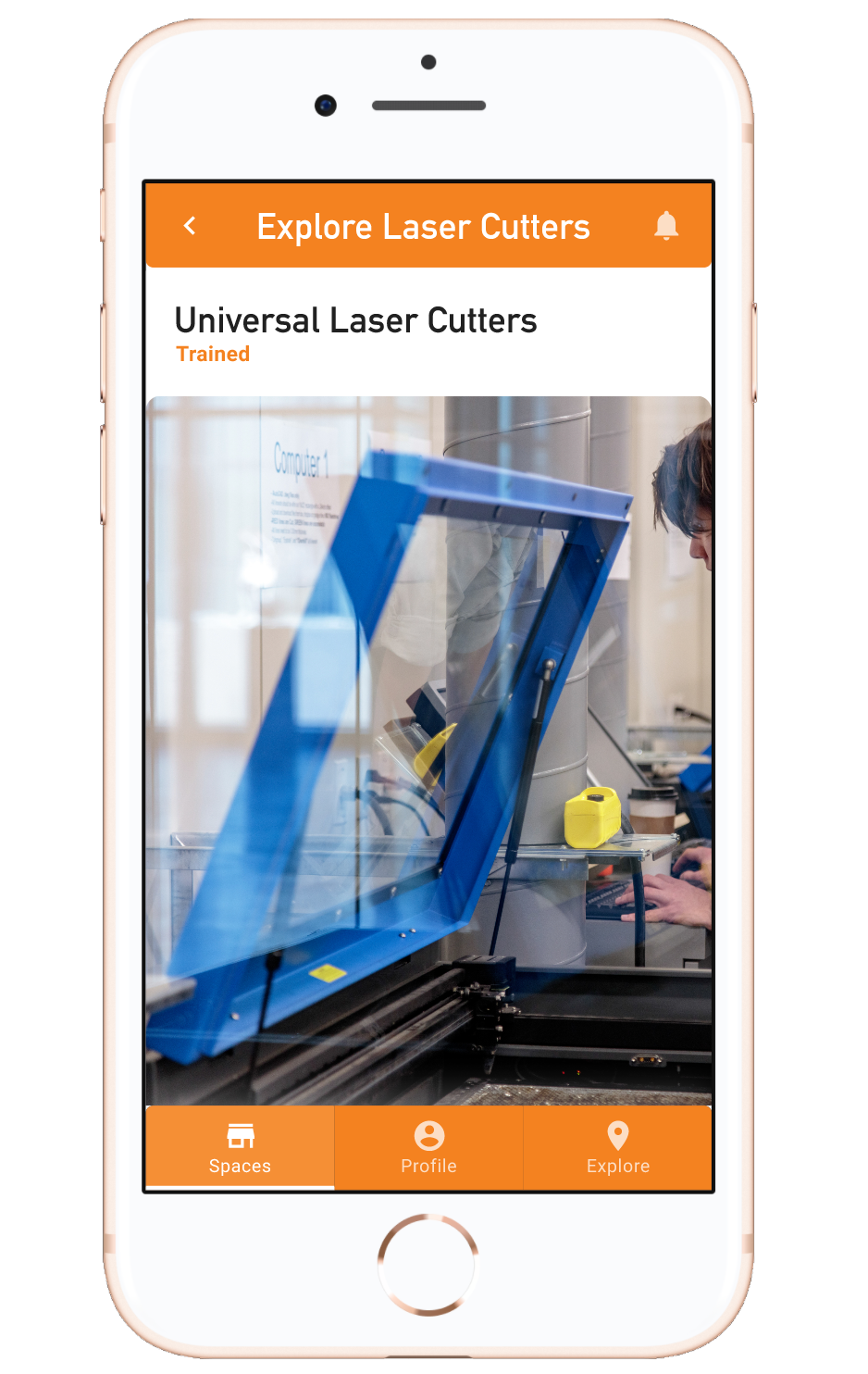
Within the constraints of this project, I was only able to build out a few key concepts on the shop user side. But I considered both user types when organizing content. I developed a bottom navigation bar with three sections: Spaces, Profile, and Explore. These sections provide different levels of information to each type of user. Both Spaces and Explore provide information on the shops and tools, but Spaces uses a list/card view as opposed to Explore’s visual map views (containing 2D, 3D, and live views of shop floor plans).
The live view floor plan is inspired by the tool LaundryView which shows real-time availability of laundry machines at colleges, presumably using RFID or motion sensors. I thought the same concept might benefit impromptu shop users who want to know which tools are currently available. Sam Fox shops have so much equipment that it can be intimidating for new users to know what’s available to them, so I wanted Explore to provide a visual way to foster familiarity.
Making Reservations
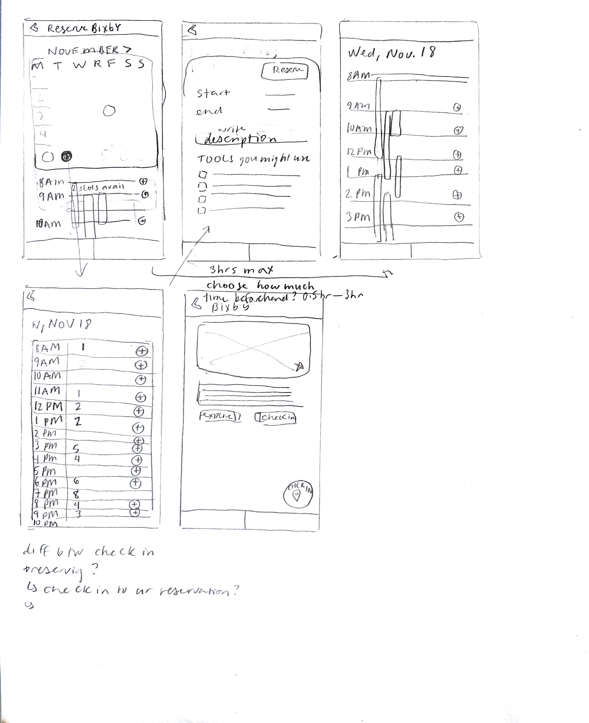
At the very beginning of the project, my peers and I got the chance to interview shop users (non-WashU affiliated) and technicians about their own experiences with reserving spaces. Because the shop users we interviewed actually weren’t WashU-affiliated, I decided to interview my roommate who is a Sam Fox shop monitor and user. Her perspective as both a user and administrator was invaluable. She feels that it’s hard enough to know how much time to block out for work in the shops and worries that a stricter reservation system won’t allow for impromptu work. My takeaway from our conversation was that a lot of students don’t reserve spaces ahead of time. This is not something to be punished, but accounted for.
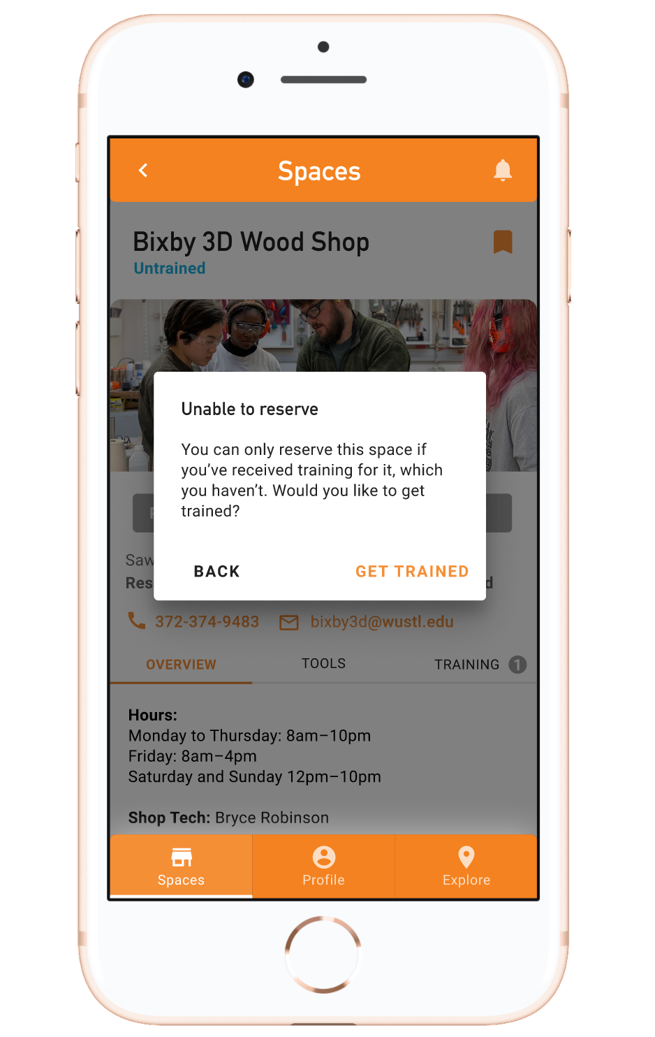
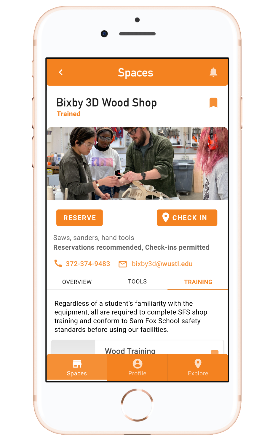
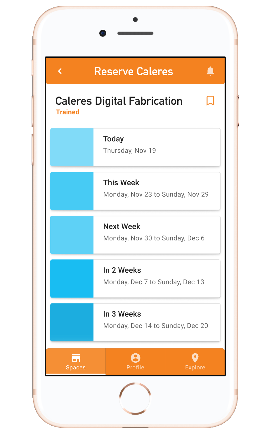
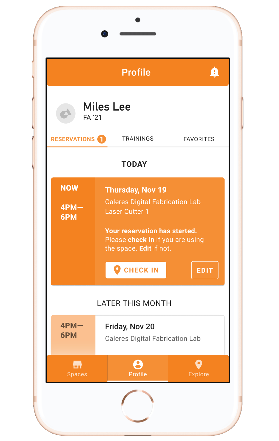
I devised a system that handles both ahead-of-time reservations and impromptu check ins. Especially during the COVID pandemic, it’s good for both users and administrators to know how many people are in a space at a given time. A user must complete training before they have the option to reserve or check in to shops.
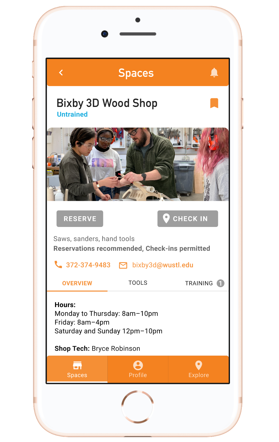
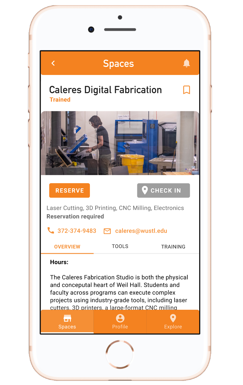
Certain shops are truly reservation only, so they don’t allow users to check in.
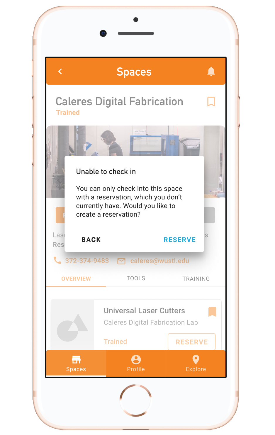
Of course, one app can’t solve all problems. Users could bypass all of this by simply showing up to the shop and using tools.
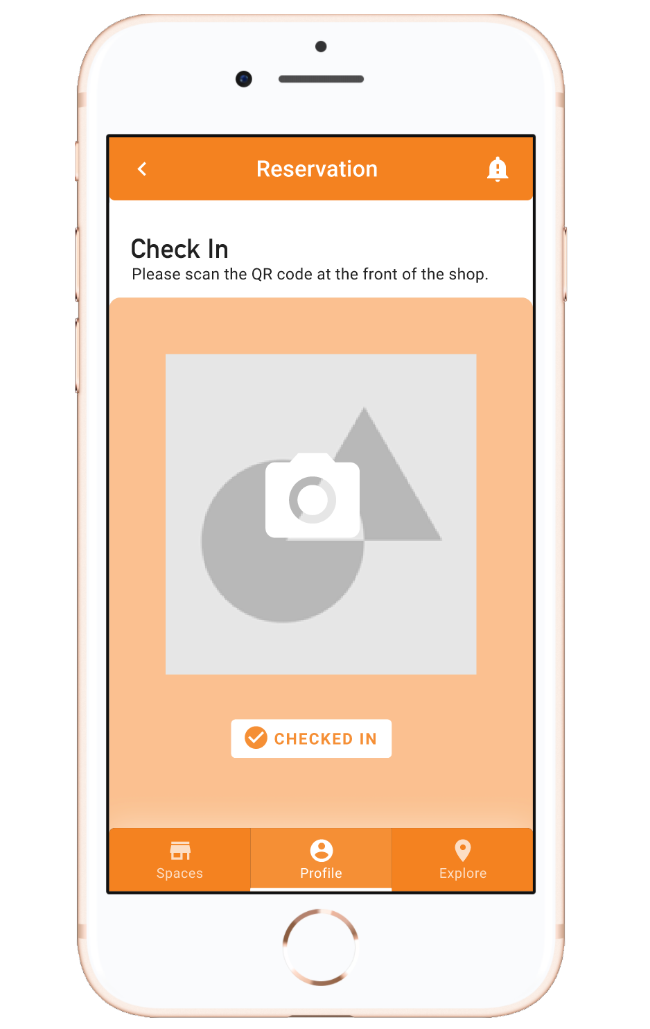
This is where good old-fashioned monitors come in. The monitors must still ask users to check in when they arrive. Currently, monitors assign numbers to shop users to maintain occupancy levels. I approached that problem by prompting users (checking in impromptu or showing up to their reservations) to scan QR codes at the front of the shop. This alerts both users and administrators to occupancy levels. At the end of their slots, users must check out of the shop via the app. But if users forget to, monitors have the power to check them out.
User Testing
I really loved the opportunities to user test throughout this process. It was helpful to periodically speak to people both unfamiliar and familiar with my project.
One of the most important pieces of advice I received was to consider the level of information on each screen necessary to achieving the intended goal. The list/card screen on Spaces originally had bookmark toggles on each of the items. Googlers commented that this made it seem like the Spaces items were only for bookmarking instead of leading to individual shop pages. I reduced the amount of information on that screen by only showing the bookmark toggle on items that the user actually bookmarked. Similarly, the Explore screen originally had an option to view the entirety of Sam Fox in 3D view. I realized this distracted from my original intention of allowing unfamiliar users to explore each shop visually, as opposed to Sam Fox itself. I removed 3D view from the main Explore screen but kept it on each shop’s Explore page.
Another piece of feedback that surprised me was about the bookmarking function. Early on in the process, I wanted users to be able to bookmark (or favorite) shops and tools for easy access on their Profile page. Later, I decided to get rid of that function and removed the bookmark toggles, unaware that I’d forgotten to remove them from one screen. During user testing a shop user pointed out the bookmark toggle and said how helpful he (and other users who frequently use the shops) would find that function. That’s one of the many reasons why multiple stages of user testing is so important! I was about to remove the bookmarking function entirely until a user expressed interest in it.
Wireframing and Prototyping
You can see the four iterations of my prototype here on Figma. Regrettably, I didn’t sketch as many lo-fi iterations as I would have liked to (or should have). Due to the short time frame, we were encouraged to jump into wireframing with Material, which proved useful in testing what features were possible. But I do think it’s important to quickly generate lo-fi wireframes so as not to lock the UX, concept, or sequencing on the first try. Digital wireframes can be hard to step away from, especially if they take considerable amounts of time to make! In future projects, I’ll definitely want to start with pencil lo-fi wireframes. At some point after my first Figma draft, I sketched out a few screens (below) to get a sense for reservation flows. I ended up not focusing on reservation flows because we were encouraged to “do one thing well” instead of spreading ourselves too thin over all features. I chose to focus on the discovery and exploration aspect.
Reflection
If I were to continue working on this project, I would make sure that my app really and truly adheres to accessibility standards (especially color contrast). While I kept accessibility in mind throughout the process, I believe it’s imperative to user test specifically for it. I’d also want to conduct a lot more user testing, particularly with Sam Fox students, and Sam Fox monitors and techs after building out the administrator side.
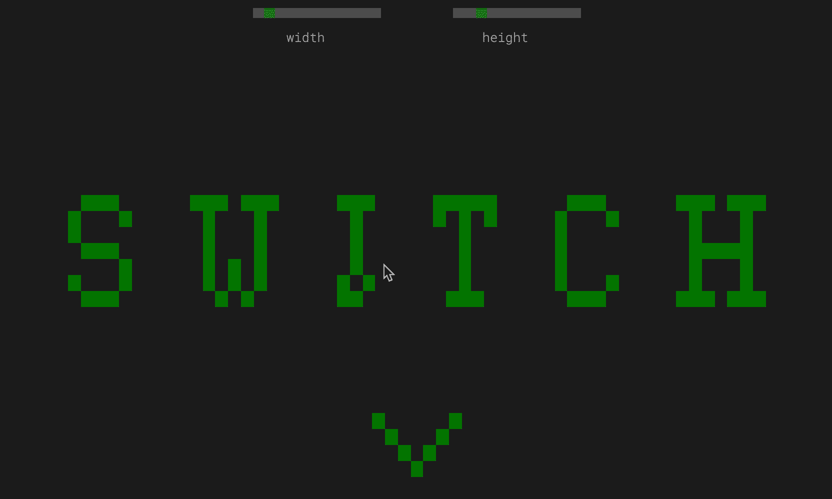
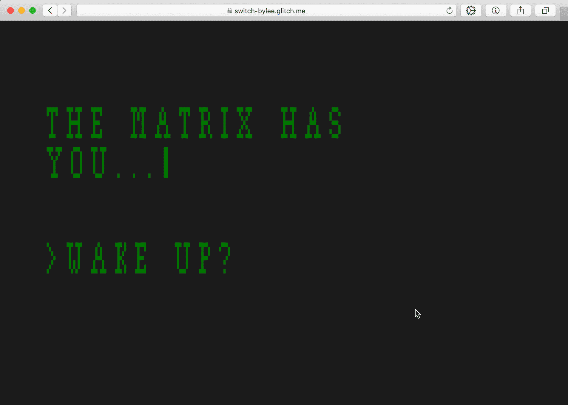
One of my biggest takeaways is that repeated user testing, with both familiar and unfamiliar users, is crucial to building any UI/UX project. I’ve conducted user testing with a few projects, namely Switch and the SQSH website, but not nearly enough. I hope to do so in future projects!
Attribution
Roboto designed by Christian Robertson for Google. How do you pronounce Roboto? Let me know in an email!
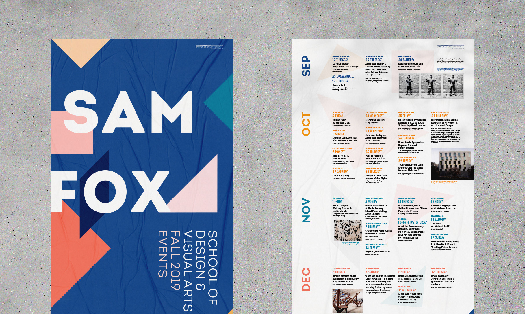
DIN Text Pro designed by Panos Vassiliou for Parachute. DIN, along with the orange and blue colors, is part of Sam Fox’s visual branding system.
Jonathan Hanahan for his mentorship and good vibes
Googlers, notably Tara Hosseinipour, Felix Wang, Melissa Smith, Aaron Zemach, Will Bates, and Molly Needleman, for their incredible mentorship and feedback
Shop techs and users Dryden Wells, Amelia Jones, Jason Meyer, Brady Fulton, and Natalie Snyder for their feedback and perspective
The Sam Fox Office of Communications for resources including photographs and specs
My classmates for their feedback, community, and emotional support*
*Note that beyond preliminary interviews and research, this was not a group project.