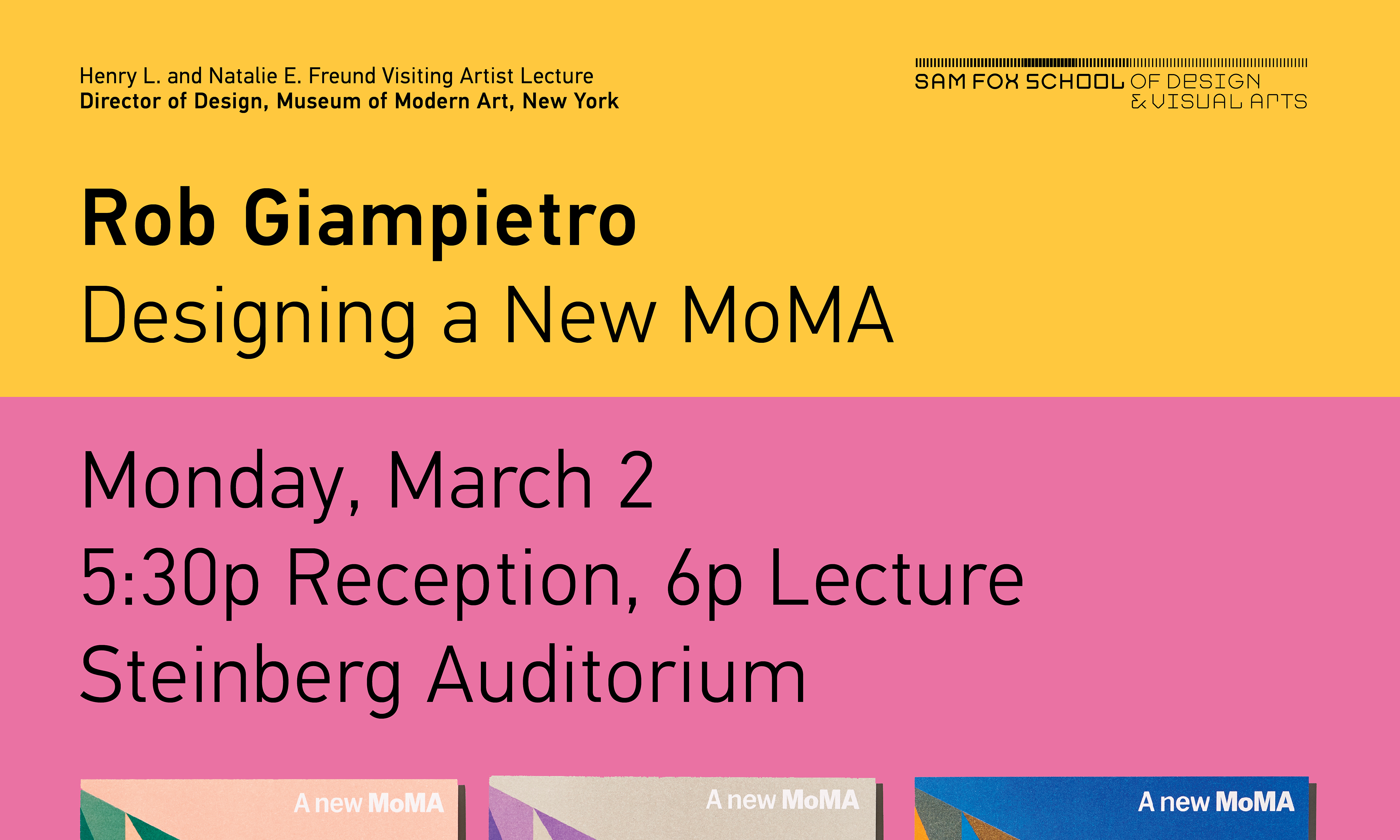
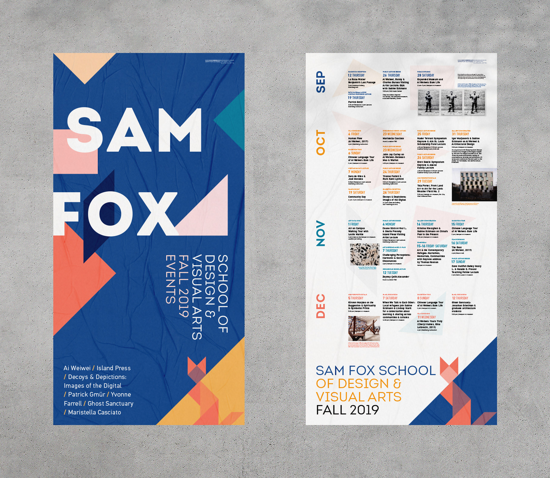
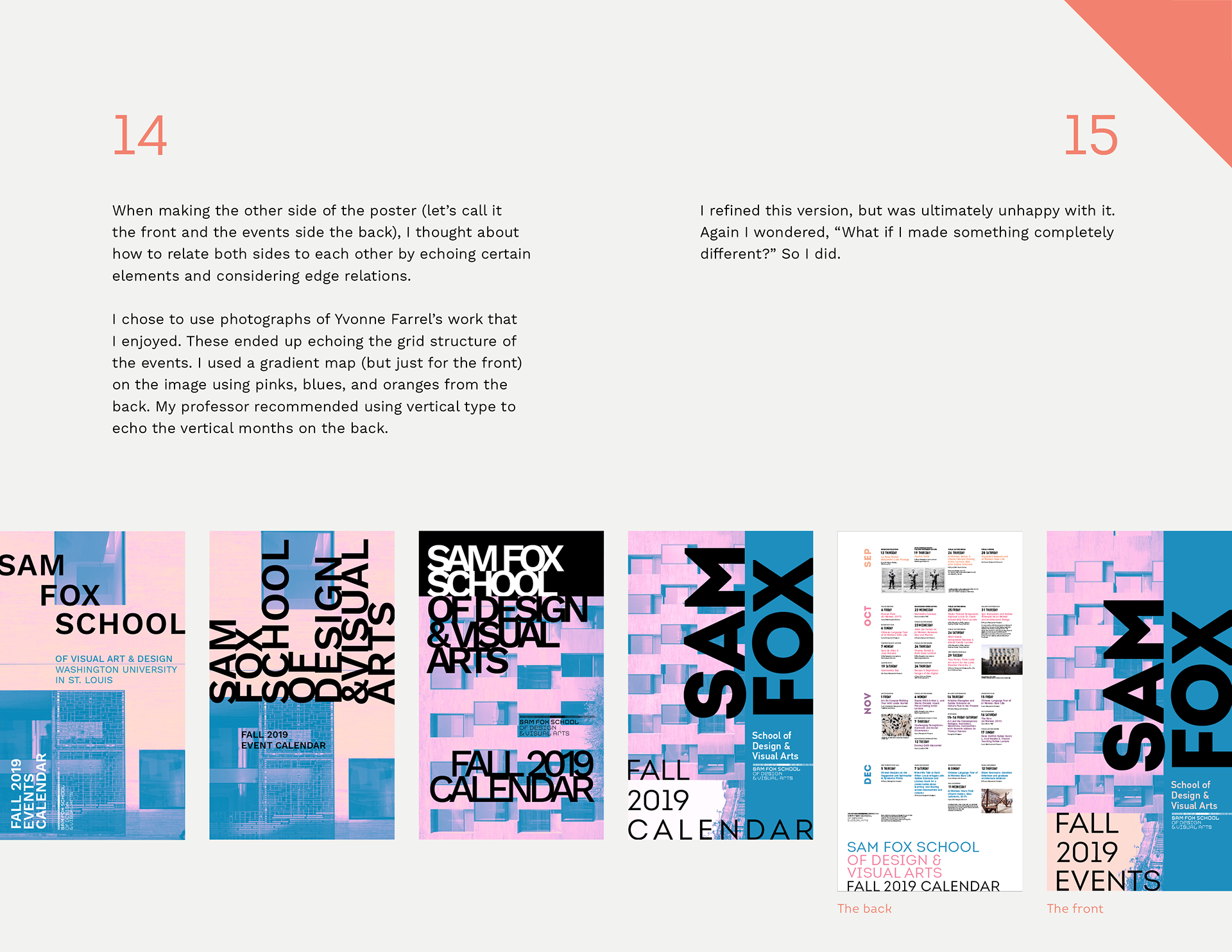
I designed a hypothetical double-sided calendar poster for the semester's events at the Sam Fox School of Design & Visual Arts. Several times throughout this project, I wondered, “what If I made something completely different?
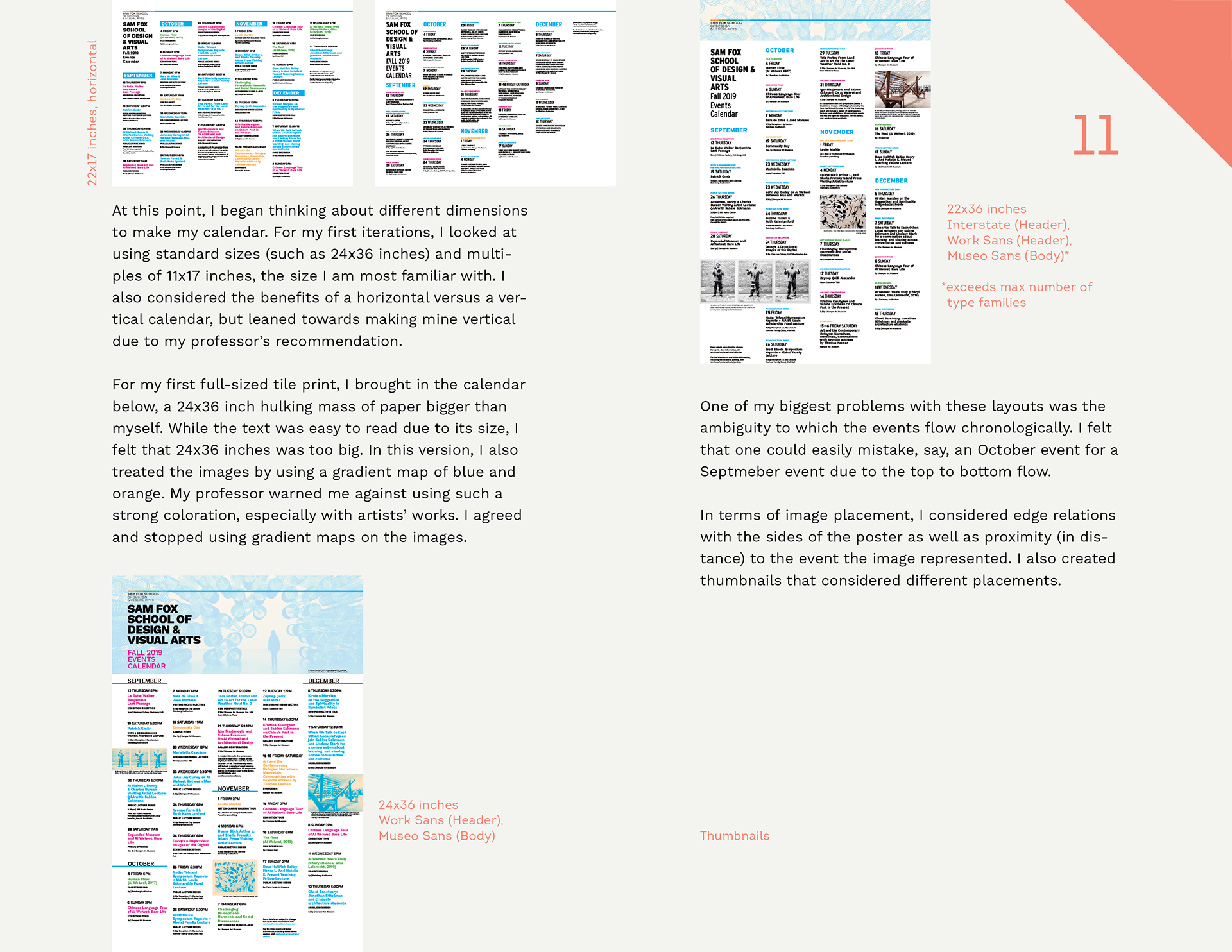
When I was first assigned this project, I was excited to explore grids and typographic systems. I had designed and illustrated monthly calendars for my campus job, Ursa’s Nite Life, but had never designed an event calendar containing multiple months. I began to consider type size, scale, colors, image treatment, grid systems, and layout.
I thought about what I as a viewer would want to see emphasized on a calendar, and first explored emphasizing the event date using scale. I chose to include the day of the week because I personally need that extra piece of information while looking at an event flyer to quickly decide if I am able to attend or not.
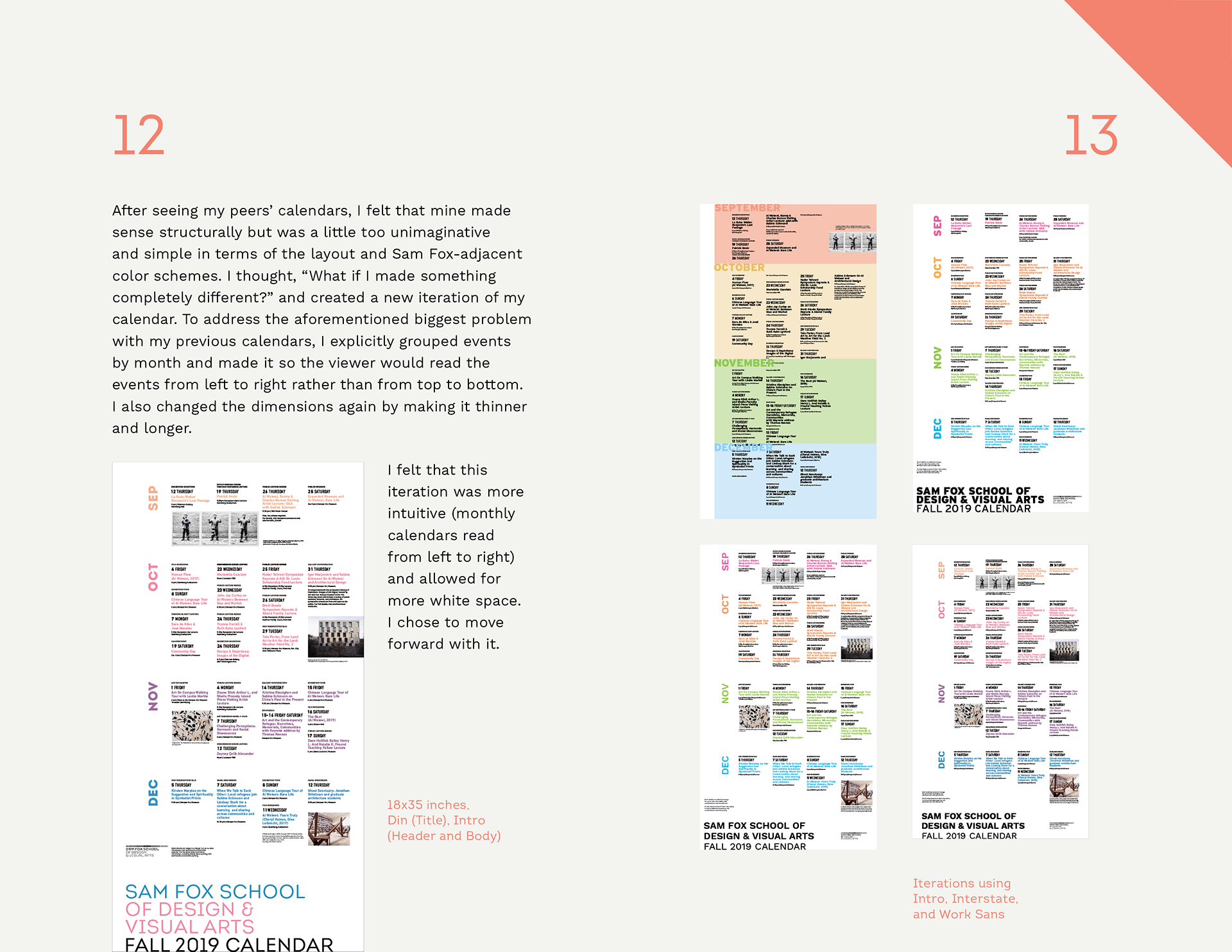
In early iterations, I explored differentiating between types of events (lectures, exhibits, film screenings, and miscellaneous) by using a color key. I picked these colors from the Sam Fox logo. One of my biggest problems with those layouts was the ambiguity to which the events flow chronologically. I felt that one could easily mistake, say, an October event for a September event due to the top to bottom flow.
To address the problem, I explicitly grouped events by month and made it so the viewer would read the events from left to right rather than from top to bottom. I felt that this iteration was more intuitive (monthly calendars read from left to right) and allowed for more white space.
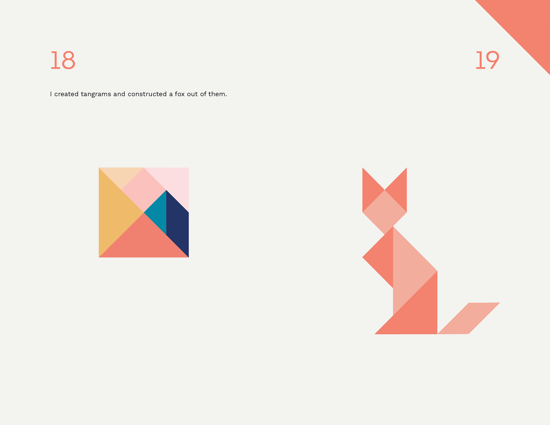
At the start of this project, I remember thinking “what If I used tangrams to create a fox?” but pushed that idea aside. But at this point, I re-entertained that idea. This is, after all, the Sam Fox School—despite being named after a real person, Sam Fox is a very image-driven name. Why tangrams? Much like events in a month or disciplines in the Sam Fox School or schools within a university, they’re shapes that fit together to create one larger shape (a perfect square). They’re extremely old puzzles that people still use today to create shapes of any kind, including foxes. I created tangrams and constructed a fox out of them.
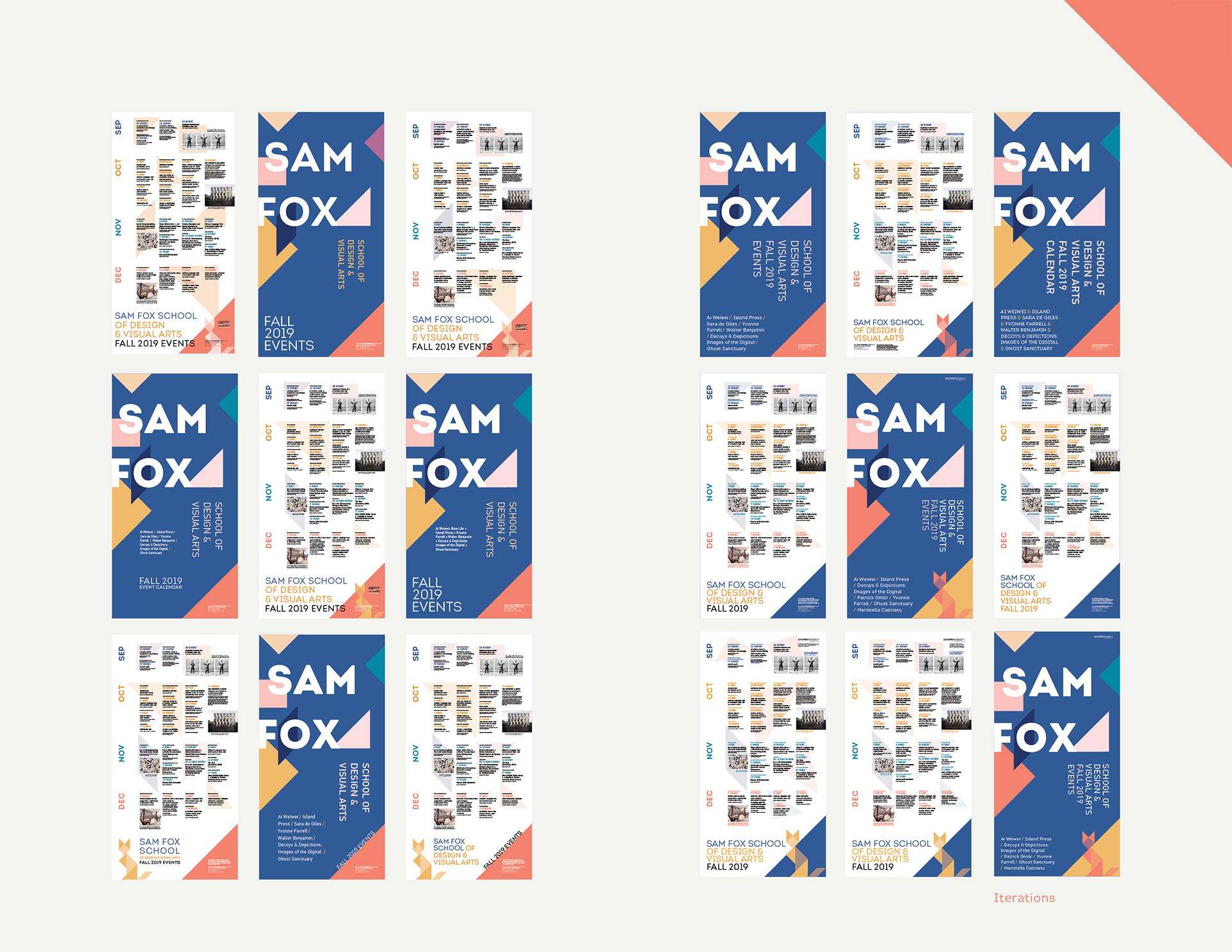
After finally deciding to move forward with my tangram idea, I created iterations of the front and the back, a whopping 36 in total. My original desire was to have tangram pieces scattered around on one side and the fox on the other side to let the viewer have a little “aha!” moment when they realize the fox was made from the same shapes. However, this ultimately did not pan out due to the somewhat awkward negative space the fox creates around itself.
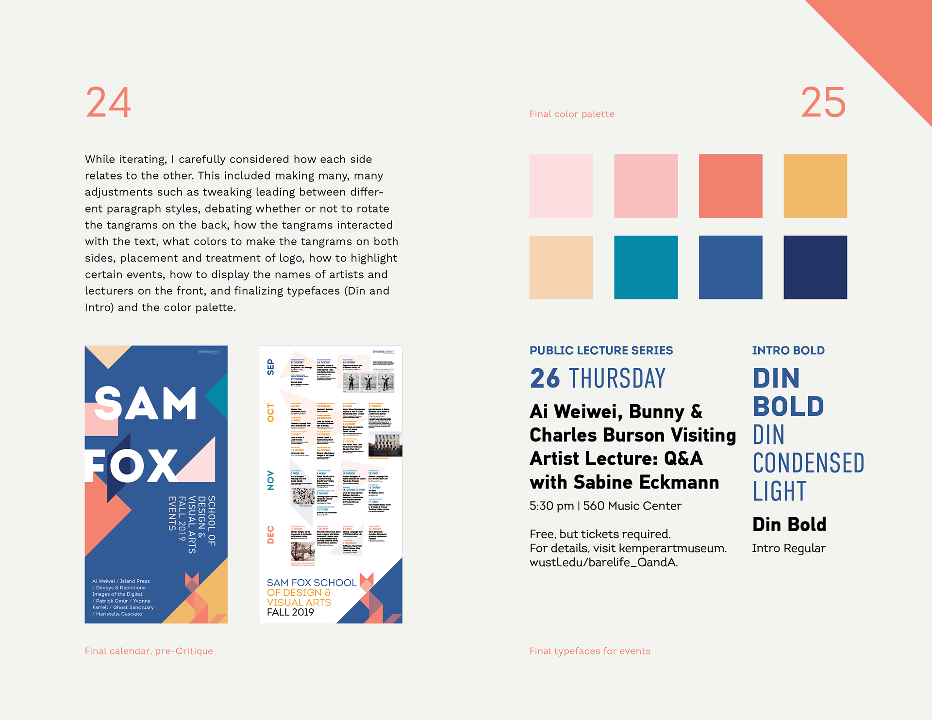
While iterating, I carefully considered how each side relates to the other. This included making many, many adjustments such as tweaking leading between different paragraph styles, debating whether or not to rotate the tangrams on the back, how the tangrams interacted with the text, what colors to make the tangrams on both sides, placement and treatment of logo, how to highlight certain events, how to display the names of artists and lecturers on the front, and finalizing typefaces (Din and Intro) and the color palette.
For critique, our professors brought in designers from the Sam Fox publicity office. Audrey Westcott, Senior Graphic Designer, explained what kind of features the office would hypothetically look for in a Sam Fox calendar. Her main points included: having “Sam Fox School of Design & Visual Arts” instead of just “Sam Fox,” whether the design can be carried over to the Spring semester, if all artists and guest lecturers are treated well (due to the time and energy they are putting into the school), and if there is a clear sense of hierarchy throughout.
I appreciated her insight on what a client would be looking for. If I were to redo this project, I would think more carefully about giving guest lecturers the same importance as artists (though she did acknowledge that Ai Weiwei is a hugely important figure in the art world and therefore a good selling point).
The first thing she said about my calendar was that she enjoyed the fox. I appreciated this because I was a bit hesitant to put a smaller version of the fox in my poster, albeit on both sides of it. She also enjoyed the color palette and clear hierarchy. One thing my professor pointed out was that the “School of Design & Visual Arts Fall 2019 Events” on the front was set in Din, which felt too condensed for that block of text. After critique, I set that text in Intro and the artist/lecture list in Din to alleviate that problem.
If you’re interested in reading more of my process, you can do so on Issuu at the link below.
After this project, my professors actually recommended me for a position as an intern at the Sam Fox Office of Communications. I began working with the office in January 2020. Creating posters for the Sam Fox public lecture series taught me a lot about how to make variety within branding guidelines.
Attribution
DIN Text Pro designed by Panos Vassiliou for Parachute. DIN is part of Sam Fox’s visual branding system.
Intro designed by Svetoslav Simov for Fontfabric. I used Intro a lot for any and all graphics in early high school, then convinced my Publicity co-Chair in Pride Alliance to use it as one of our two typefaces for the year.
Mentorship provided by Ben Franklin
Valuable feedback provided by Audrey Westcott and my classmates