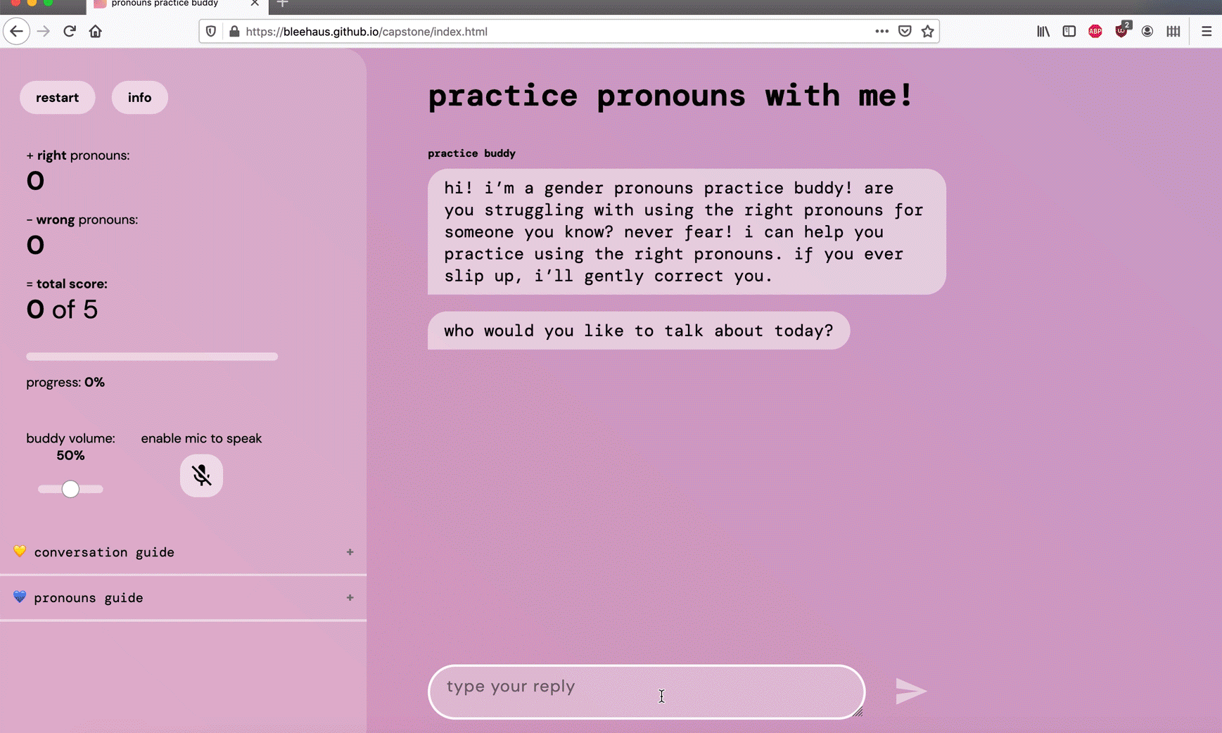
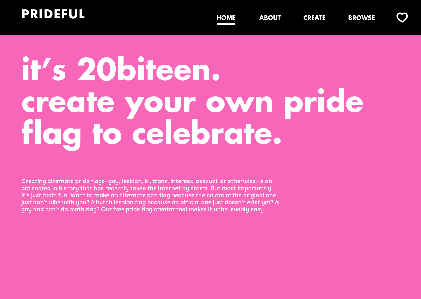
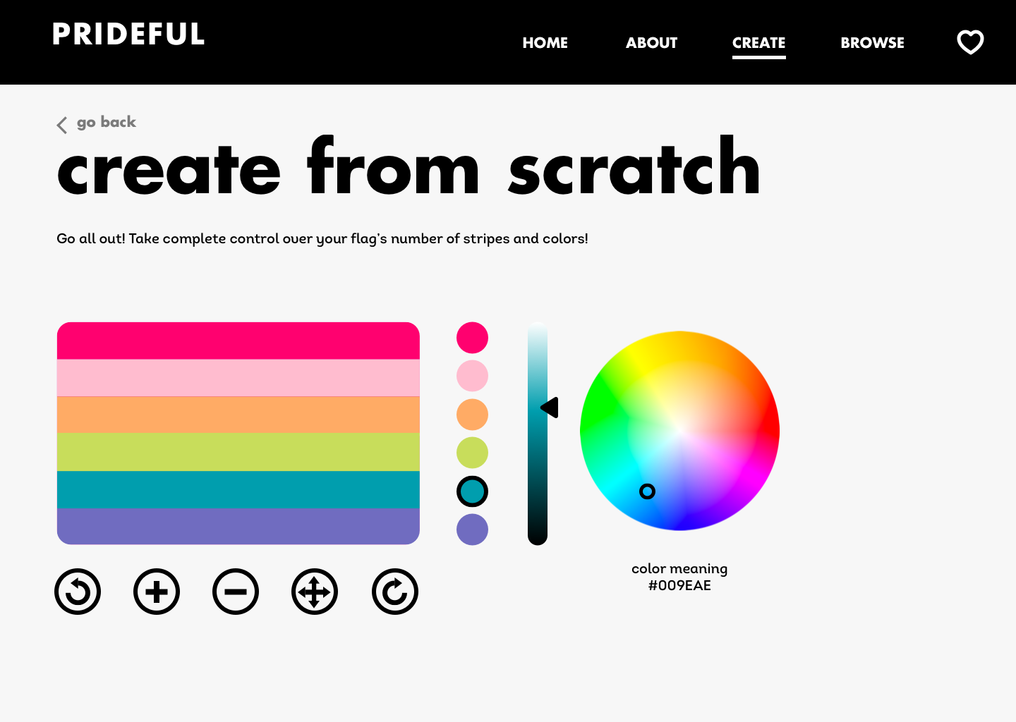
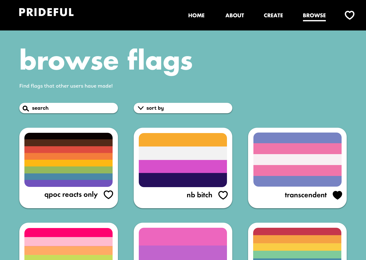
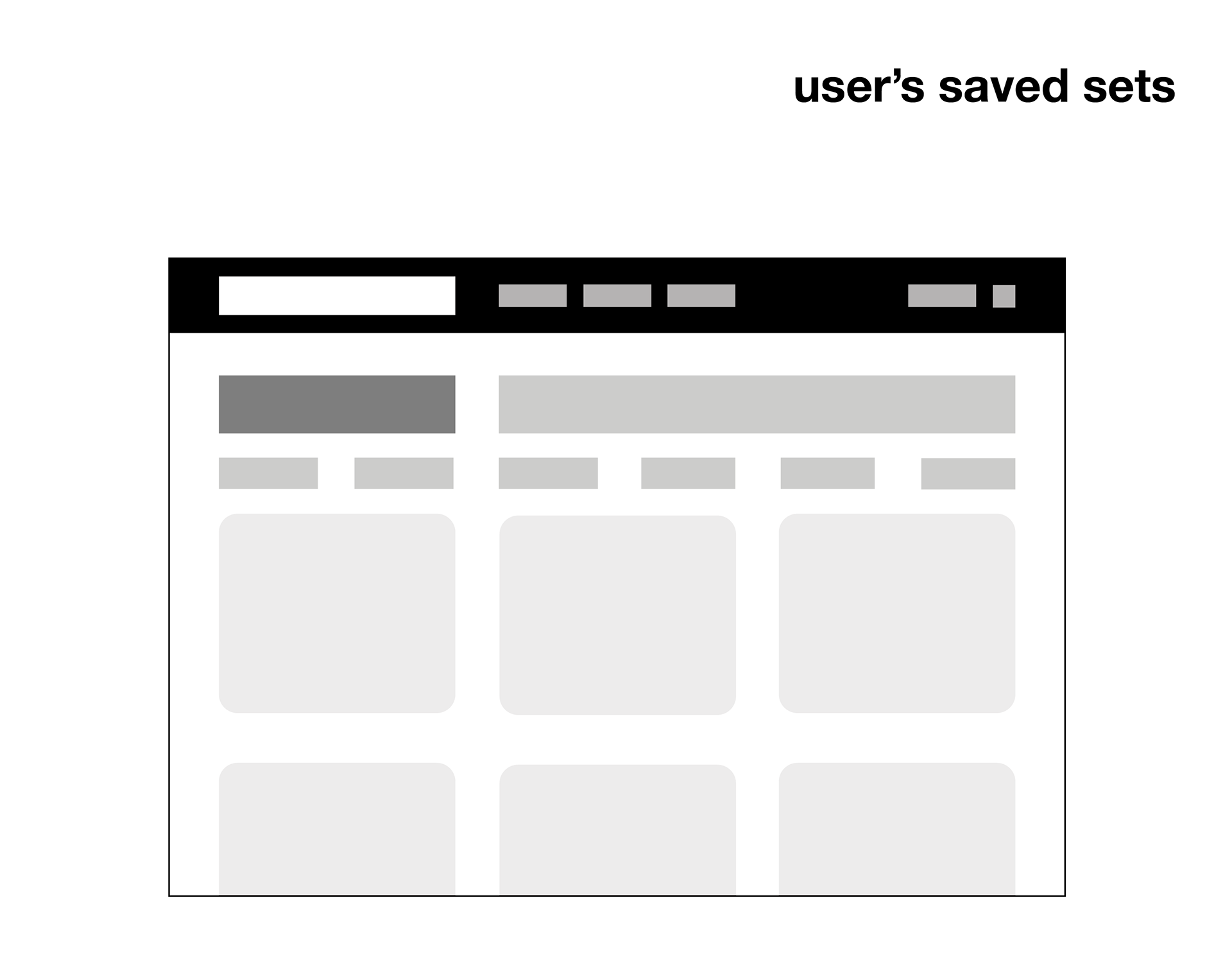
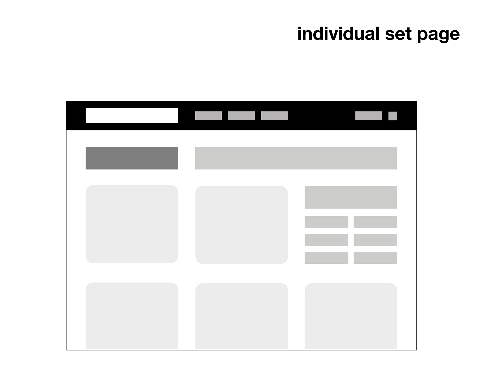
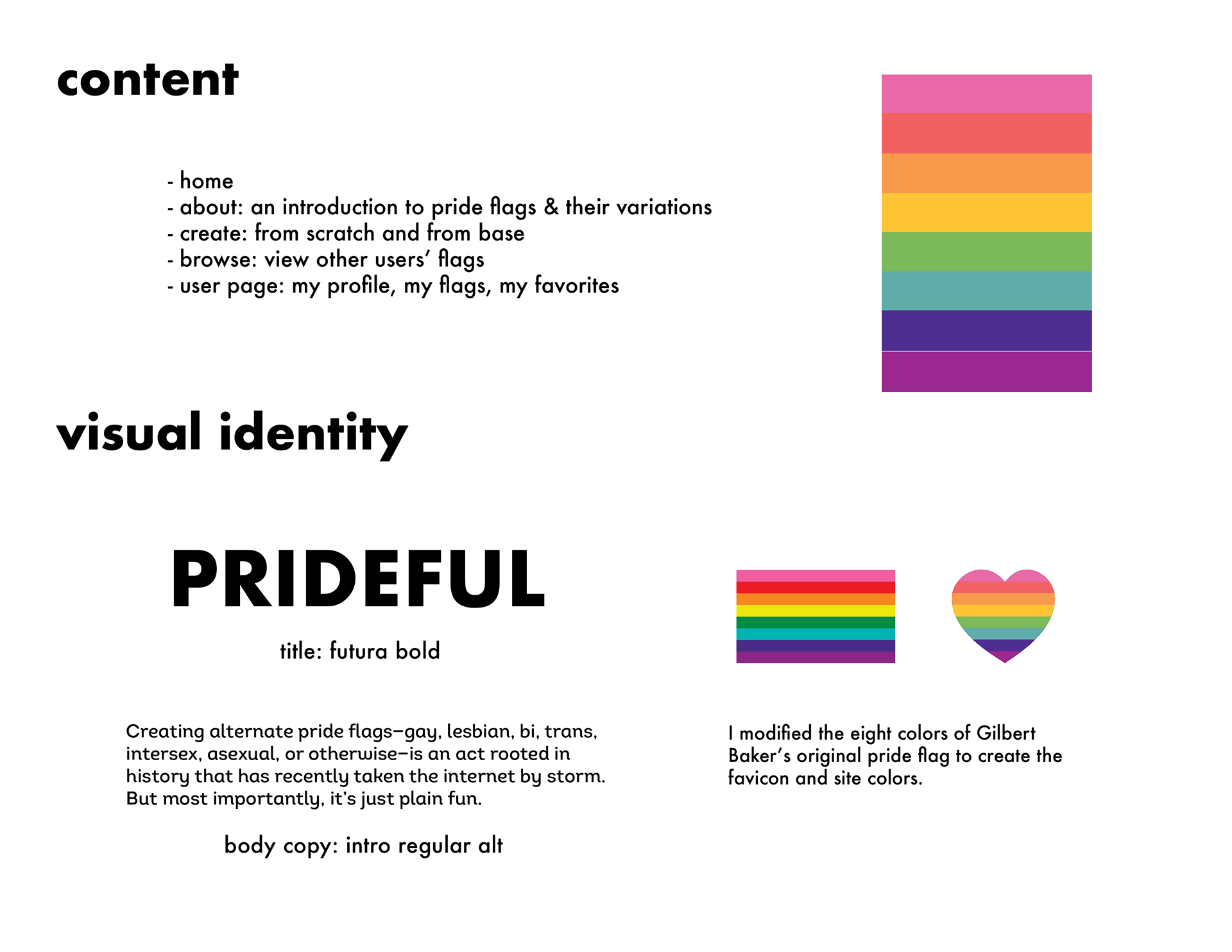
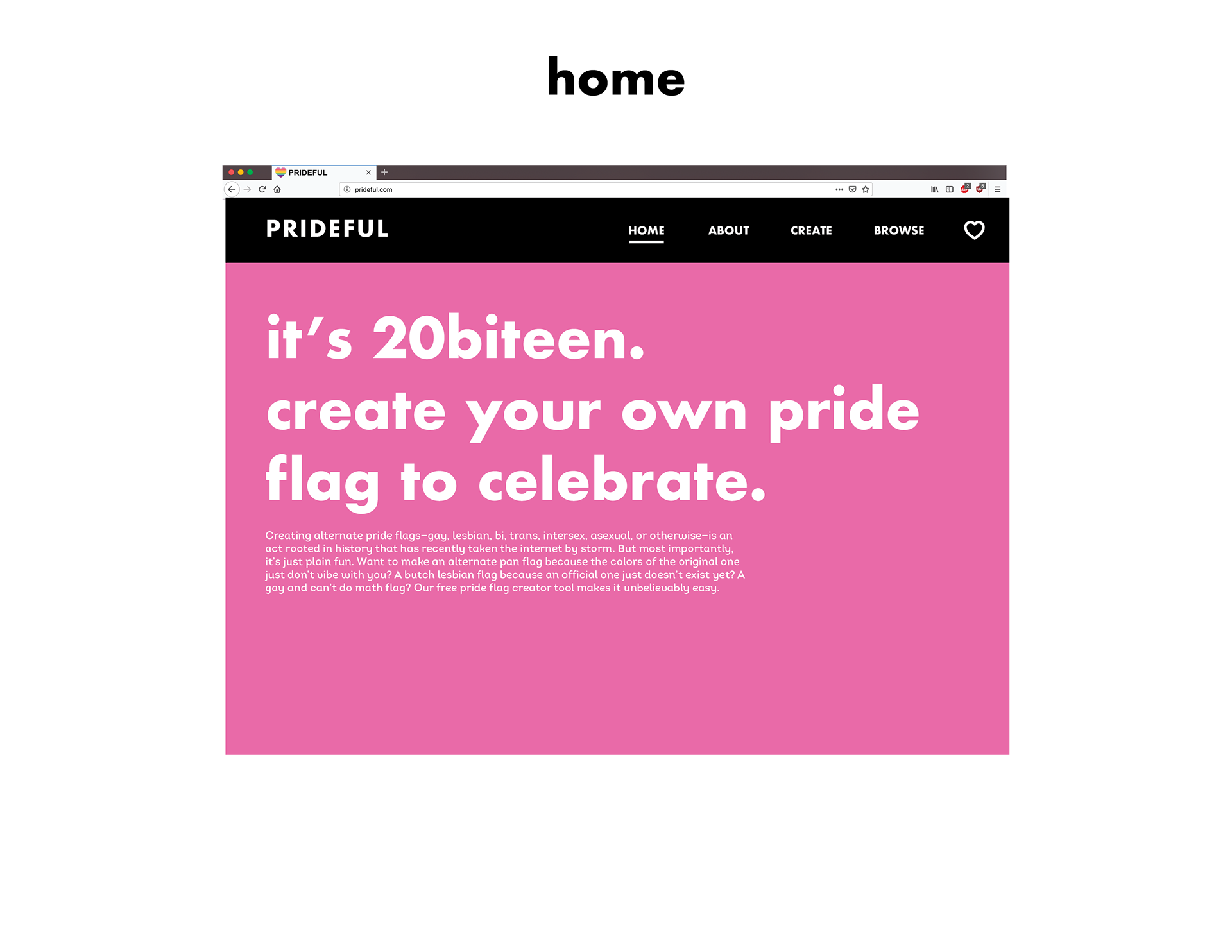
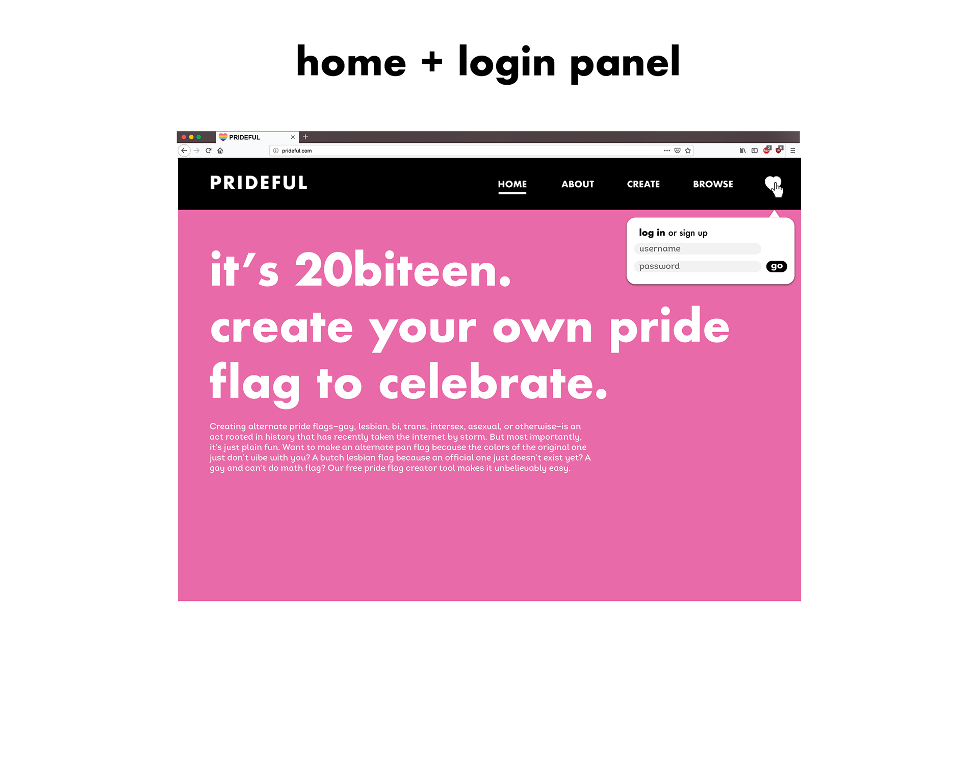
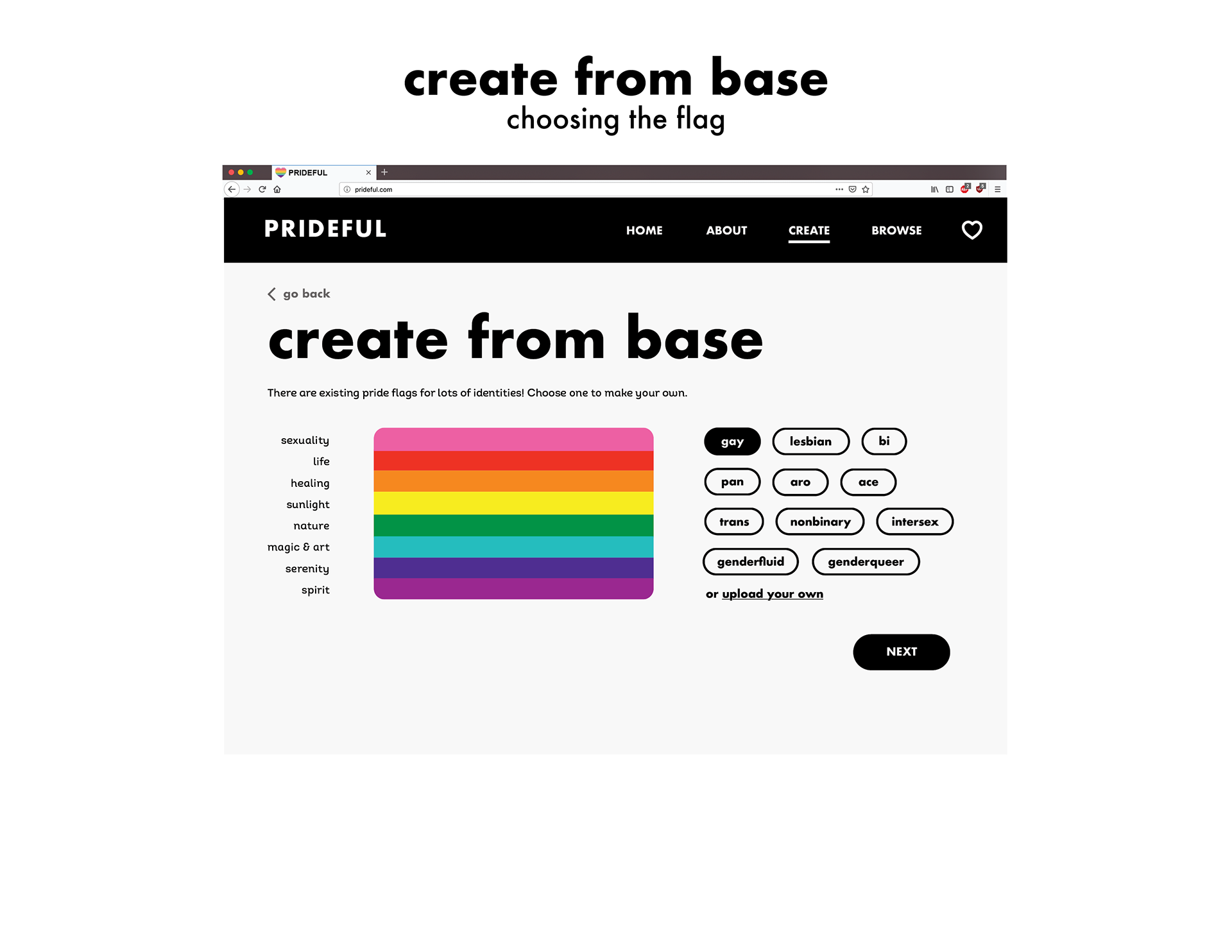
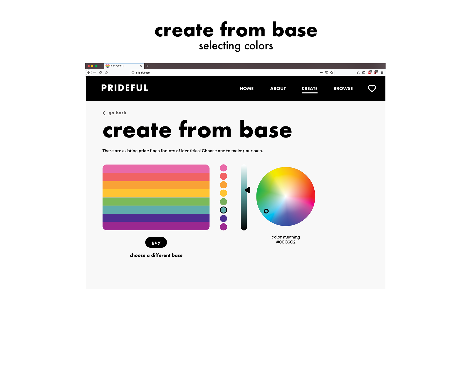
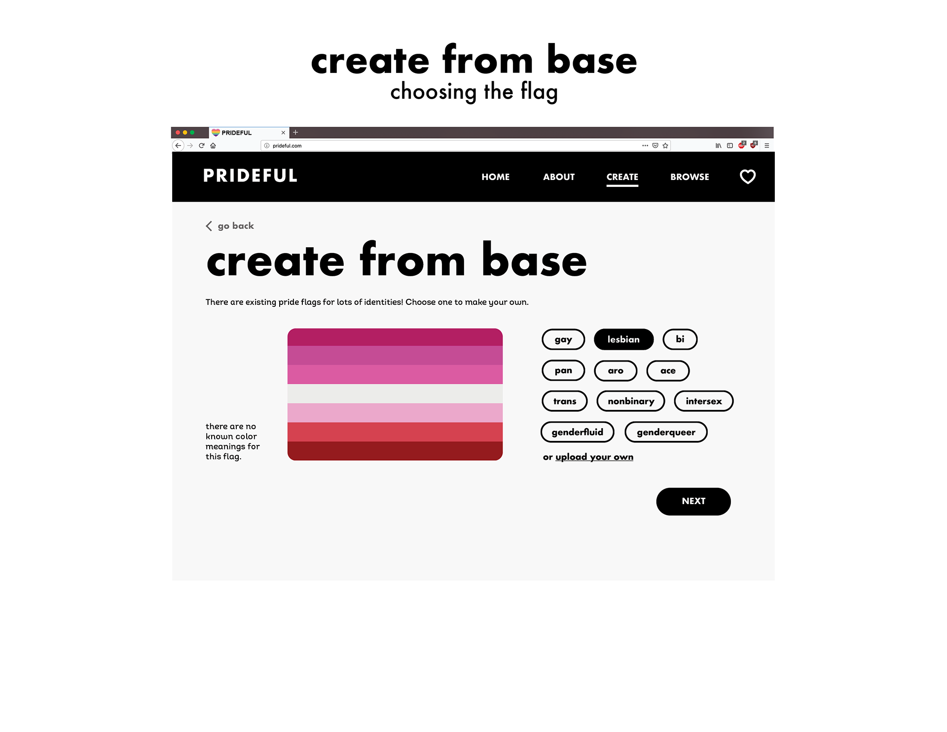
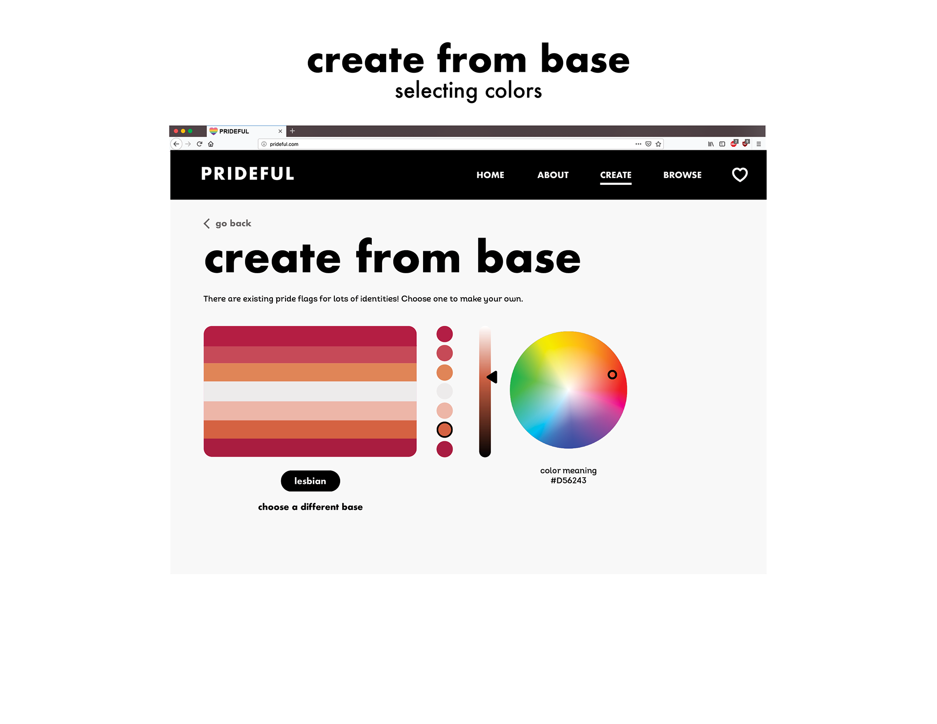
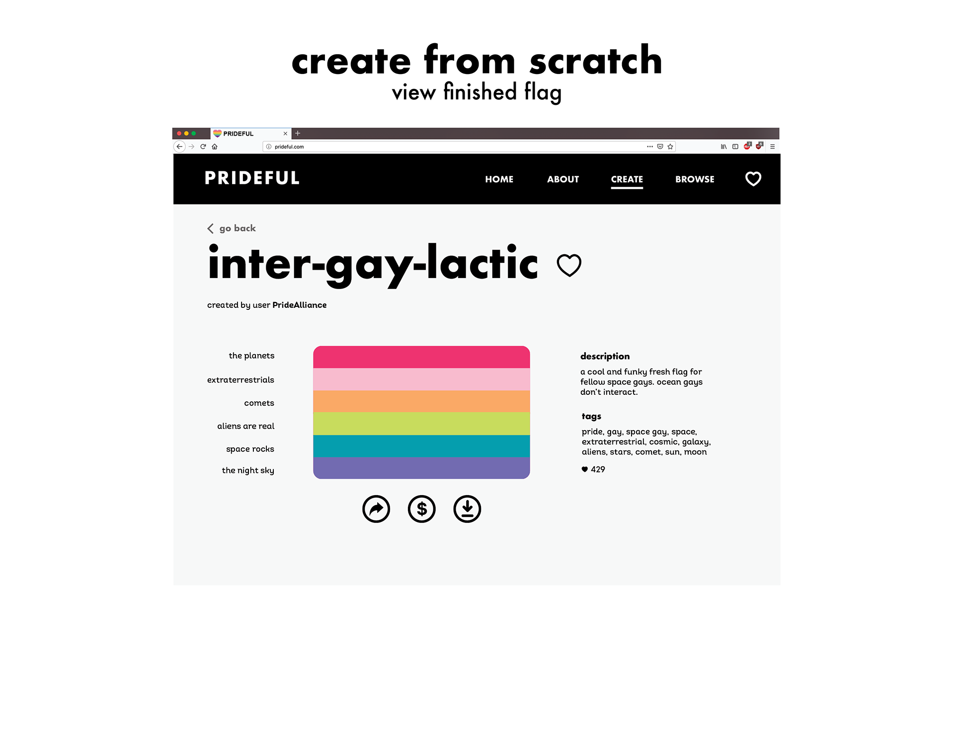
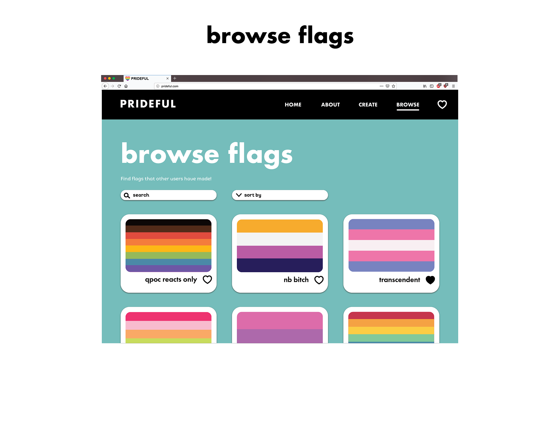
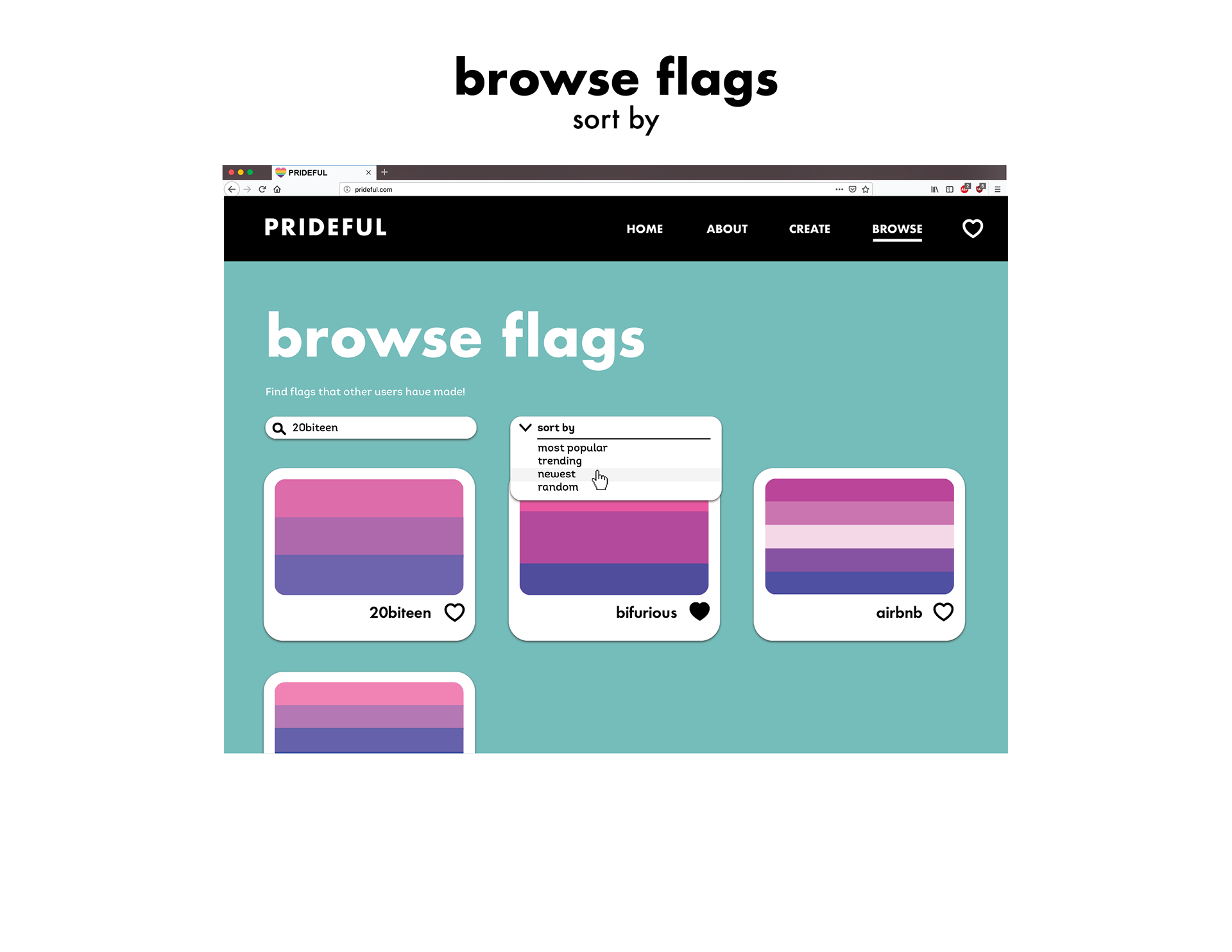
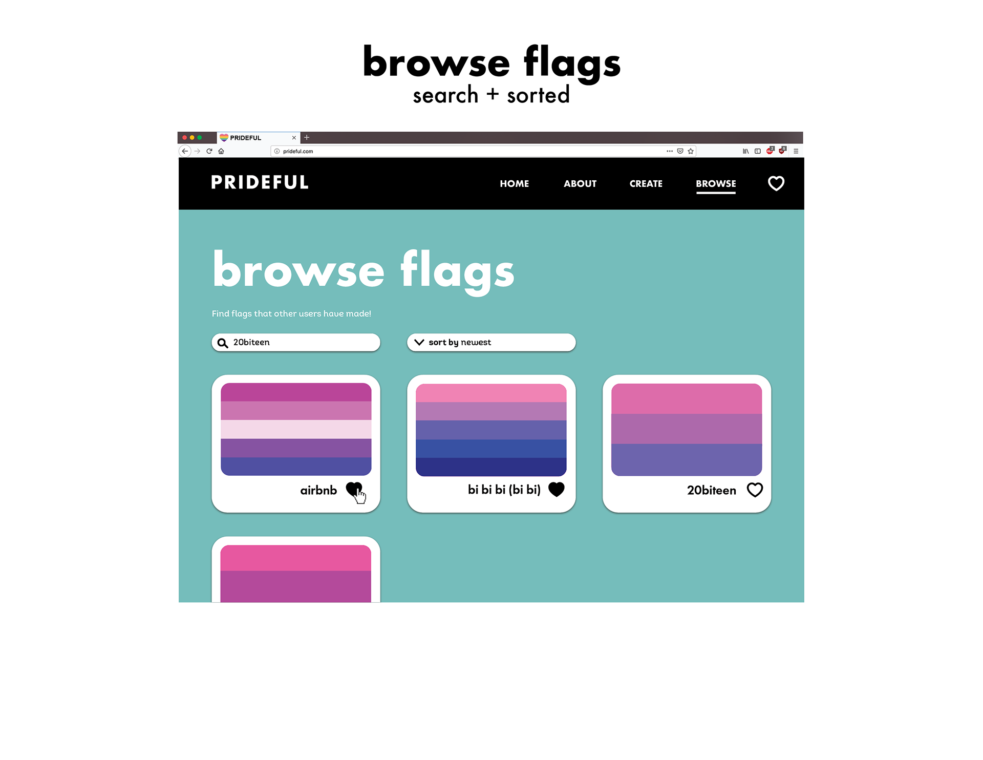
Responding to the prompt to design a website to host an archive, I designed a hypothetical website on which users can create and post alternative pride flags. I paid attention to how users would interact with different elements and maintained a lighthearted tone when writing the content.
Mentorship provided by Rebecca Leffell-Koren.
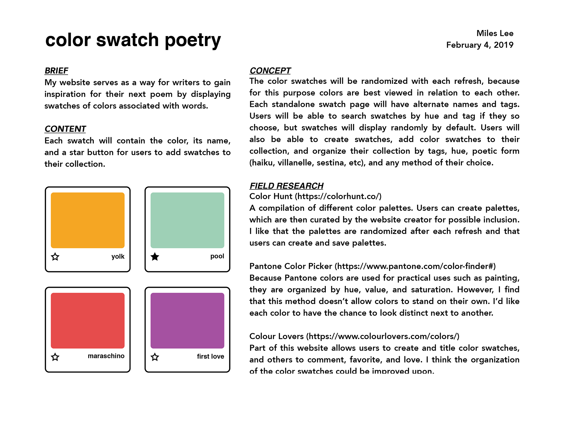
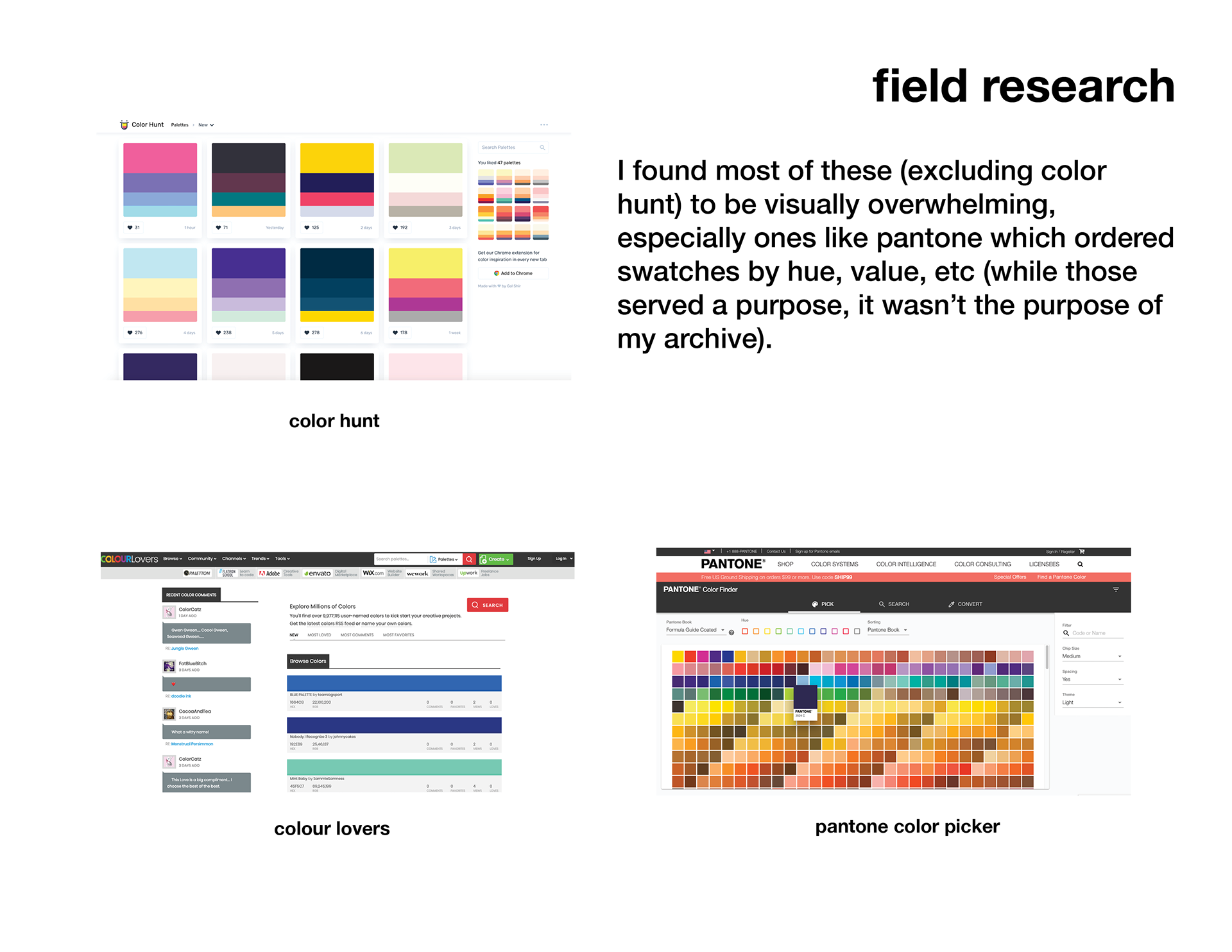
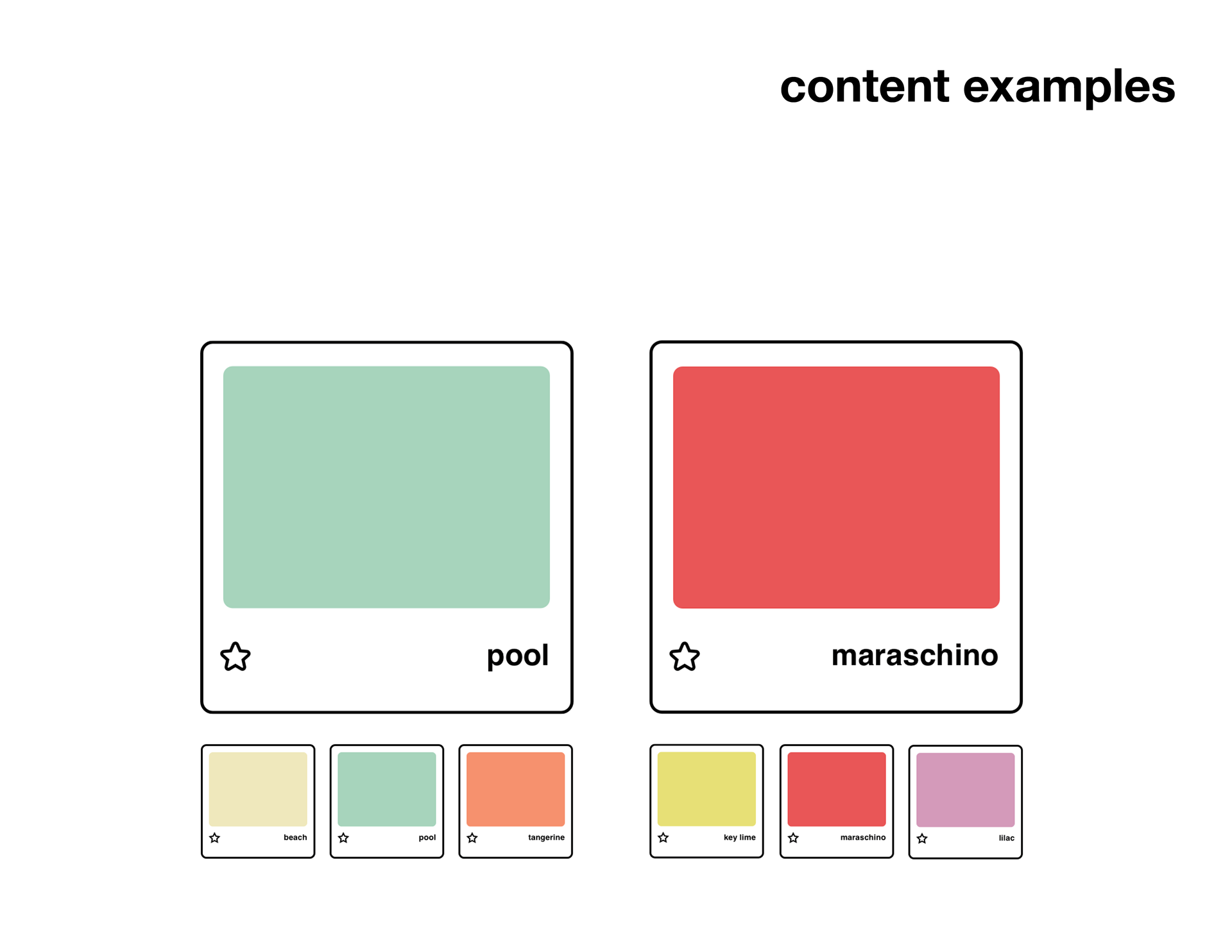
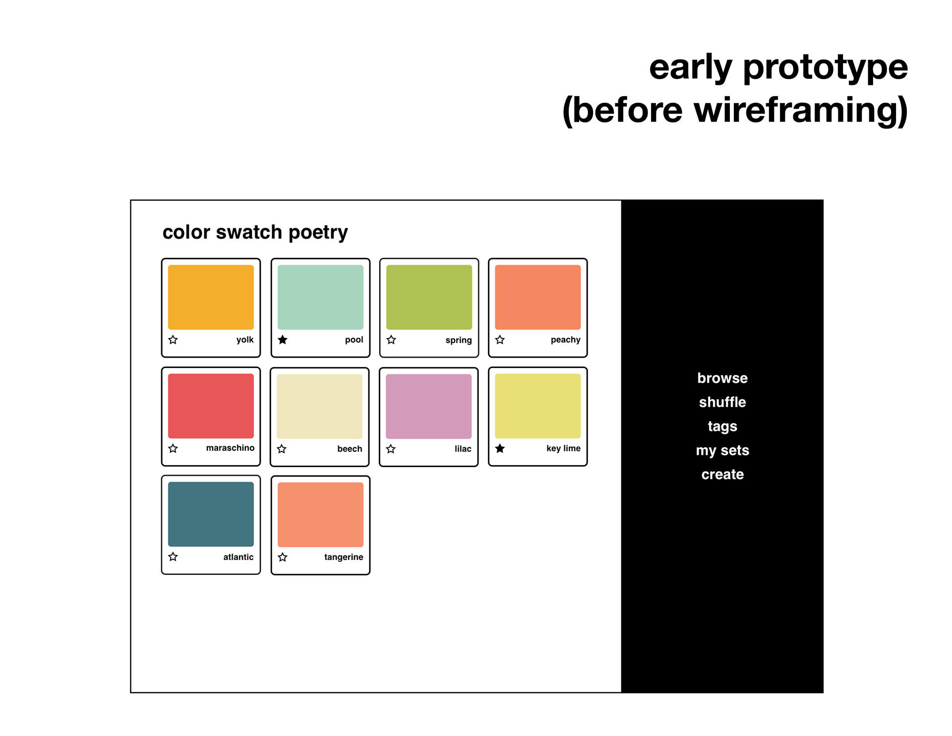
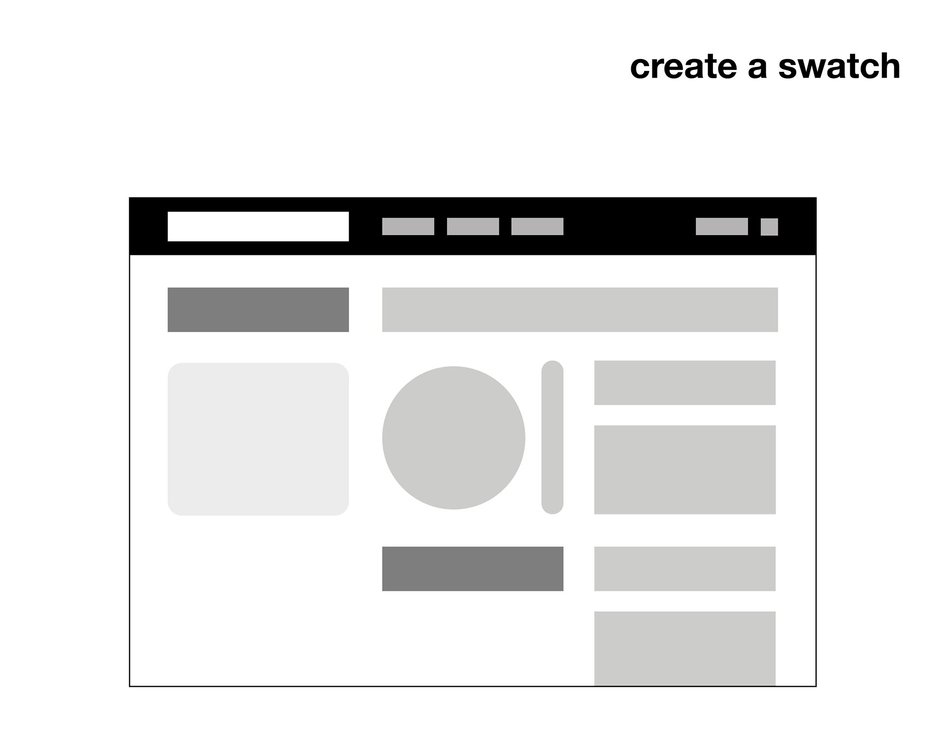
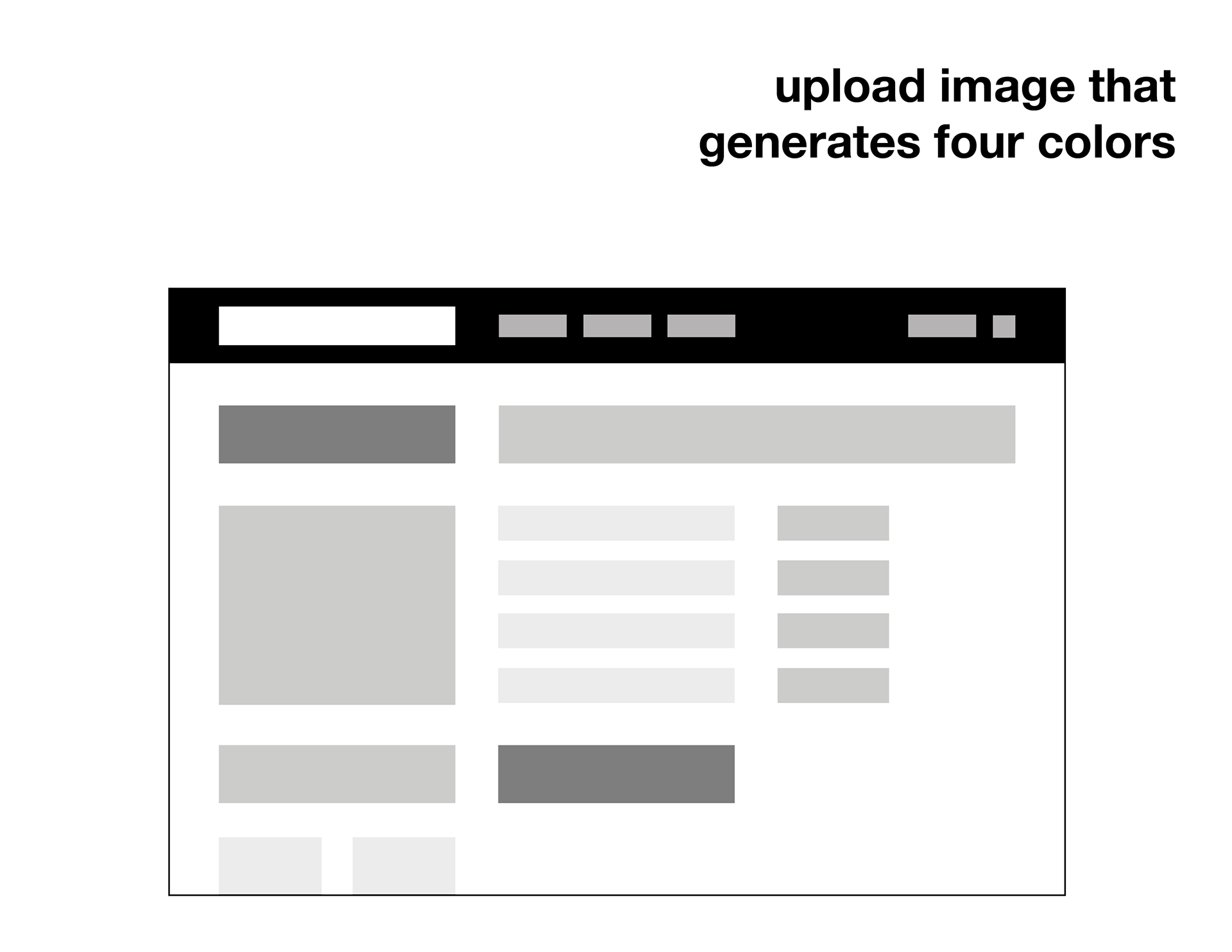
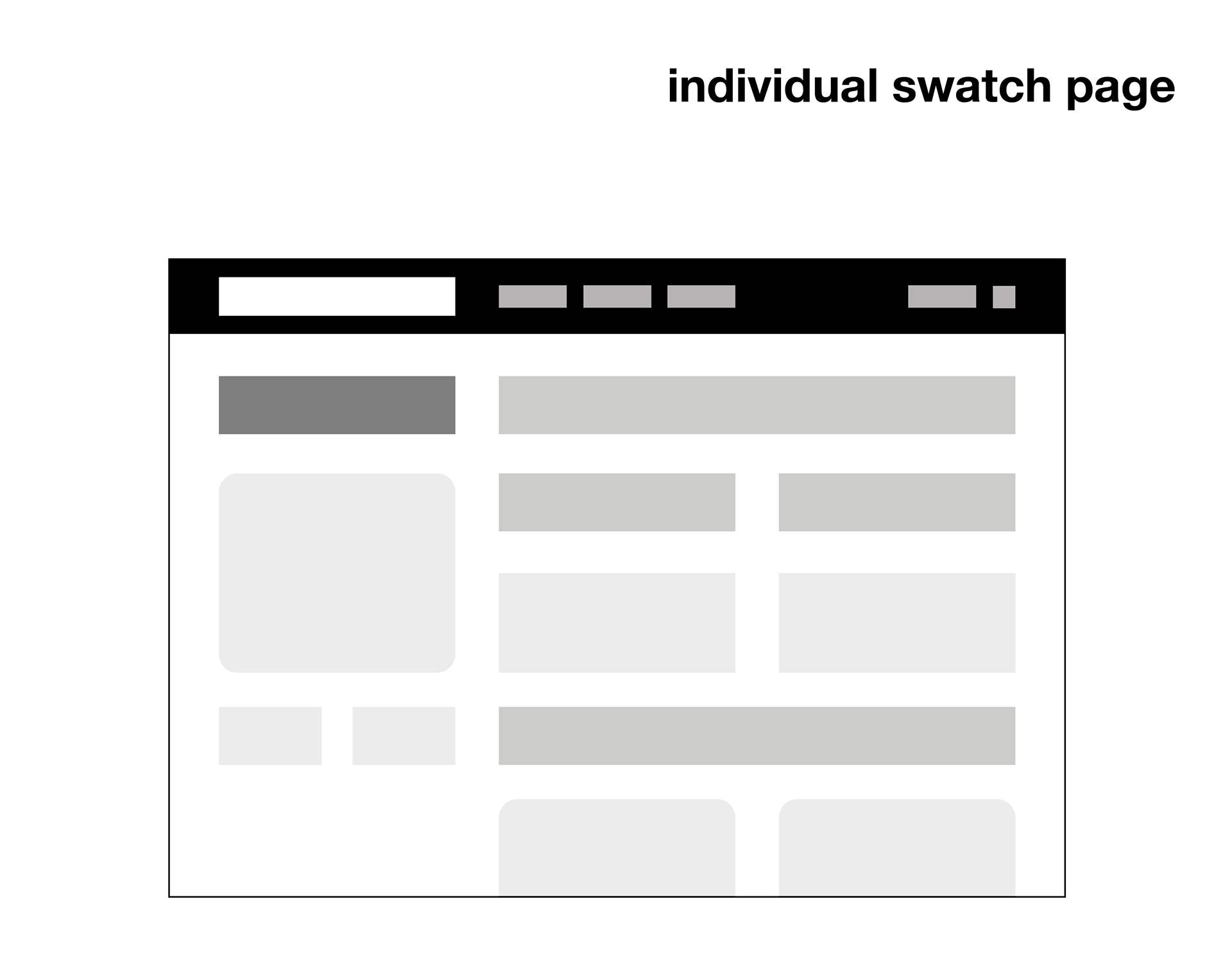
At the beginning of this project, I wanted to make an archive of different color swatches associated with words to inspire poetry, inspired by the game Paint Chip Poetry. As I progressed further into the wireframing stages, I wondered if I could explore an offshoot of my original idea: an archive of pride flags. Instead of creating color swatches, users would be able to create their own pride flags. I was more excited about this idea than the color swatches, but I’m still glad I explored my original idea because it helped me create better wireframes and clearer content architecture and hierarchy moving forward. I learned that sometimes it’s good to take risks (within reason), and it’s okay to deviate from your original ideas (that’s why the iterative process is so important).
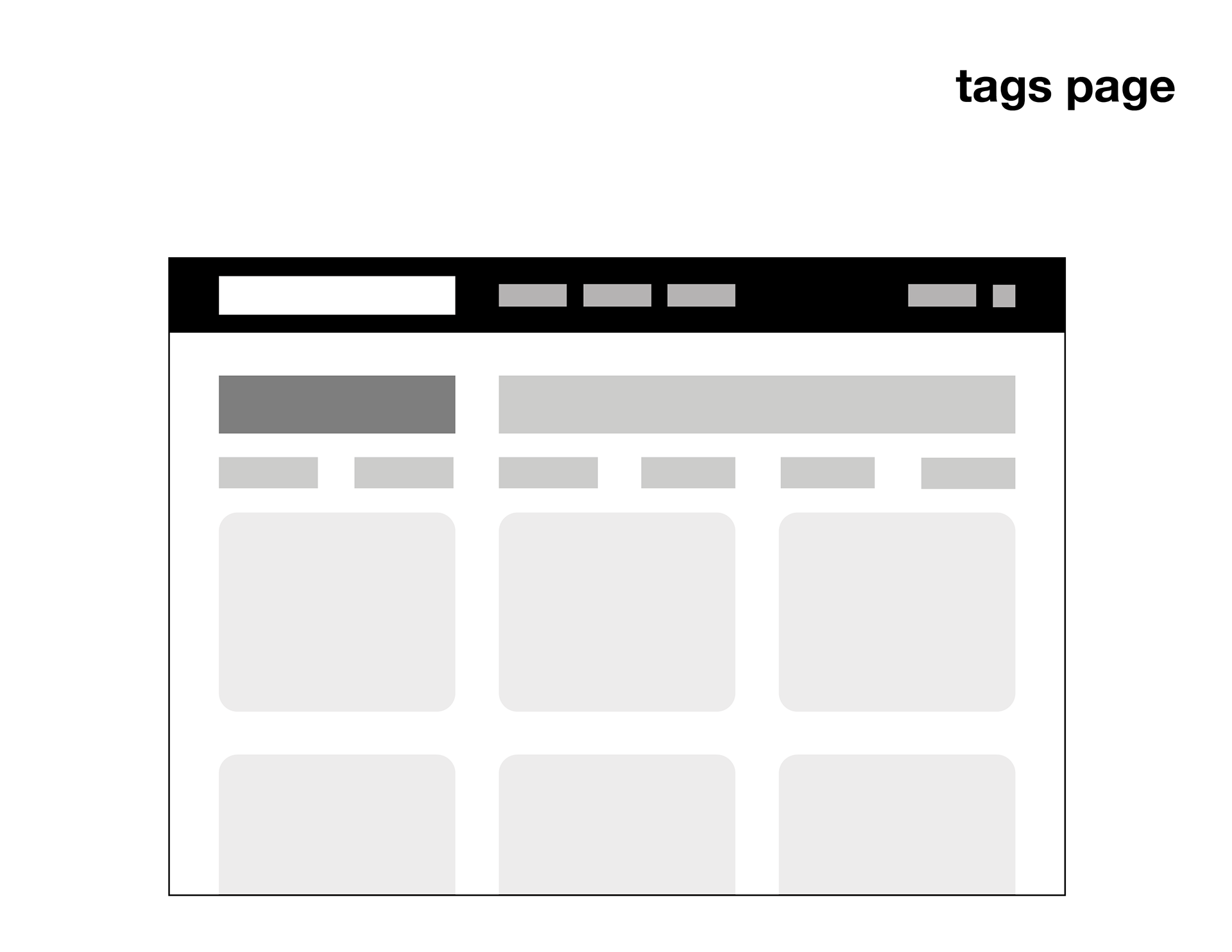
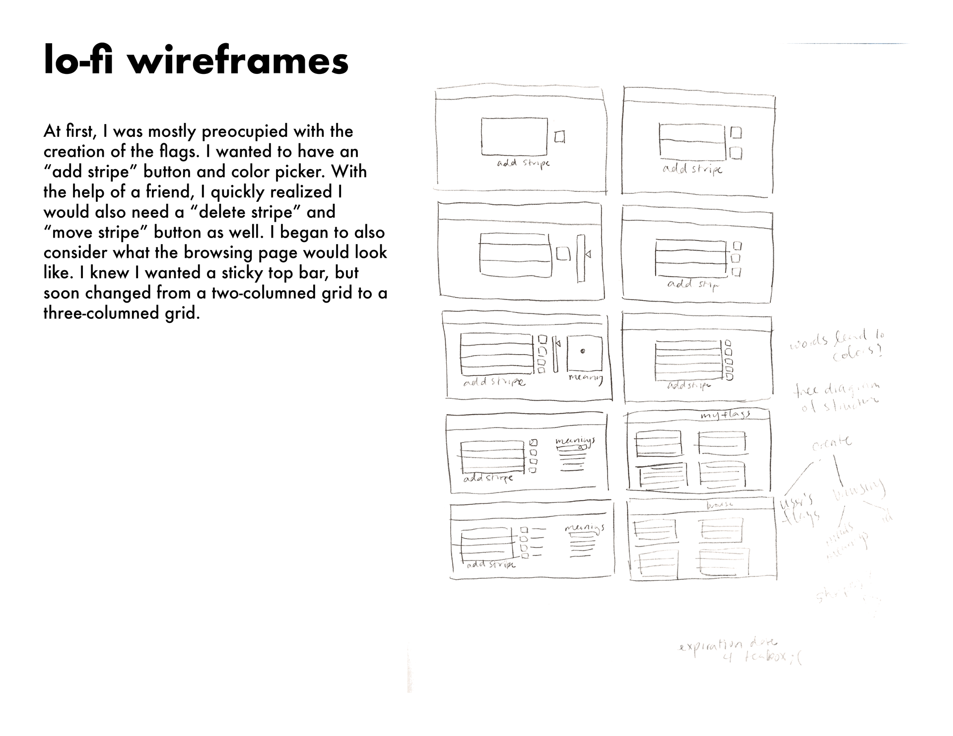
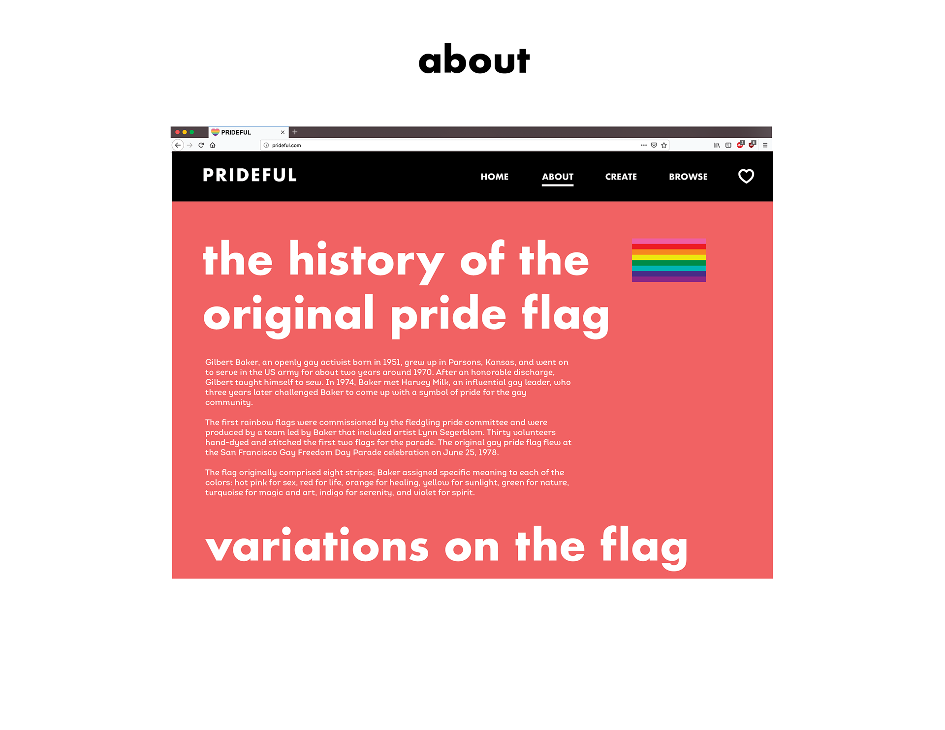
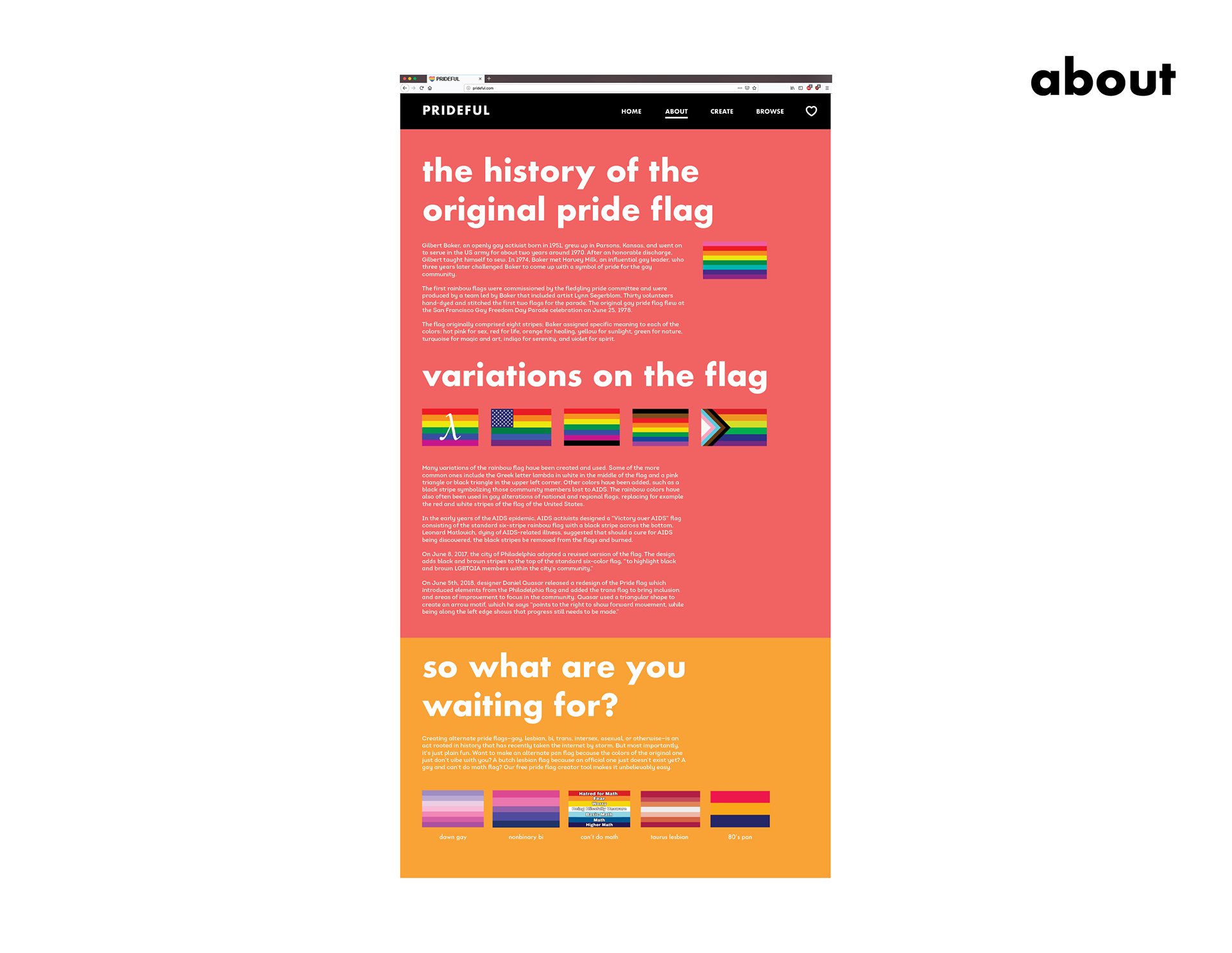
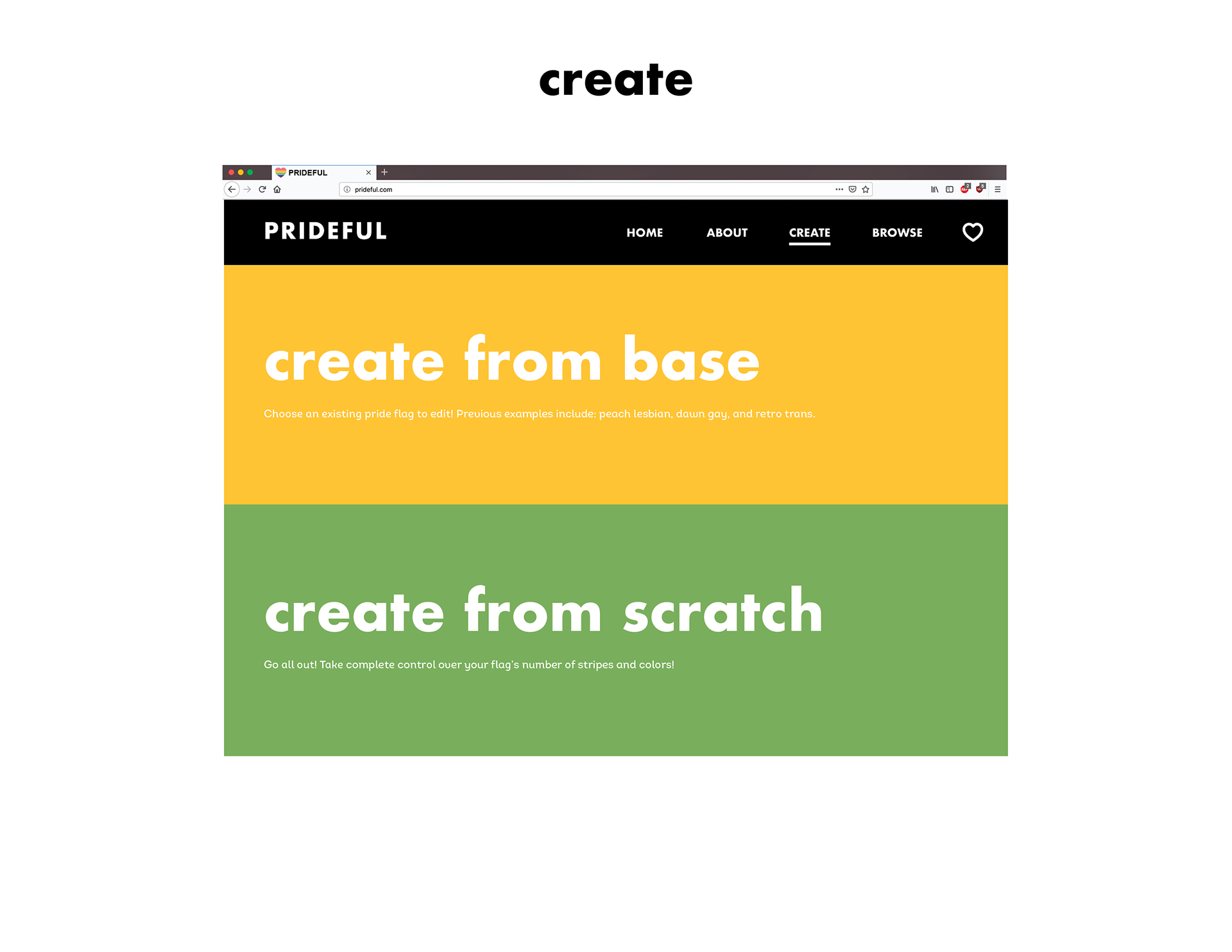
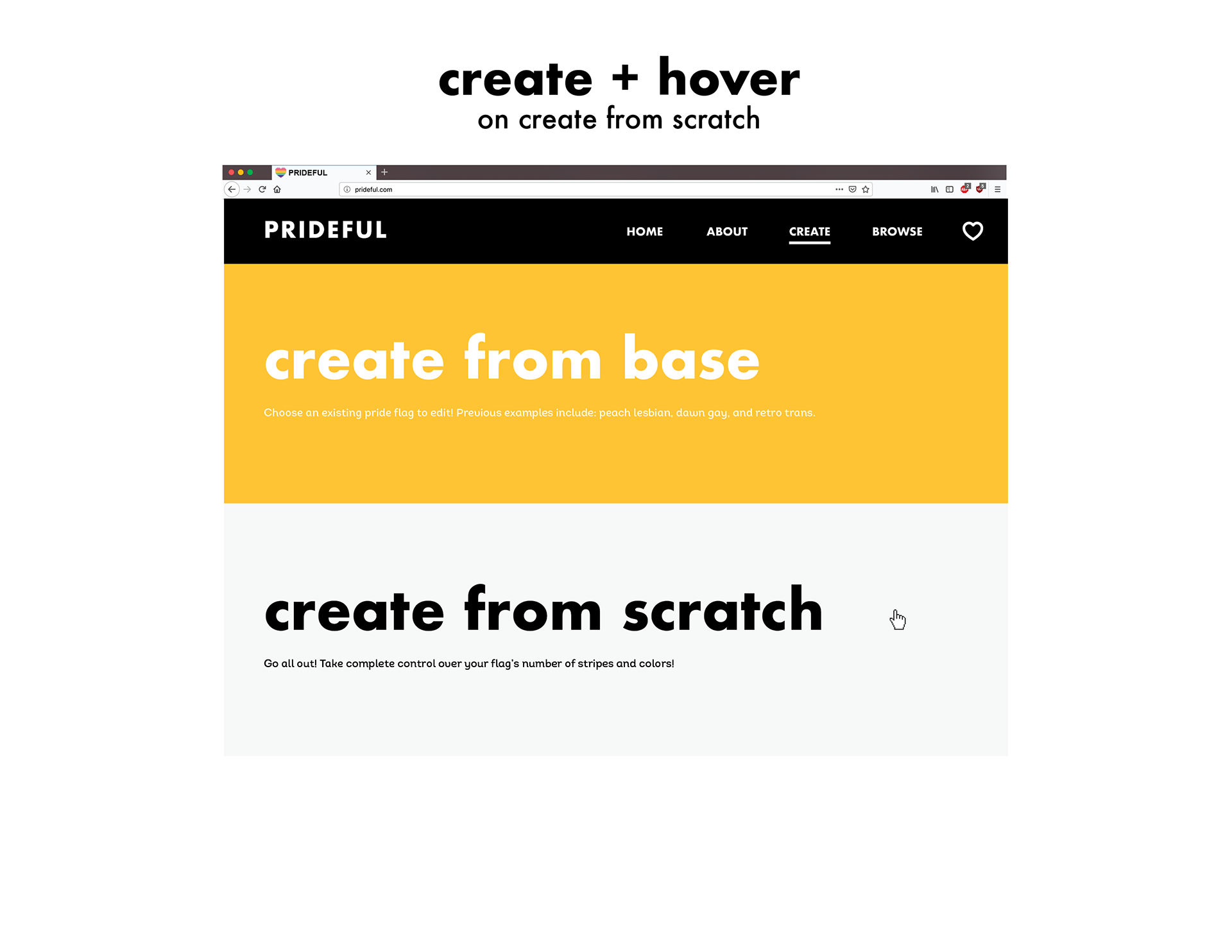
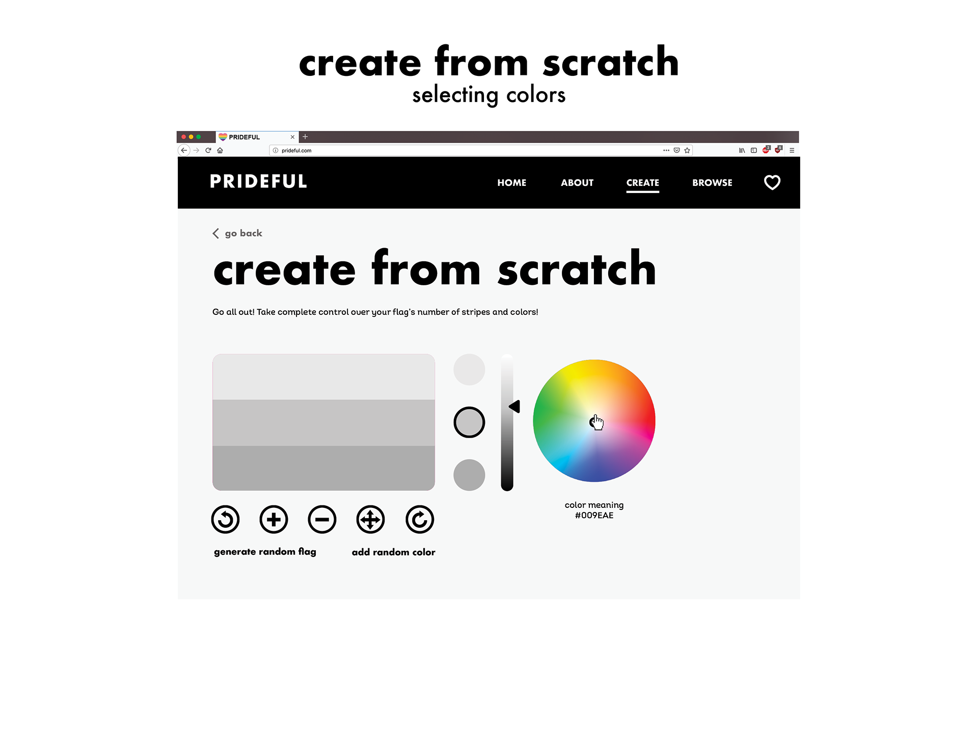
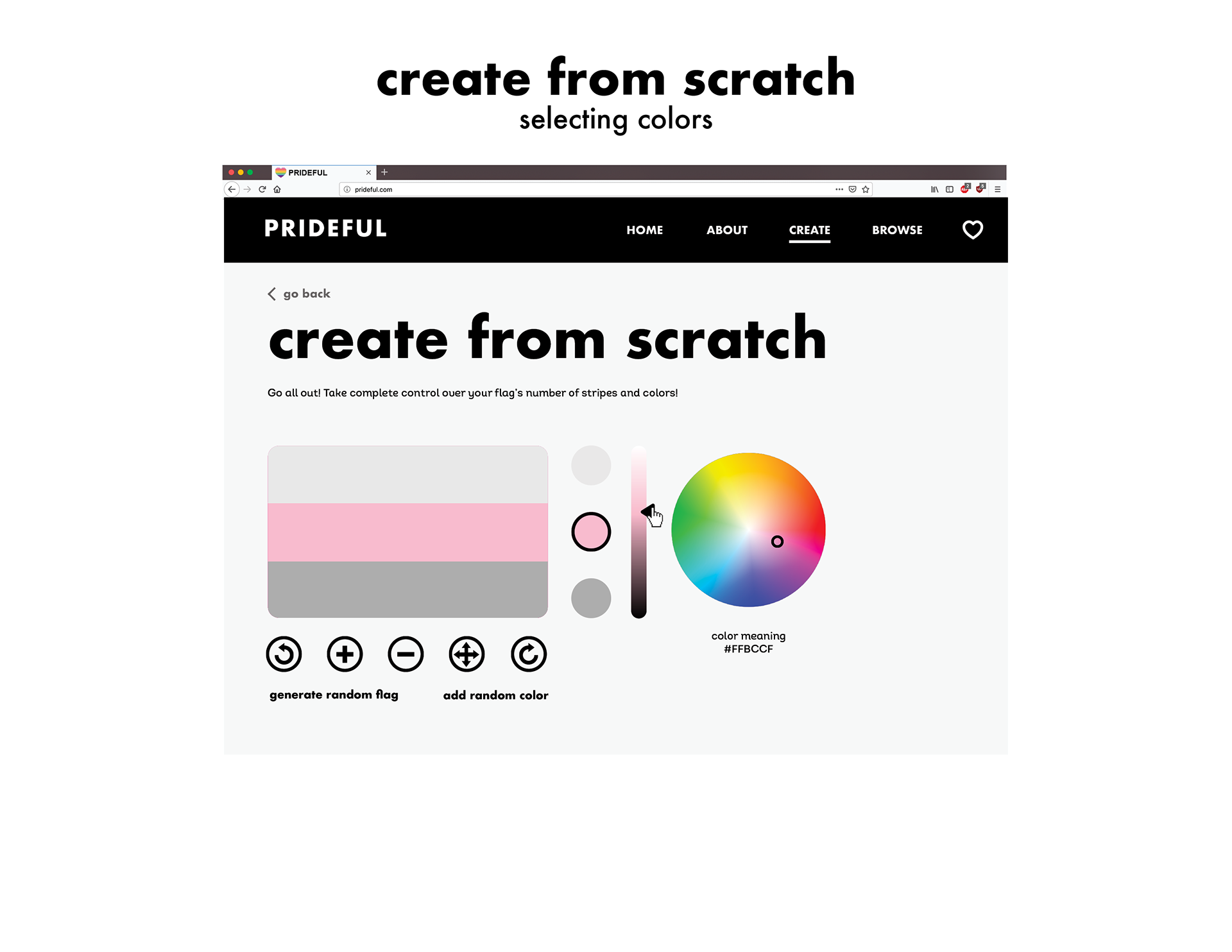
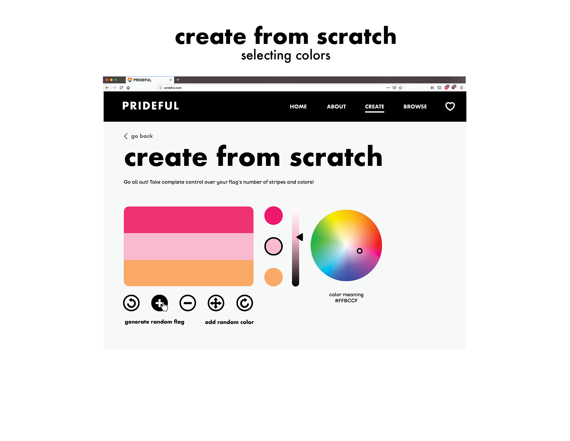
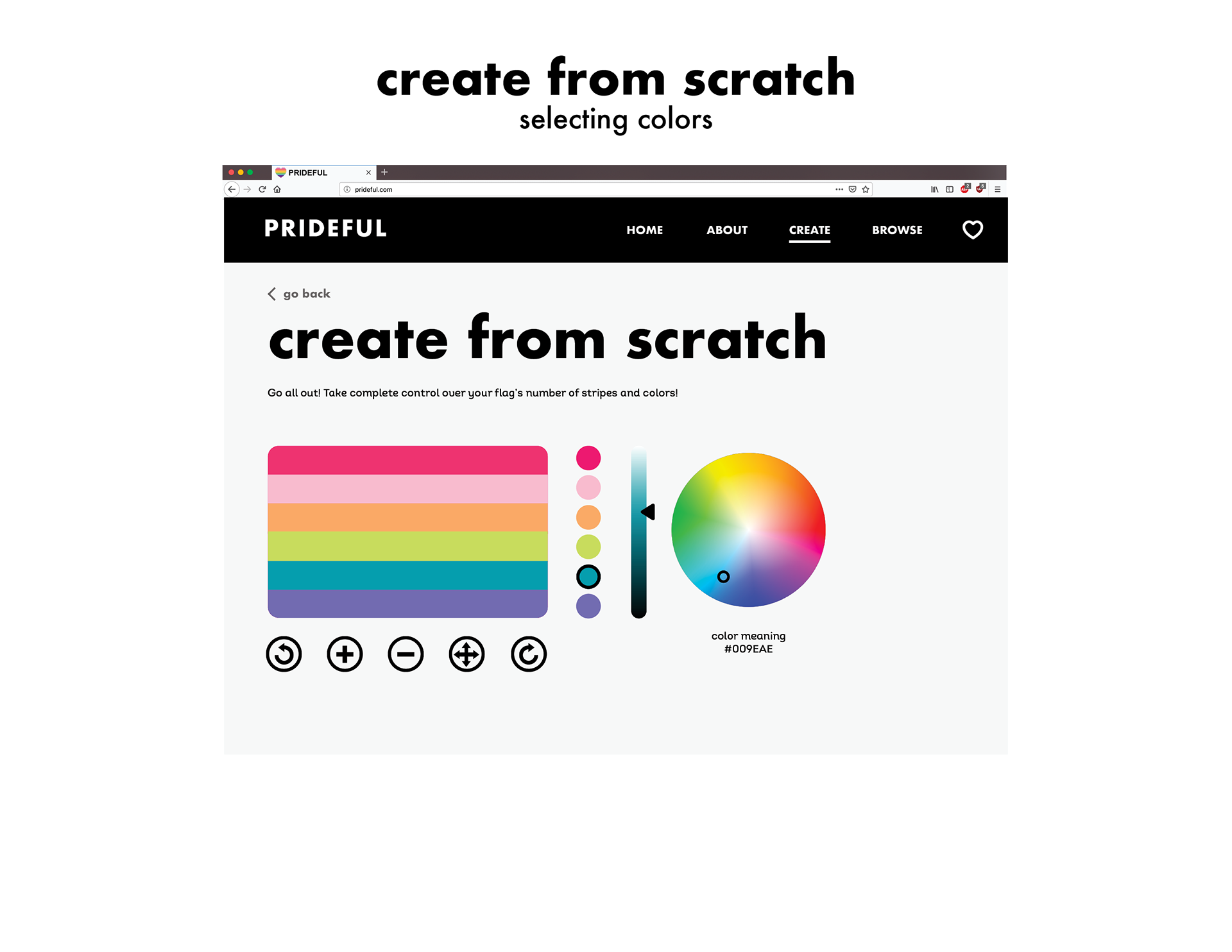
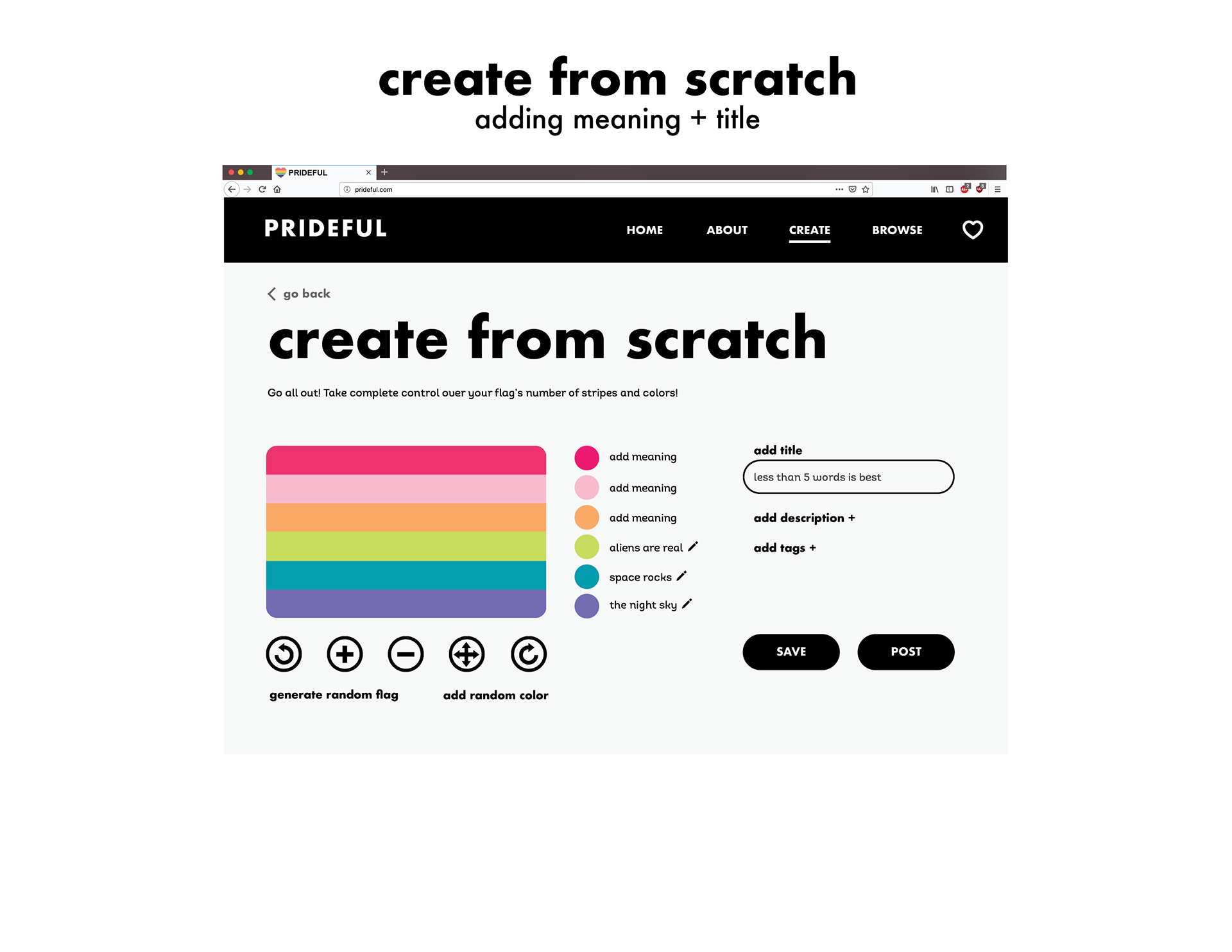
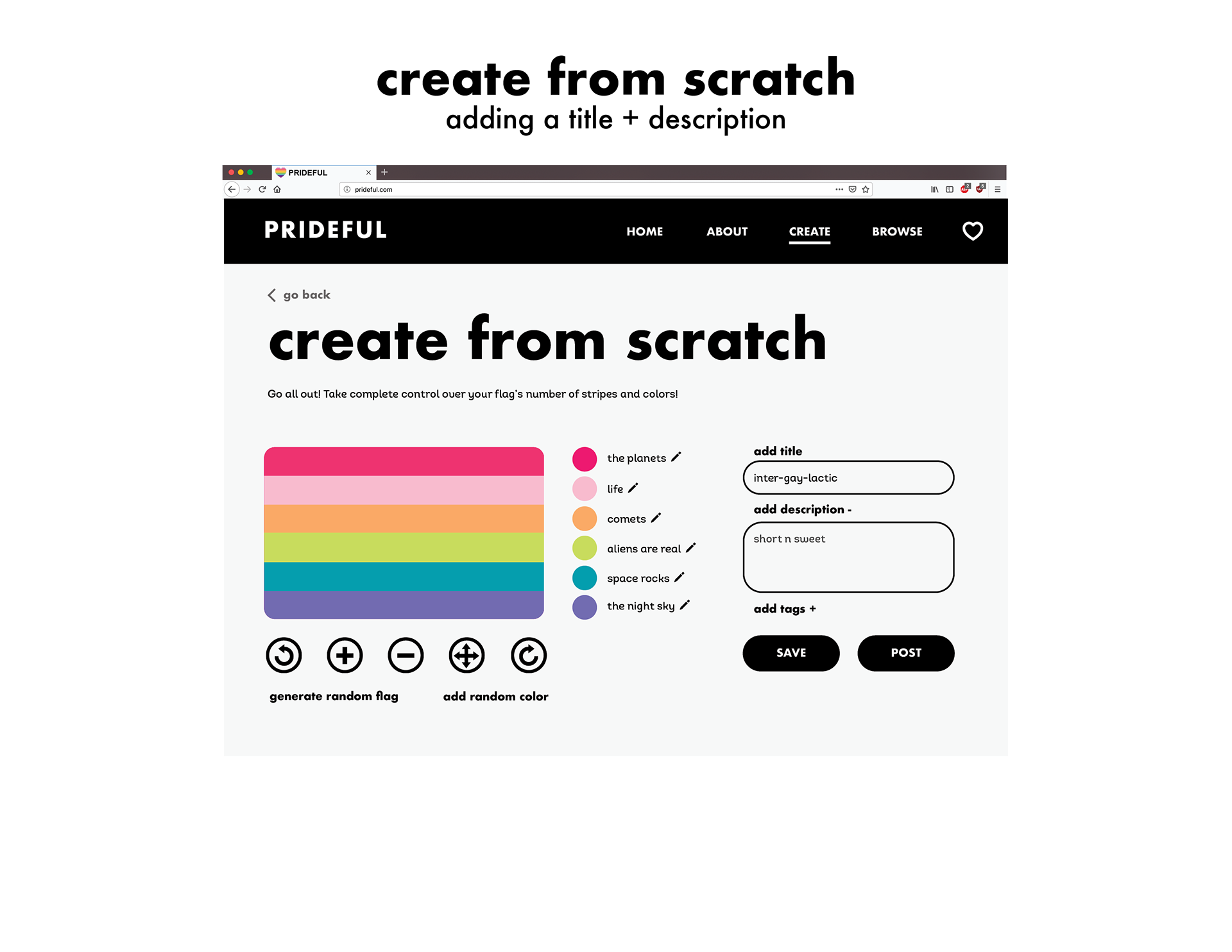
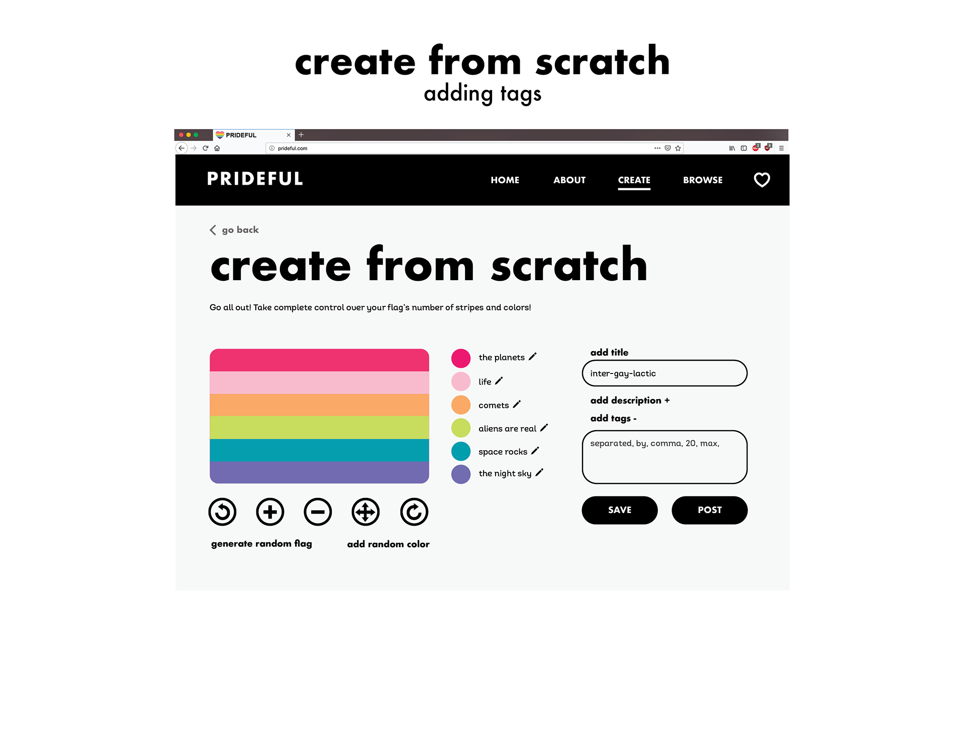
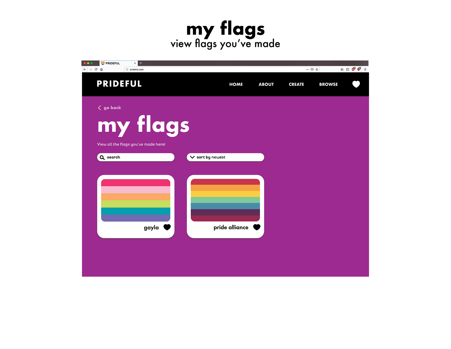
After the lo-fi wireframing and user feedback stage, I was unhappy with how my archive was progressing. I thought of how I could expand on my original idea, and eventually came to the idea of making a custom pride flag website. Enter Prideful.
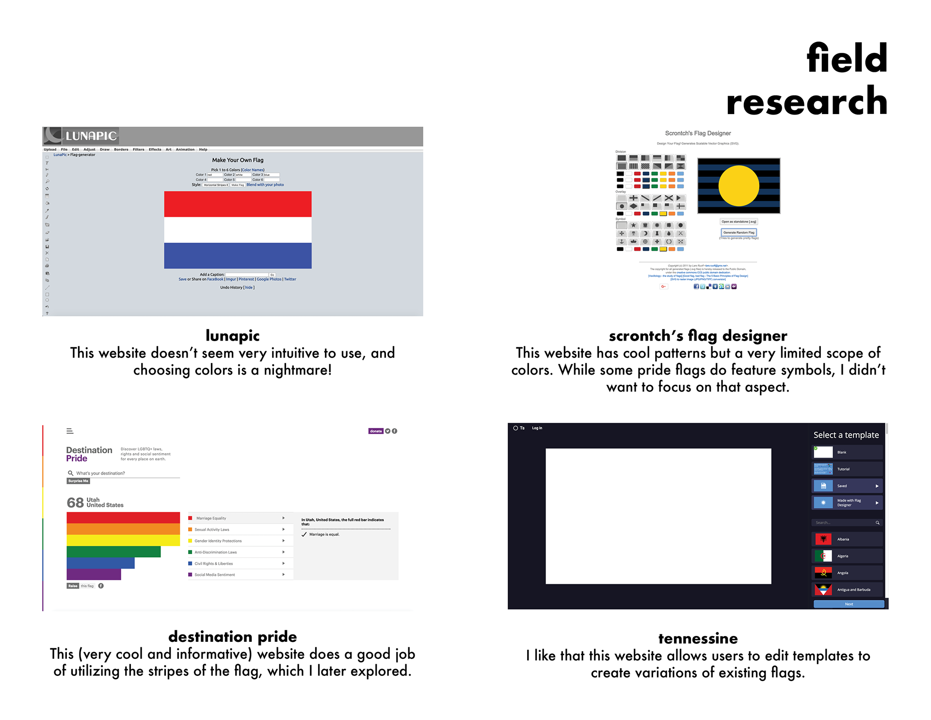
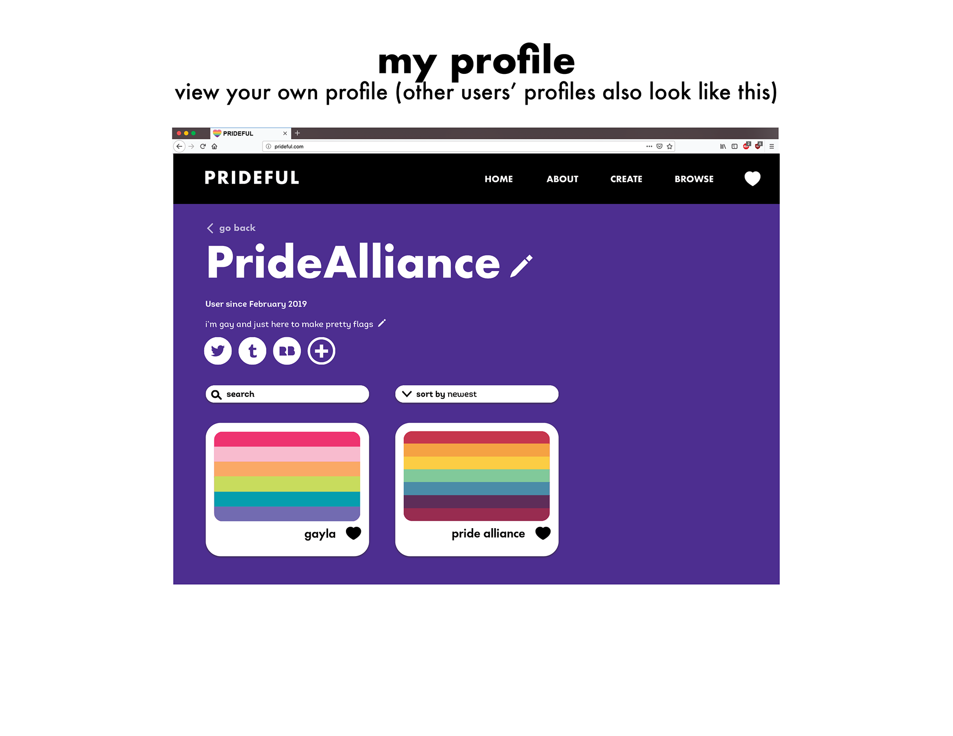
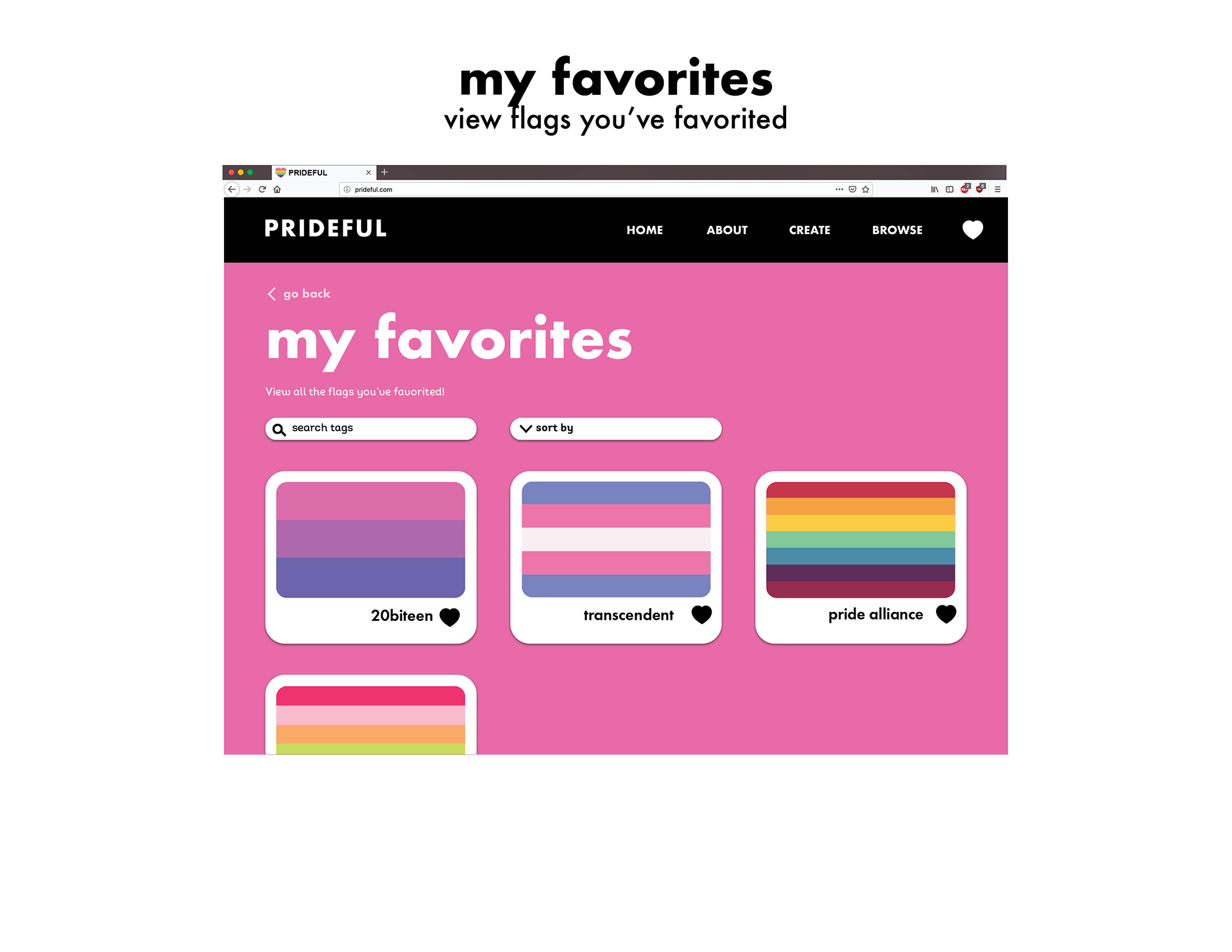
It is a growing hobby for LGBTQ+ people to create alternate versions of existing pride flags, such as the lesbian and genderqueer flags. I wanted to try to make my site as user-friendly as possible, because many of my researched sites were lacking in that area.
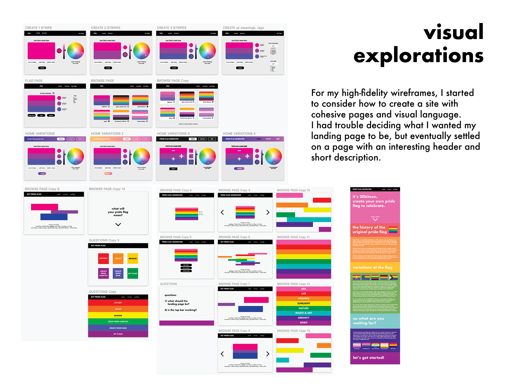
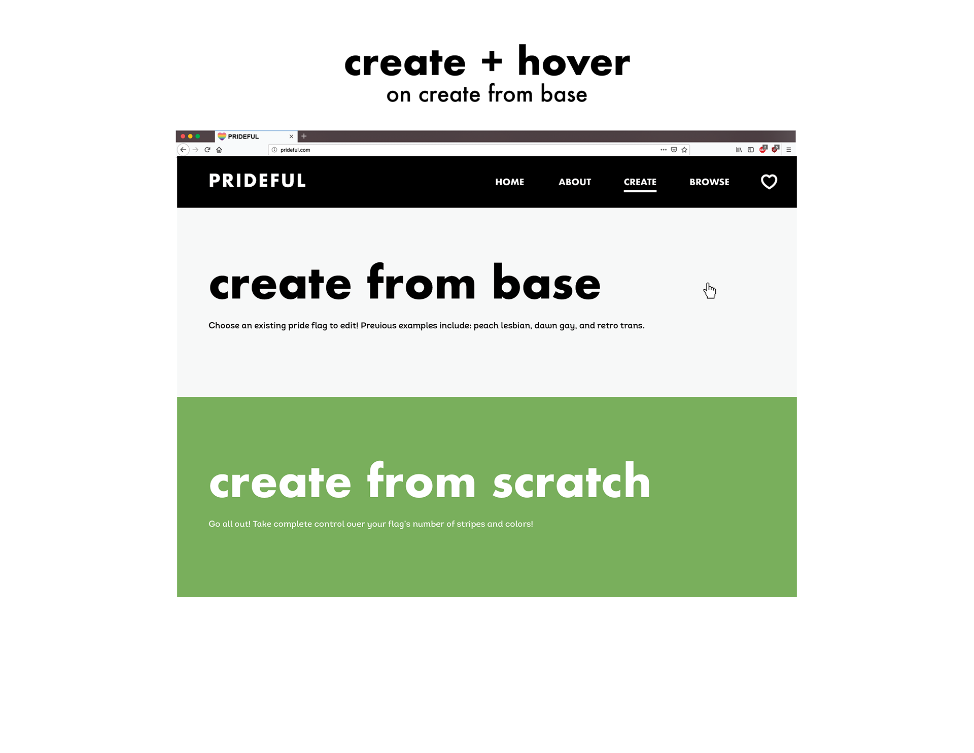
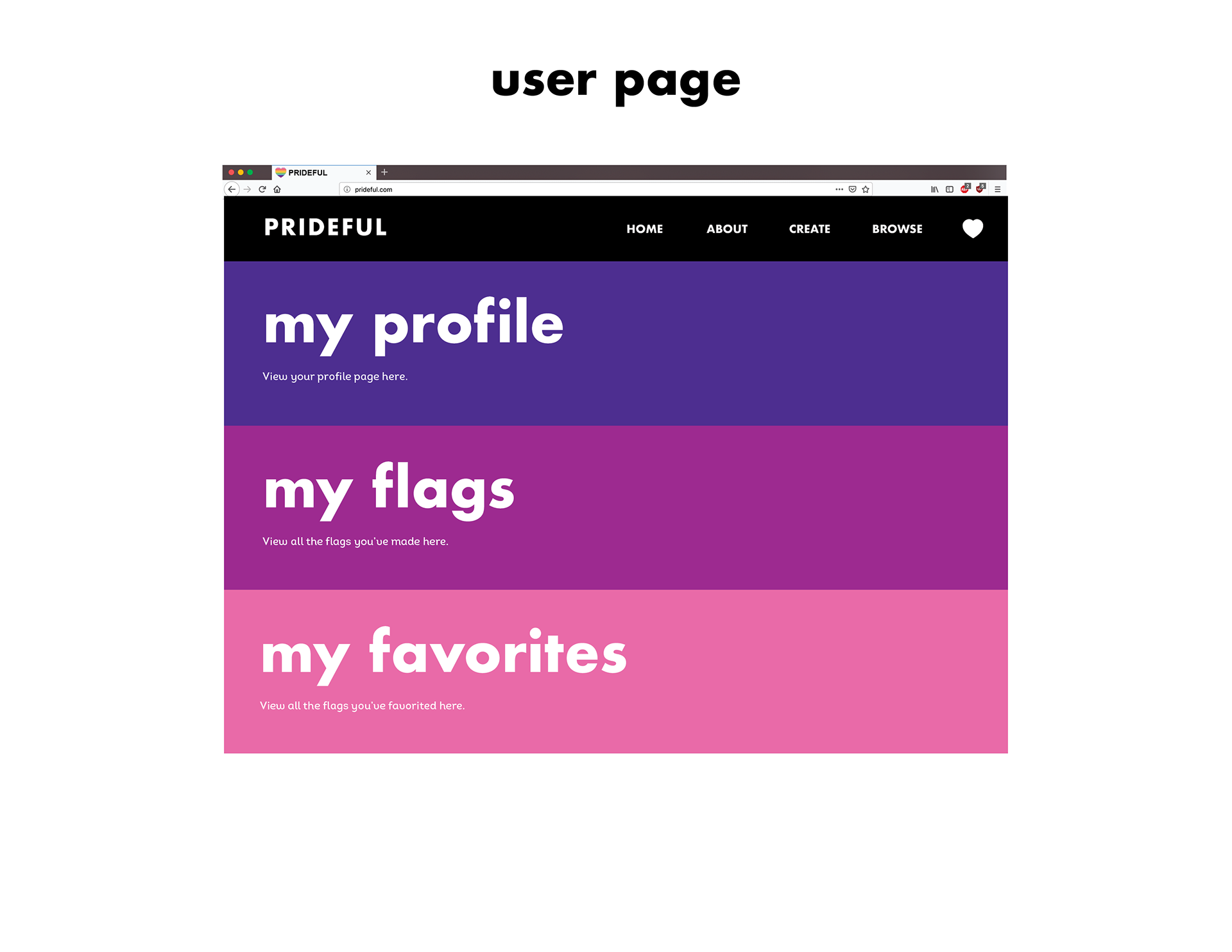
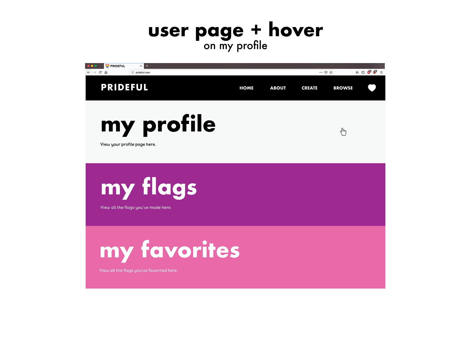
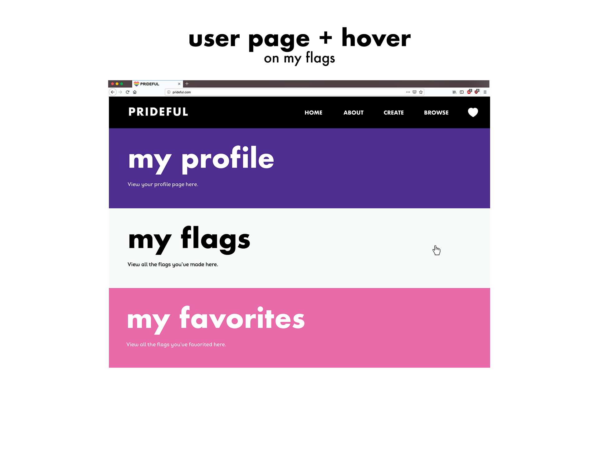
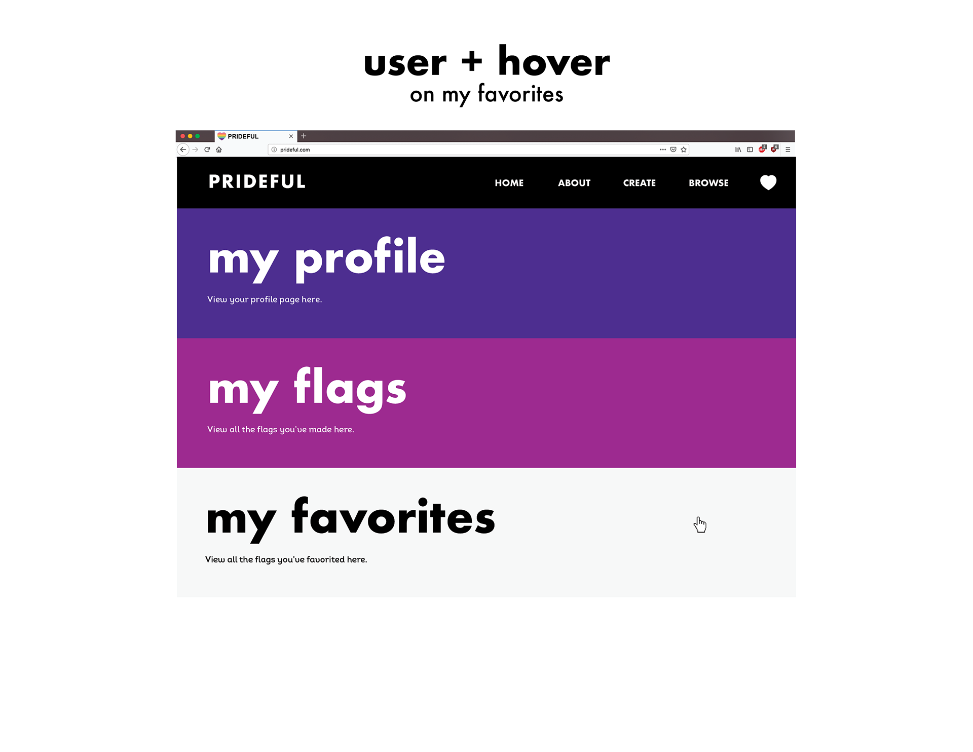
When creating the final screens of my website, I paid attention to visual identity, user experience, hover states, and language.


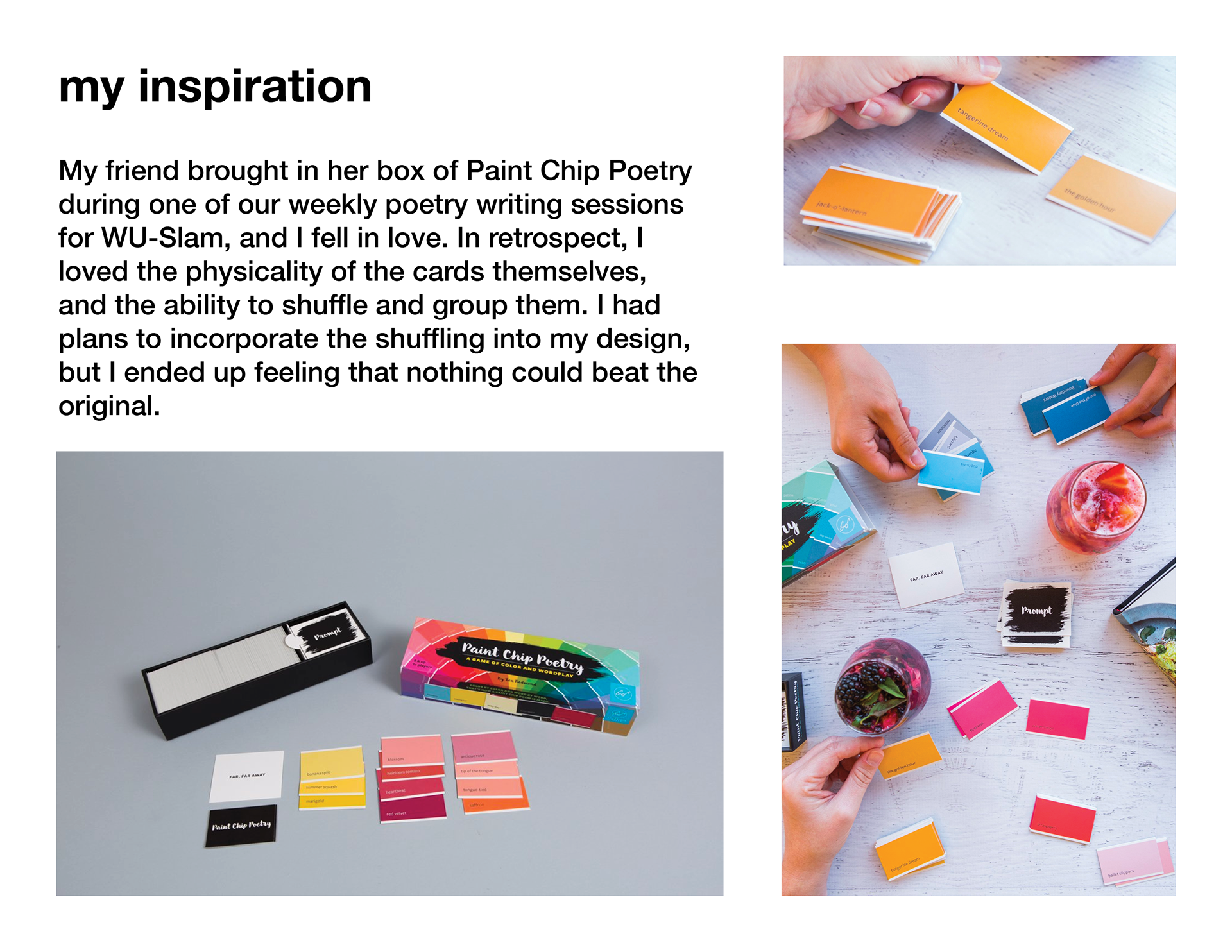
If I were to create a similar project, I would try to explore many different ideas instead of settling on the first one that seemed somewhat interesting. Another component I would consider would be whether my idea can really be executed well through that medium. For example, I ended up feeling like my color swatch idea wouldn’t work best online, especially after using the paint chip poetry swatches in person.
If I continued to work on this project, I would consider more complex hover states for the heart icon. Instead of filling in with white on hover, it could fill in with the color of the page, rainbow stripes, or a shifting rainbow animation. I would also think of different ways to execute the login/signup function and user page. I could also explore the buying and selling pages of the pride flags.